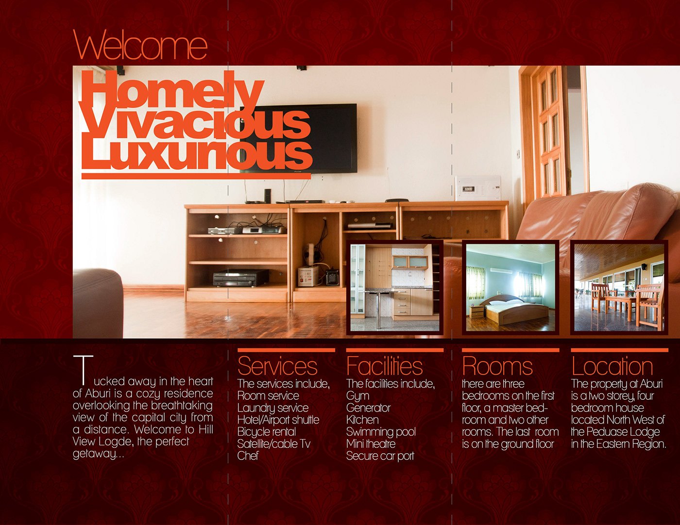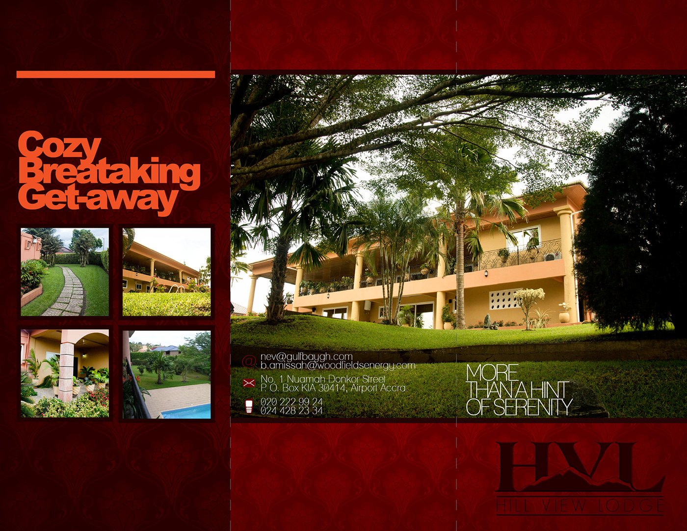
The task was a print identity for a small lodge that had the rooms but not yet the voice. Hili View Lodge sits at Aburi in the Eastern Region with the capital visible in the distance, and the brochure had to explain the offer in a glance: a quiet getaway with serviced rooms, a pool and secure parking.
The layout runs on a deep maroon ground with a faint damask texture, orange and cream type, and a heavy display face stacked into short words: Cozy, Breathtaking, Get-away on the cover and Homely, Vivacious, Luxurious inside. Photographs sit in hard-edged blocks, and the tagline More Than A Hint Of Serenity is set beside the HVL monogram.
The inner spread carries a welcome paragraph, a lounge photograph and three insets for the kitchen, a bedroom and the corridor, with four narrow columns headed Services, Facilities, Rooms and Location setting out the offer. Delivered as two print spreads for one folded brochure, the piece gave the lodge a single sheet to hand to enquiries.
Two sheets, two deliverables. The same lodge is presented on this site a second time as HVL Identity (2012) — the boxed monogram, wordmark and scroll on the studio’s silver identity sheet, published a year after these spreads and archived rather than listed. The brochure lockup above, with its hill silhouette inside the V, is the extended form of that mark.
The project was published as HVL BROCHURE — RDVS. DESIGN; the full set is on Behance.