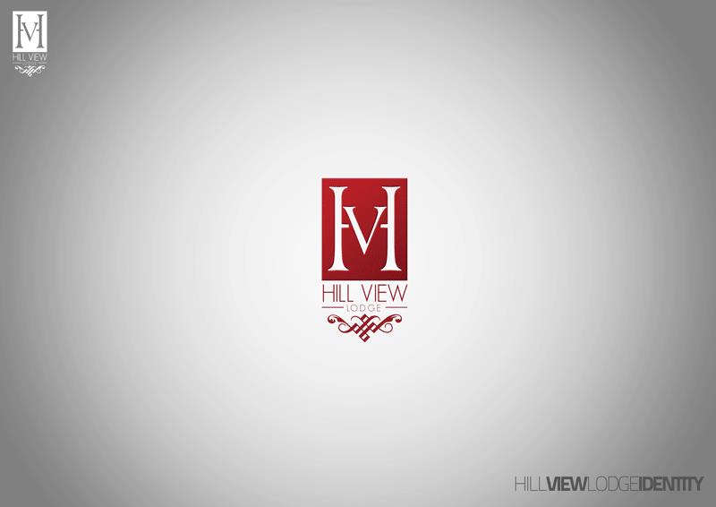
The commission was a mark rather than a campaign. The device collapses the lodge’s initials into one figure: two heavy serif stems framing a V, drawn white on a tall deep-red rectangle so the letterforms read as an M as easily as an H and a V. Under the block the name is set twice over — HILL VIEW in a thin geometric sans, then LODGE in small spaced capitals held between two hairlines — and the sheet closes with a knotwork scroll with curled ends. The same lockup is repeated reversed in white at the top-left, which is where a reversed application would be proved.
It is one of a run rather than a lone sheet. From 2009 to 2012 the studio published identity presentations on this same silver canvas — a field brightening through the centre and falling to grey at the corners, the mark centred, and the client named along the foot as a series signature, here reading HILL VIEW LODGE IDENTITY. TSIK Company Ltd ran in June 2009, White Fleece in December 2010 and Gold Dust in January 2011; this post went up on 6 June 2012 and Sam-Mellics followed two days later, with E-Zone in October. Different clients and different marks, the same board — which is why their images sit close to one another without being the same work.
The lodge is already on this site as HVL (2011), the two maroon brochure spreads for the same client, and that listing stays live while this sheet is archived. They are different deliverables and the frames are proved apart. The brochure carries the extended lockup: H, V and L drawn as one ligature with a hill silhouette inside the V, set over HILL VIEW LODGE between two rules on the back panel. This sheet presents the boxed monogram on its own. Both spell the name Hill View.
Nothing on the sheet is dated and no town is named on it, so the listing carries 2012 — the year the studio posted it and the date the owner gave — while the brochure listing carries 2011; both stand rather than one being reconciled to the other. The post states the software and no designer, so Photoshop and Illustrator are recorded and no team is claimed. The brochure listing records its client as “Hili View Lodge”, but the artwork on both sheets reads Hill View, and that is the spelling used here. The source post is on blogspot — HILL VIEW LODGE - GRAPHIC DESIGN, 6 June 2012.