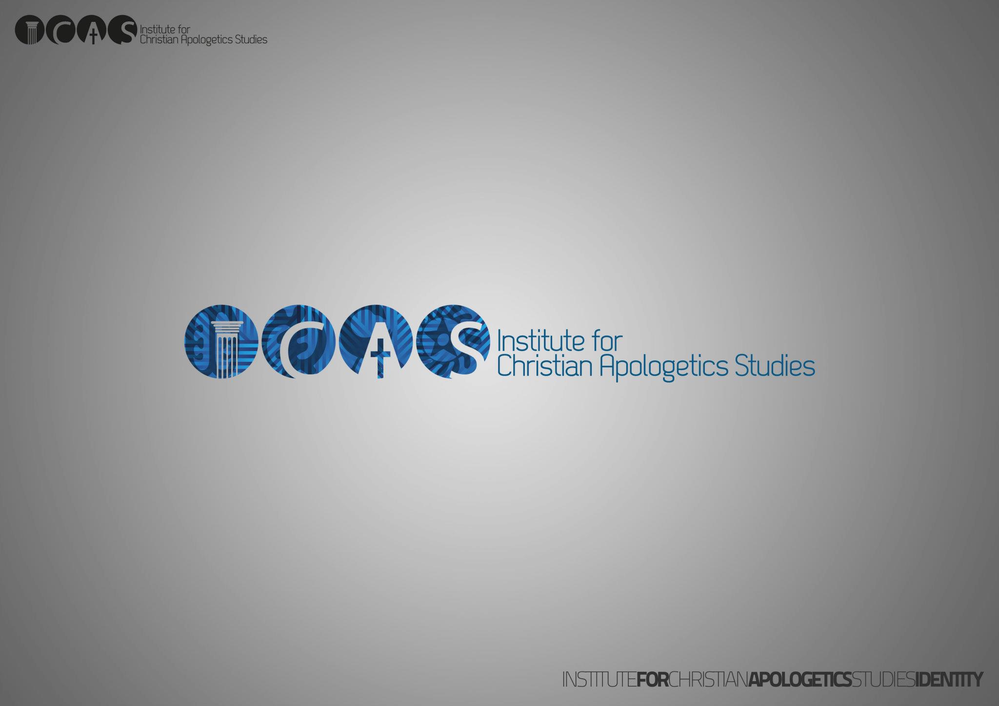
ICAS is an abbreviation, and the mark spells it out. Four discs carry the letters I, C, A and S as white knockouts, and two of the four are pictures as well as letters: the I is a fluted classical column complete with its capital, and the A holds a small latin cross in its lower half. The C is a thick crescent and the S is left plain. Each disc is filled with an overlay of circles, wedges and radiating bars in several blues, so the set reads as one family without the four shapes being identical, and the institute’s full name stands beside the lockup in a light geometric sans.
The plate is composed as a presentation sheet rather than an artwork: the finished colour lockup in the middle of an empty grey field, a small all-black version of the same lockup pinned to the top left to show it holds without colour, and a caption bottom right that runs the whole name followed by the word IDENTITY, with FOR, APOLOGETICS and IDENTITY set heavier than the words around them. Nothing on the sheet is dated.
That is the whole record. The post carries no labels, names no designer or team, gives no location, no brief and no process — one image and two lines of text, the second of which is a software list: PHOTOSHOP & ILLUSTRATOR. So the client row comes from the studio’s own expansion of the abbreviation, the discipline comes from the post’s title, and the location is the site’s default for a job the post does not place, since the studio worked in Accra. There is no Team row because no team is named.
ICAS sits in a burst of about thirty-five posts the studio made across June and August 2012, most of them back-catalogue rather than new work, and six other graphic-design jobs went up on 6 and 7 June alongside it. Searching the studio’s surviving hundred-and-twenty-two entries for ICAS, apologetics or institute returns this post alone, so nothing later resolves whether the institute adopted the mark.
One image was published and one is plated. The upload is a Facebook original — the filename 467333_10150712612546913_710155347_o.jpg is the CDN’s own naming, with the o suffix for original — and the rendition ladder does not rank by size: the s0 is 2048 by 1448 in 81 KB while the s1600 is 1600 by 1131 in 99 KB, so the smaller frame carries more bits per pixel. Both were decoded and measured at a common width, and the s0 won anyway, with a blockiness ratio of 1.024 against 1.035 and more high-frequency detail surviving, so the larger file is held.