White Fleece, a young Accra business, needed a professional visual identity it could carry across letterheads, cards and screens. RDVS Studios built the brand from a single mark, then applied it consistently so the company would read as an established corporate house rather than a start-up.
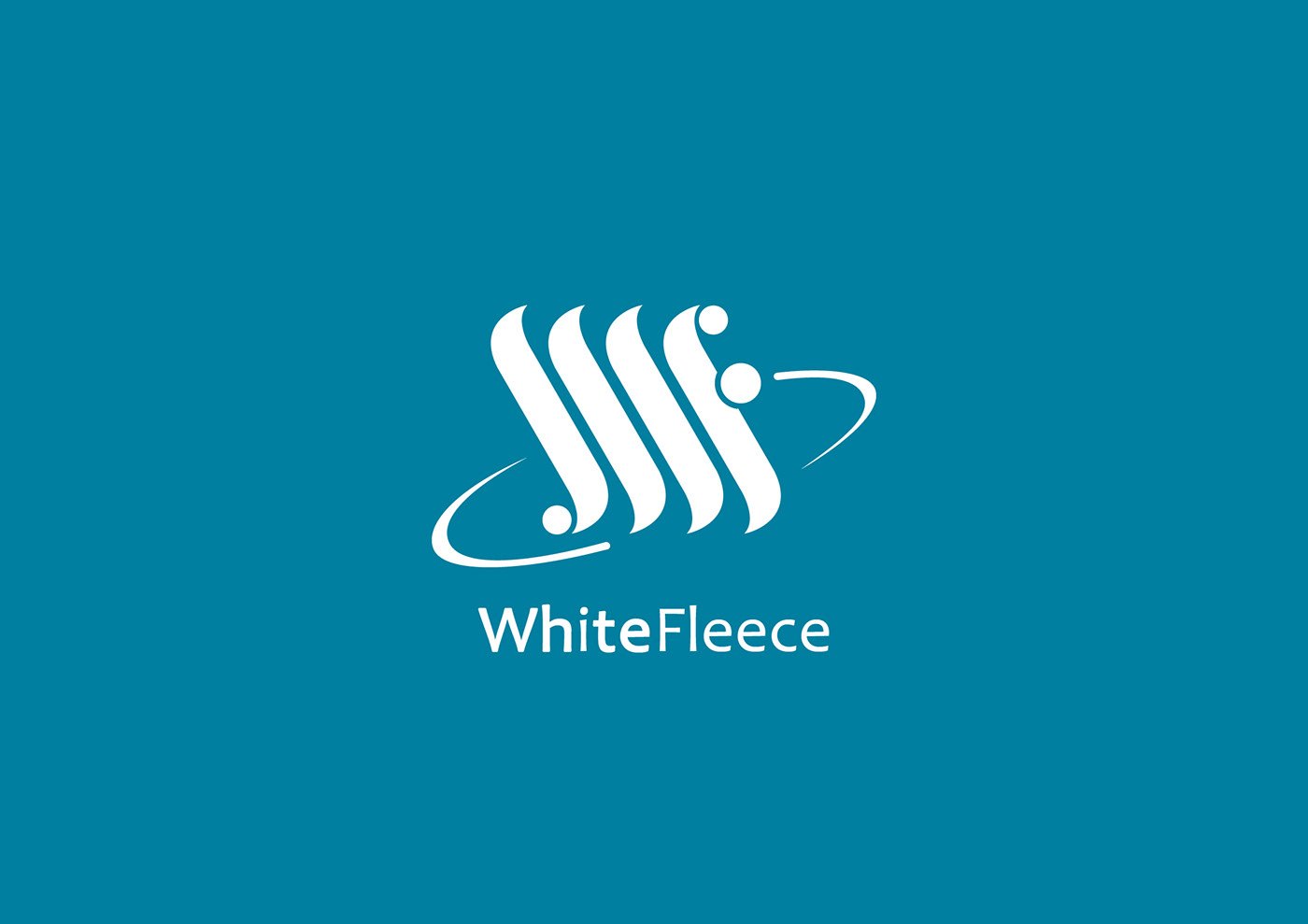
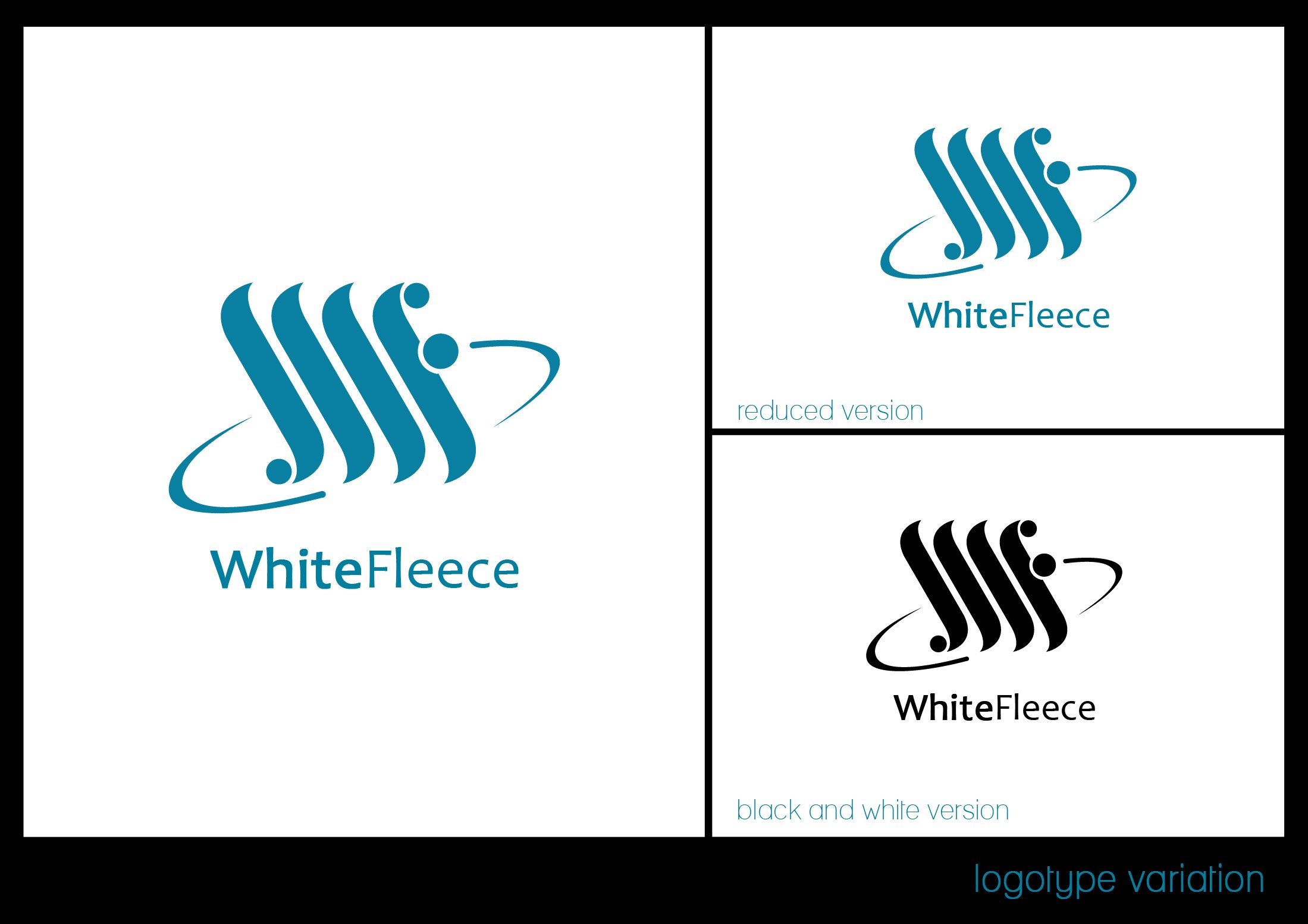
The logotype pairs a fluid teal monogram, three curved strokes suggesting fleece or waves, with an orbiting ring and dot, set above the wordmark WhiteFleece. Boards show reduced and black-and-white versions and a reversed white lockup on a teal field, so the mark holds across light, dark and single-colour uses.
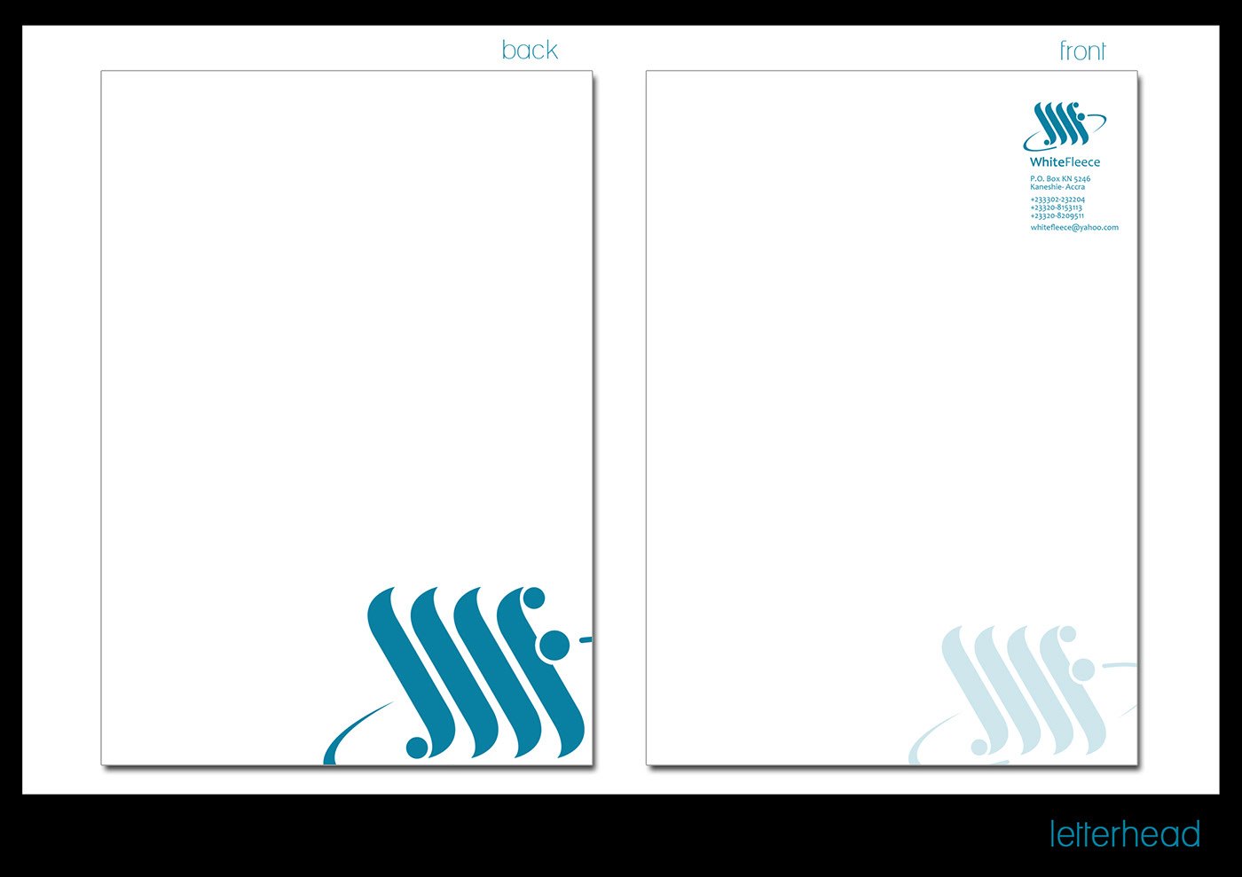
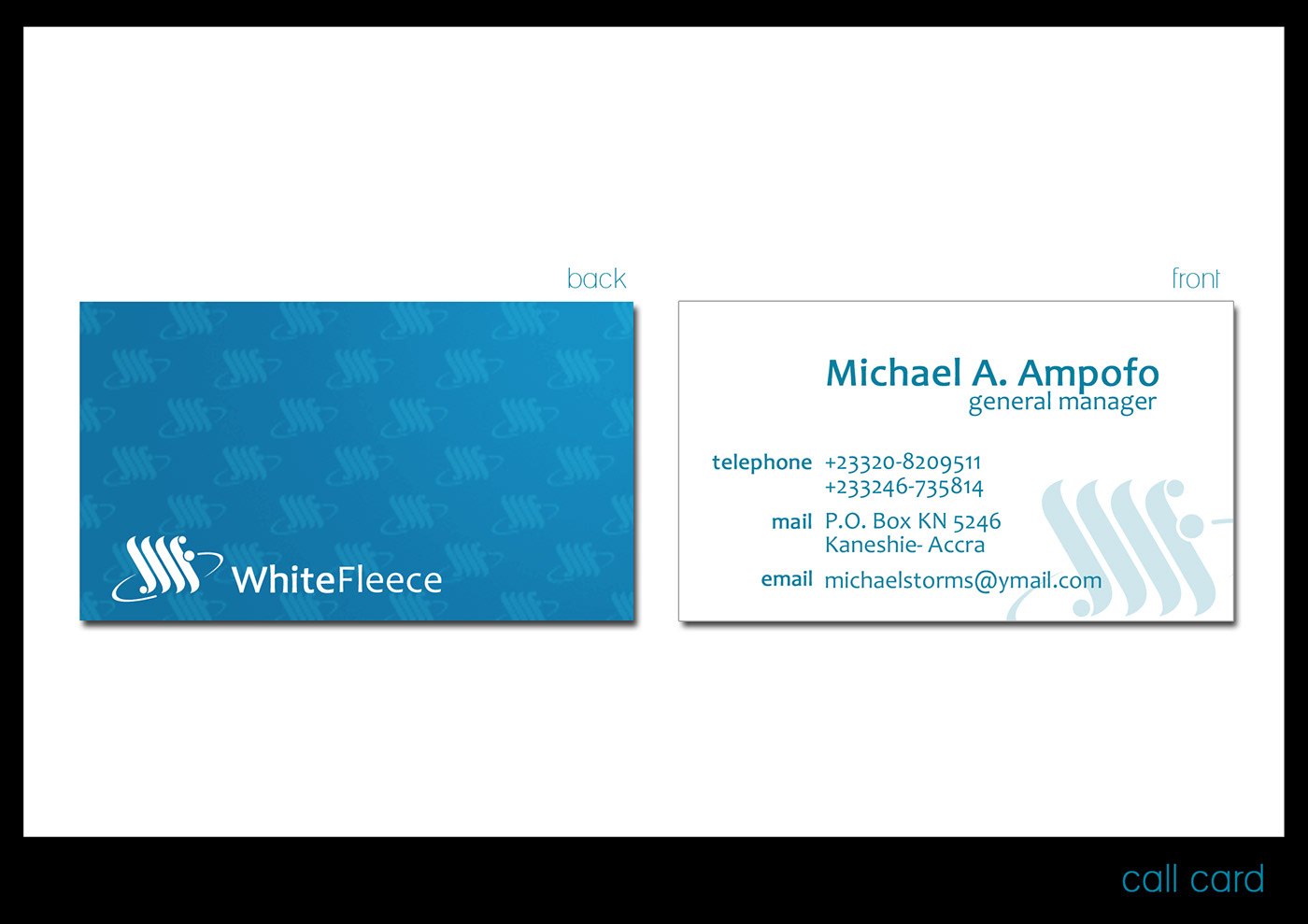
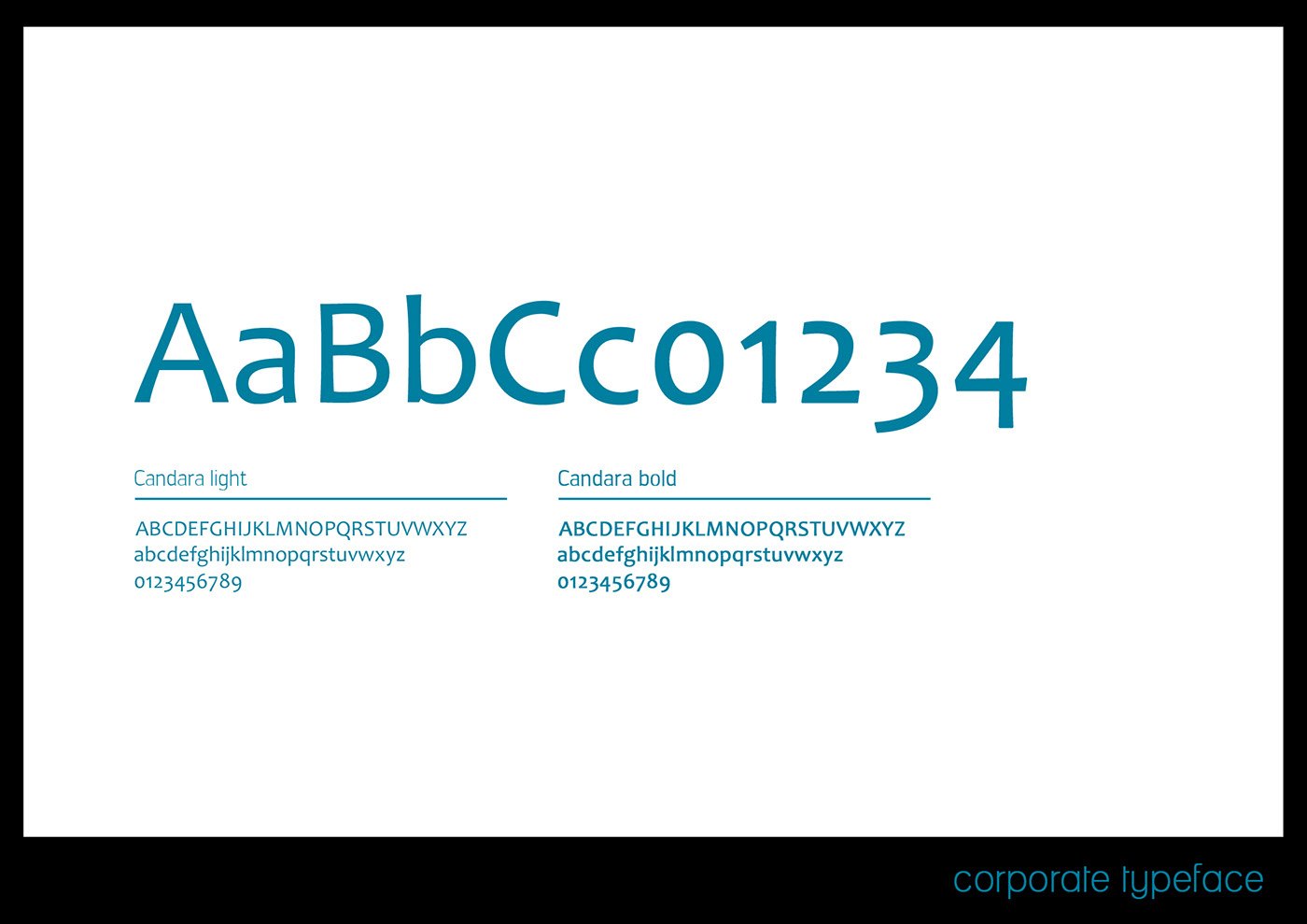
The palette is a clean corporate teal on white, with a subtle patterned blue used on card reverses. A Candara typeface is specified in light and bold for the wordmark and text, and a contact name, Kaneshie-Accra address and phone and email details are set into the stationery grid.
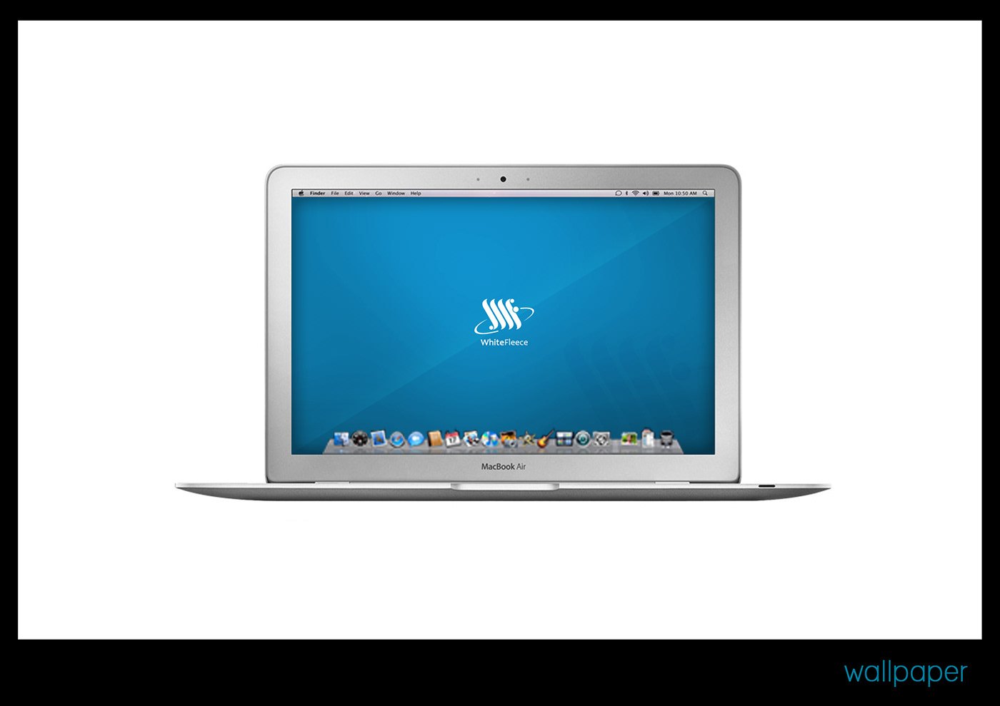
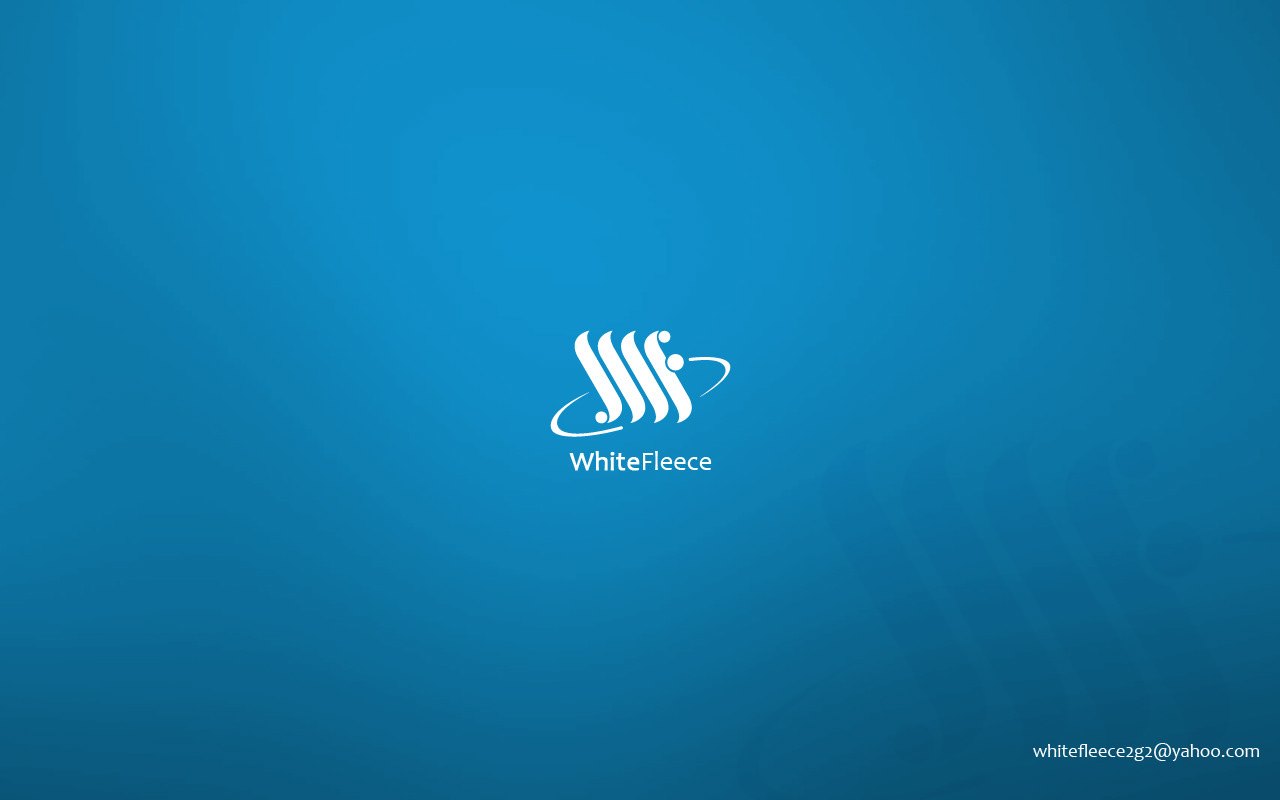
Deliverables span the logo variations sheet, letterhead front and back, business card, typeface specimen, a branded desktop wallpaper and a laptop mockup, presented as an eight-plate identity gallery. Together they form a ready-to-use brand kit that the business could apply immediately to print and digital materials.
The project was published as WHITE FLEECE — GRAPHIC DESIGN, IDENTITY — RDVS. DESIGN; the full set is on Behance.