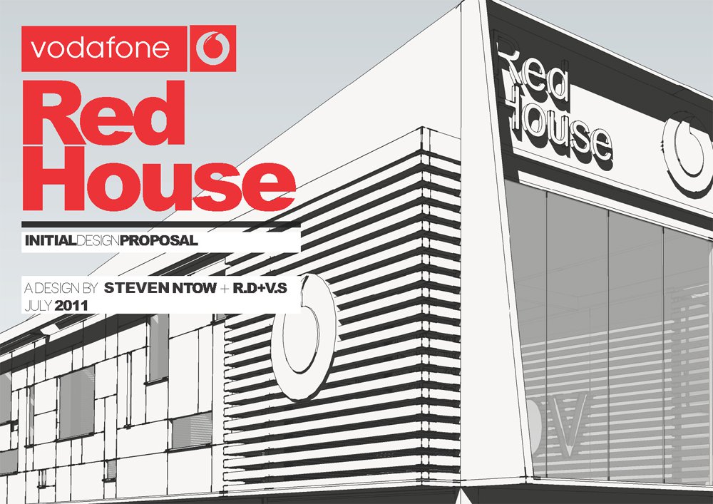
The studio published the work as RED HOUSE — PRODUCT DESIGN on 7 June 2012, describing it as “an exhibition booth designed by Steven Ntow + RDVS (2011)” for Vodafone and listing the tools as SketchUp, Illustrator, V-Ray, Photoshop and 3ds Max. The sheet below is the only image that post carries, and the sheet itself declares the work an initial design proposal, dated July 2011.
It is half identity and half structure. At the top left the vodafone wordmark is reversed out of a red block with the speech mark beside it, and below that Red House is set as two stacked words in heavy red capitals over a hairline rule. A single line declares the work an initial design proposal, with the middle word dropped to a ghost weight so the eye reads INITIAL and PROPOSAL first; underneath, the credit names the authors — Steven Ntow and R.D+V.S — and dates the drawing July 2011.
The rest is the corner of the stand, drawn flat and monochrome rather than rendered: pale grey sky, black line-work, and a facade of horizontal louvers wrapping the corner of the upper volume. The speech mark is applied twice, cut as a large outline into the slatted wall and picked out again on the dark fascia band at the top right, where Red House is lettered in outline capitals so that it reads against the slats. Below the louvered band the base is fully glazed, and a second, taller row of slats returns along the side elevation.
Read as exhibition design rather than architecture, that louvered volume is the stand’s own wall — signage carried on the fascia, the brand mark cut into the cladding, and a glazed frontage at visitor height so the corner presents itself from either approach. Nothing on the sheet says the booth was built, and it was never published to our Behance archive, so this proposal is the whole record of the project. The original post is on blogspot.