The studio published the job as SAM-MELLICS / IDENTITY — GRAPHIC DESIGN on 8 June 2012. The post carries one presentation sheet and one line of production note, “software used: Photoshop & Illustrator”. No client is named on either, so the record keeps the private-client attribution the studio’s other 2012 identity work uses.
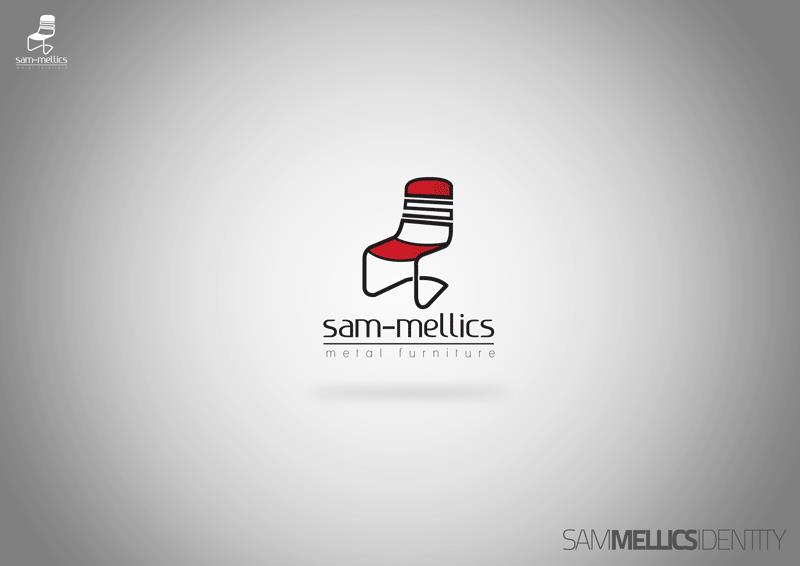
The mark is a chair, and it is drawn rather than modelled. Its backrest is a red panel crossed by three black slats; the seat is a second red plane meeting it at an angle; and the whole thing hangs from a single black line that drops from the back, kicks forward under the seat and loops back, so the frame describes the continuous bend a tube seat makes. Read at icon size the drawing still holds, which is why the same lockup is repeated small and flat at the top left of the sheet.
Beneath it the name is set as sam-mellics in a thin, low-contrast lowercase geometric sans, hyphenated, with a hairline ruled through the line and the tagline metal furniture below it in widely tracked grey letters. At the lower right the identity is written out as one logotype — SAM, MELLICS, IDENTITY — with the middle word weighted and the outer two held in light grey, so the name and the category can be set as a single lockup.
As an identity for a metal furniture maker the drawing does the work of the material: the tube frame and the flat planes are the product itself, and the palette is kept to black, one red and the grey ground. The project is on blogspot.