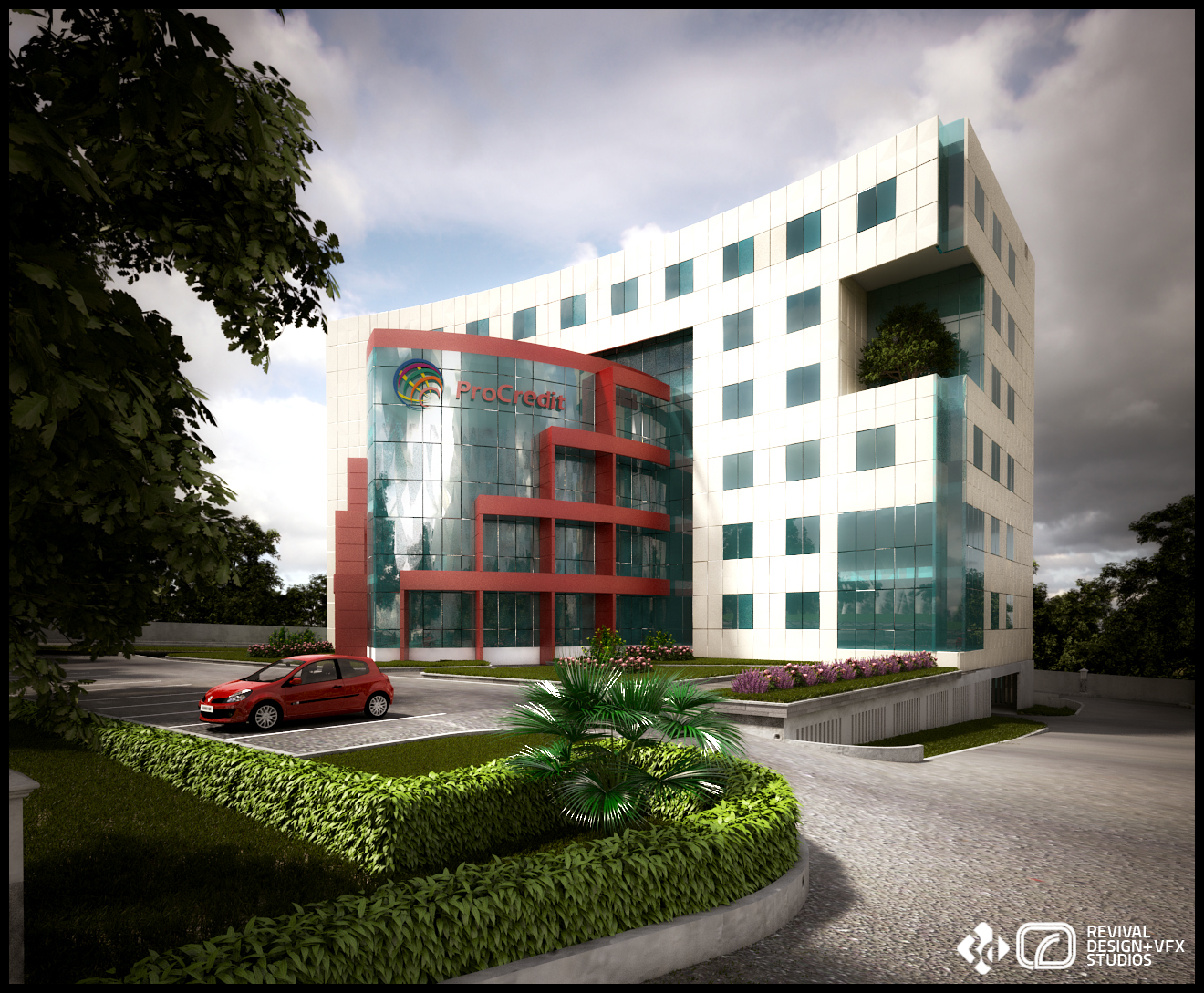
The studio’s post credits the architecture to Vista and the 3D visualization to R.D+V.S, and titles the work an office design competition. One plate survives, and it is a context view rather than an isolated massing study: the building is shown as it would meet the street, in soft overcast light.
The massing is a curved block. Its upper floors are read as a white panelled envelope punched with a regular grid of teal-tinted windows, the pattern breaking into taller glazed bays as the facade turns away. The composition is deliberately asymmetric, with the solid panelled volume held against a fully glazed entrance on the left.
That entrance does the branding. A two-storey curtain wall is framed by bold red horizontal fins and banding that stack across the bay, and the ProCredit mark — a circular multicolour emblem and wordmark — is applied to the glass directly above the entrance, so the corporate identity is carried by the structure rather than added to it.
A planted roof terrace is set into a cut-out at the top right, with a single tree reading against the sky, and the approach is landscaped to match: a paved driveway and parking court, clipped hedging, a palm and beds of pink planting, with mature trees framing the left of the view.
The project was published on the studio’s blog on 19 November 2012 as ROCREDIT OFFICE DESIGN COMPETITIION — 3D VISUALIZATION; the post is on blogspot. The original title drops the leading P from the name and mis-spells competition, both of which are corrected here against the signage in the render.