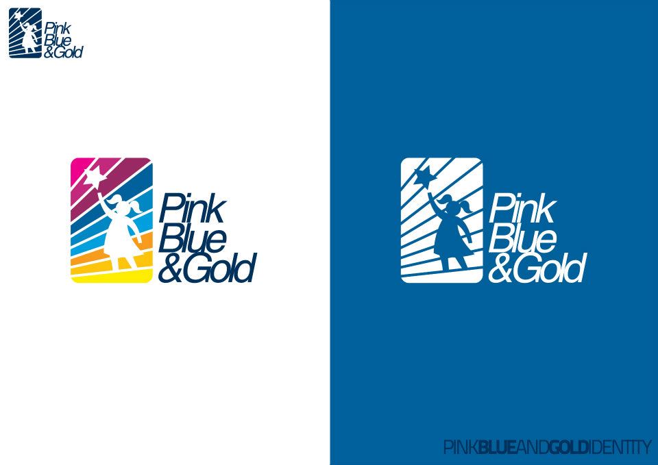
The studio published the board on 7 June 2012 as PINK BLUE & GOLD (NGO FOR KIDS) - GRAPHIC DESIGN and recorded only its toolchain — Photoshop and Illustrator — so the mark carries the brief. The three colours of the name are the whole system: they run as stripes behind the figure, and the figure is the message, a girl stretched up on tiptoe toward a star on a stick.
The badge is a square with rounded corners, cut by diagonal bands that climb from gold through blue into magenta, and the girl and her star are knocked out of it in white. Beside it the name stacks in three lines of a bold, slightly forward-leaning sans, each word on its own line, so the lockup reads as a column rather than a sentence.
The board presents the identity both ways it would be used: full colour on white for documents and signage, and reversed out of a solid blue field for banners and dark backgrounds, with a small single-colour version of the mark in the corner for the places that cannot carry the stripes.
The image is on blogspot.