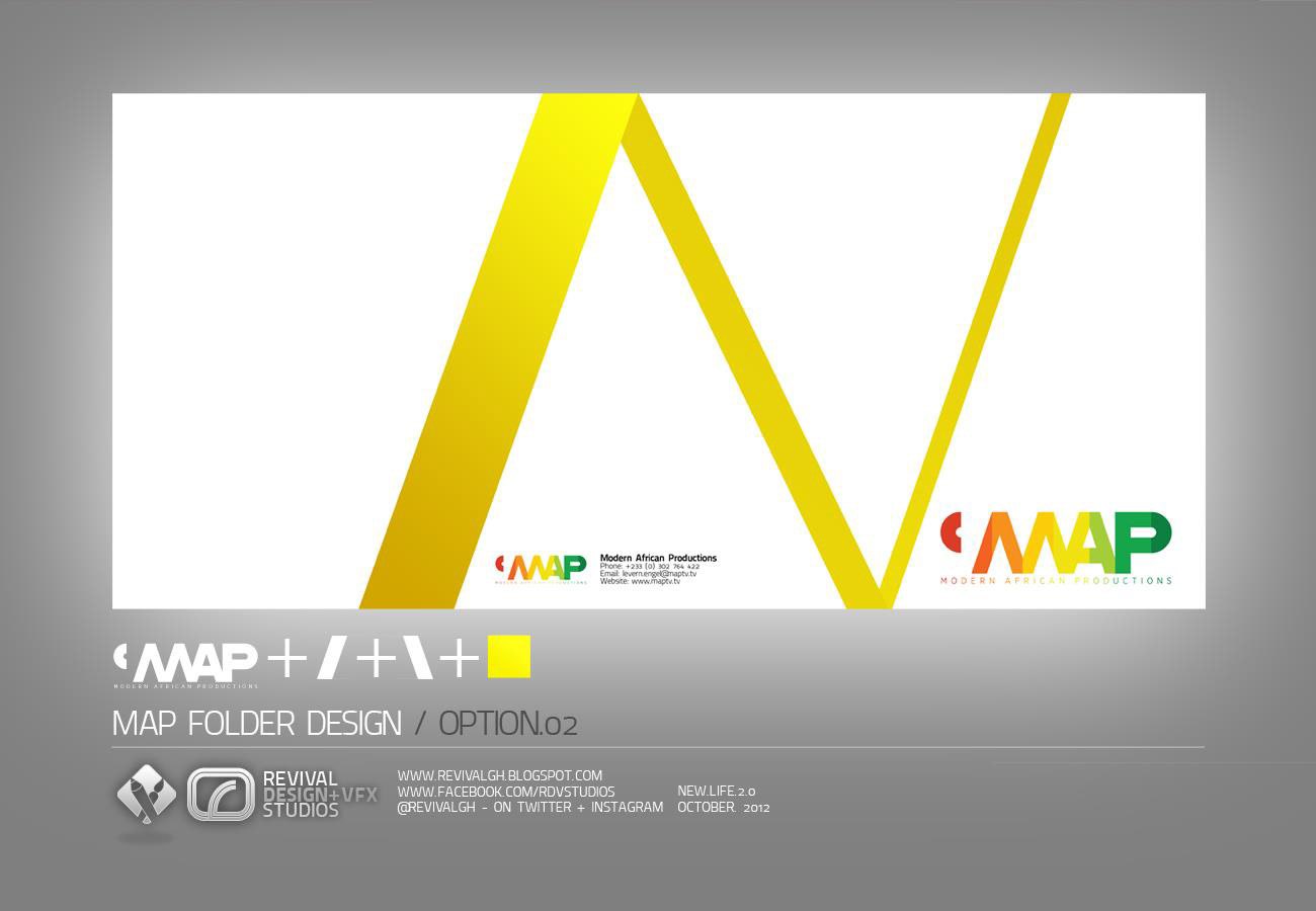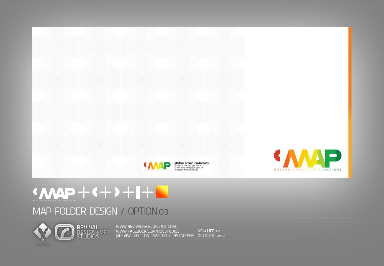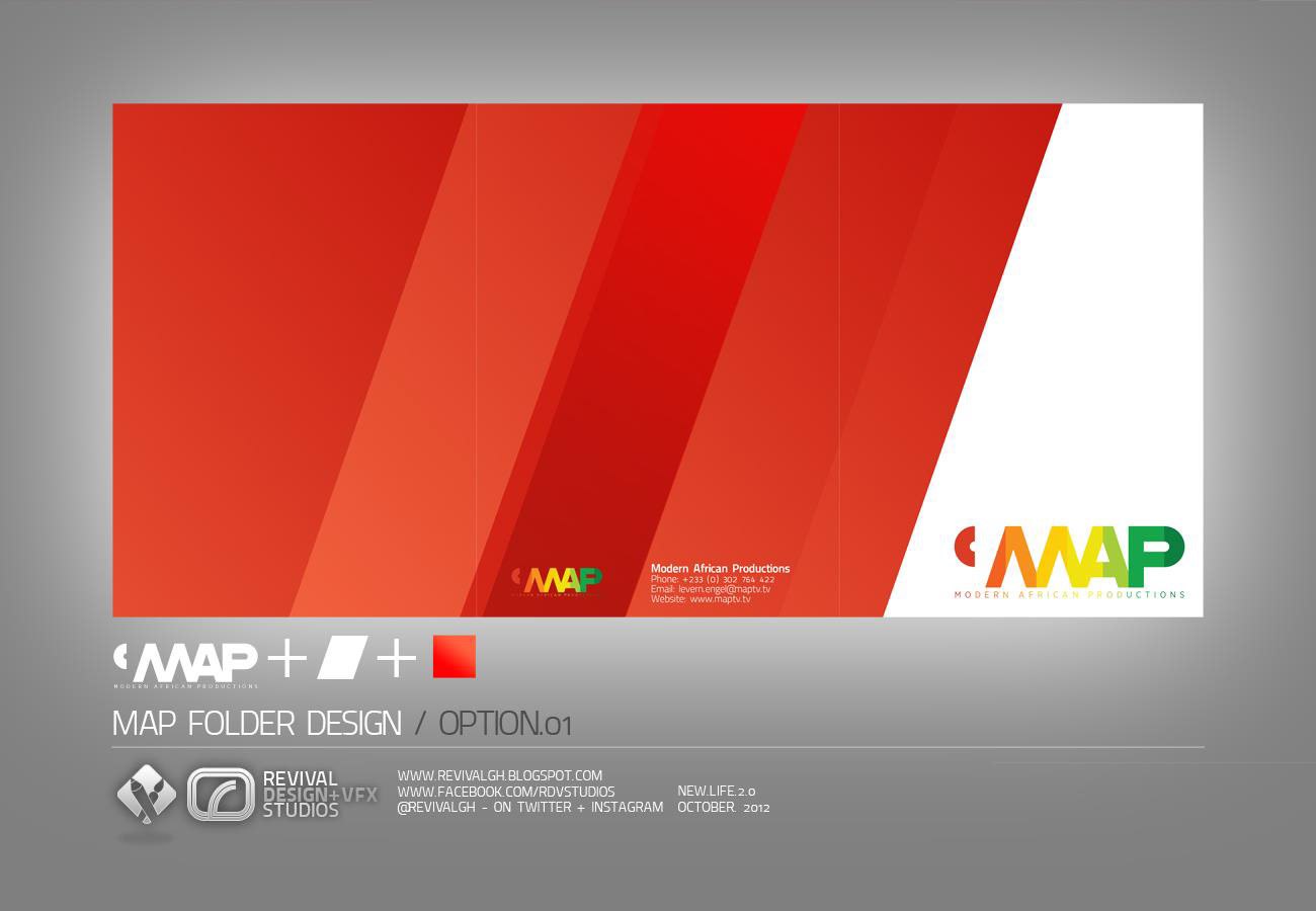
The brief was deliberately narrow: come up with a good-looking design for an A5 folder that would hold a number of inserts for MAP. No new identity was asked for, so the problem was editorial rather than conceptual, how far one existing mark could be pushed across a cover, a back panel and an inside spread.
The answer was to deconstruct the logo into its parts, the comma accent, the angled strokes of the letterforms, the vertical rule and the solid colour chip, and treat them as a small drawing system. Each option then states its own formula beneath the folder image, so the board reads as a working note.
Option one goes loud, flooding the back panel with diagonal bands that step from orange to deep red and leaving the cover white for the mark alone. Option two swaps that mass for a single oversized yellow chevron scaled until it runs off the edges. Option three is the quiet one, a near-invisible tonal check over white with a thin orange rule.
Three boards were delivered, laid out identically: folder spread across the top, logo formula and option number beneath it, and a small studio credit line with web addresses along the foot. Publishing them as a matching three-plate set lets the options be compared side by side on the same grey ground.
The project was published as MAP FOLDER DESIGN — RDVS. DESIGN; the full set is on Behance.