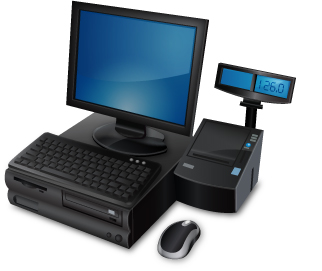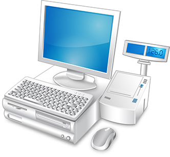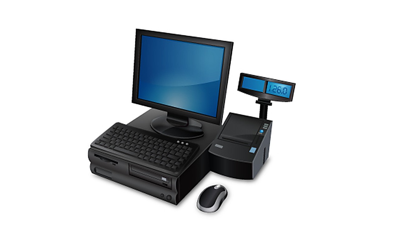
The image is a single machine broken back down into its parts. A flat-panel monitor on a round foot stands over a horizontal body whose sloped front carries a full keyboard, and a separate mouse sits in front of it. To the right is the receipt printer, a wedge-shaped box with a paper slot across its top, and rising from its back is a pole that carries a second, smaller display facing outward — the customer’s screen — split into a blank blue panel and a numeric readout set to 126.0.
Nothing in either plate is drawn in line. Each part is built from gradients and specular highlights: the black version keeps a bright rim along every edge and lets the bodies fall to near-black, the screens are a flat blue with one curved sheen across them, and each unit sits in a soft shadow on the white ground, so the group reads as objects standing on a surface although no surface is shown.
The two plates are that render in two finishes. In the second the plastic goes white and the trim silver, while the screens stay the same blue — the one constant between the versions, and what makes the pair read as one product rather than two separate drawings. The white plate is also framed a little tighter than the black one, bringing the printer and the customer display closer to the edge.
The identifying work is done by small parts rather than by any lettering: the seven-segment 126.0 on the customer display, three indicator lights at the corner of the keyboard deck, a single square blue button on the slope of the printer, and a slot and a recessed tray in the front of the body. Together they say till rather than computer. Neither plate carries a wordmark, so the icon stands on its own.
Both plates in the archive are barely wider than the icon would have been drawn at — 322 and 332 pixels across — which is a fair reminder of what this was for: something to be seen small, at the corner of a screen, rather than across a page.
Concept and design were by Kofi Tetteh, for client Dela Anyaa. Documentation was published to our Behance archive in January 2015. View the original project on Behance.