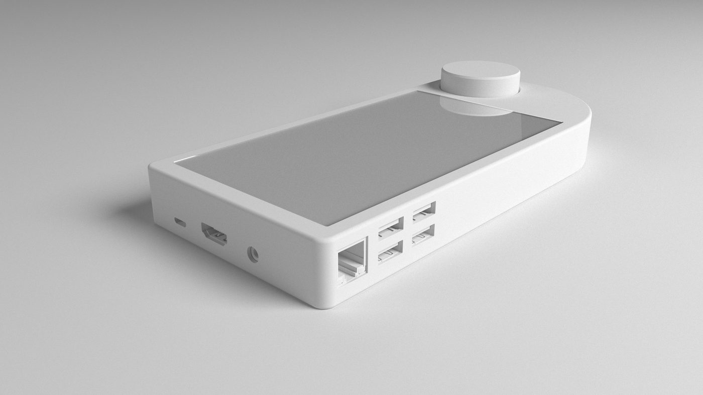
The work was taken on for Clearspace Ltd and invoiced in August 2017 under four headings: concept design, prototype, assembly drawings and packaging design. The brief was a household problem rather than a styling one. A house accumulates controls — a remote for the audio, a dimmer for each room, a keypad for the alarm — and none of them are designed for the people living with them. The research filed beside the renders puts faces to it: a resident who could never find the shared remote, and an architect-contractor whose clients ended up living inside somebody else’s control system.
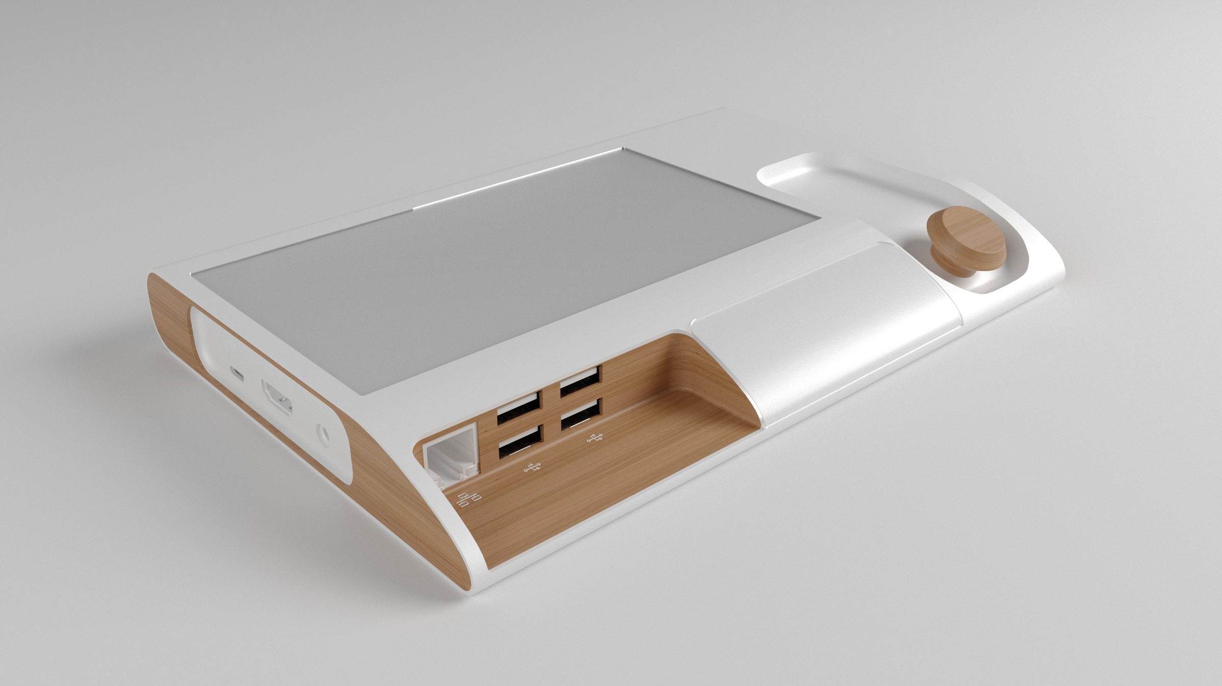
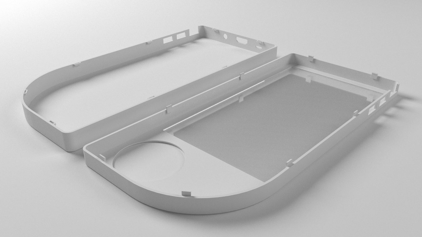
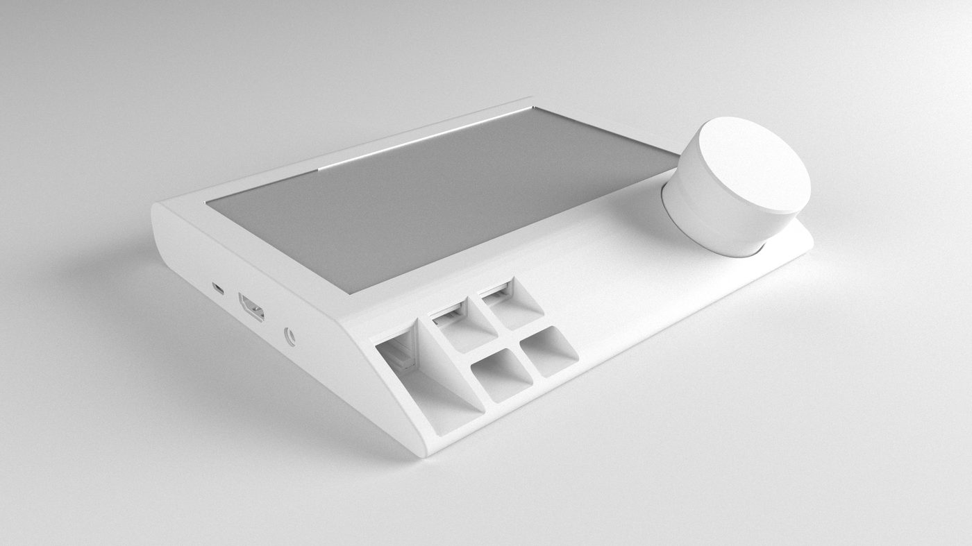
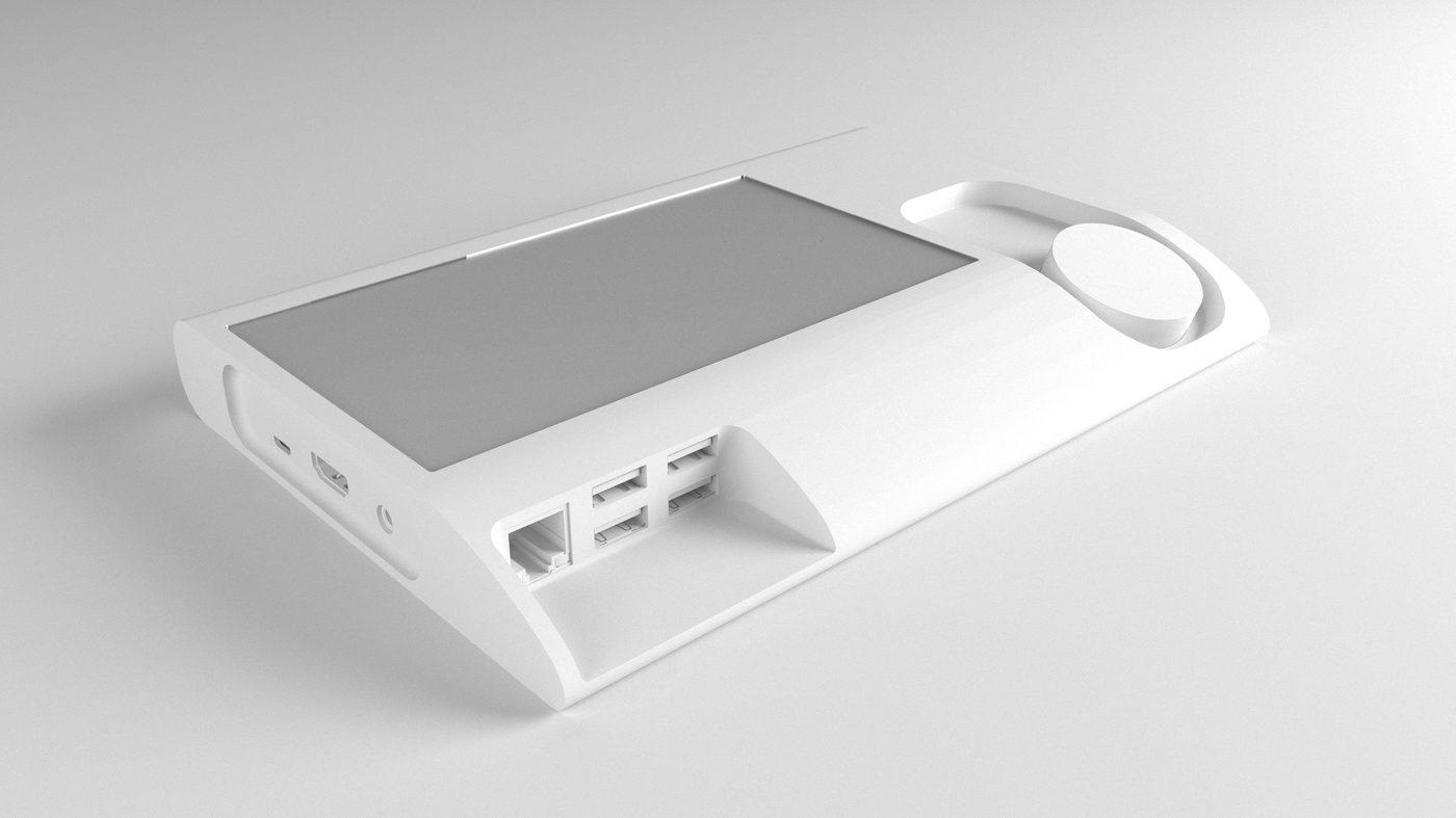
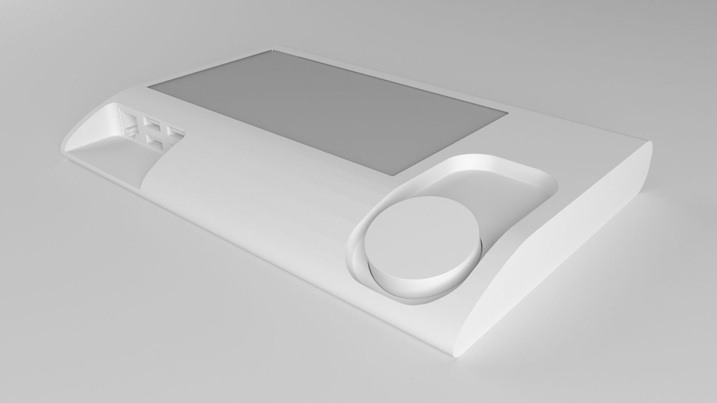
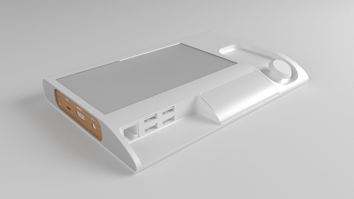
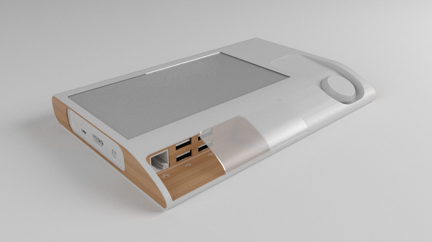
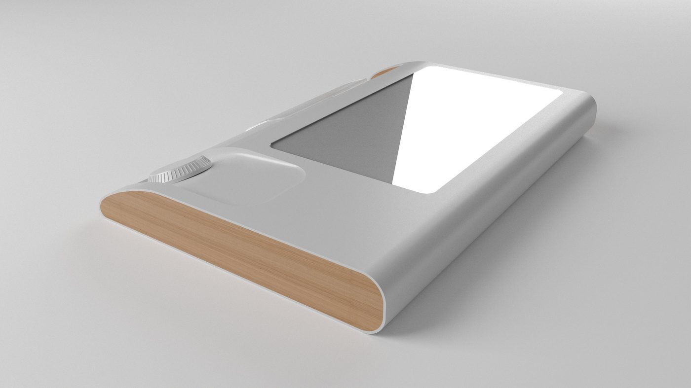
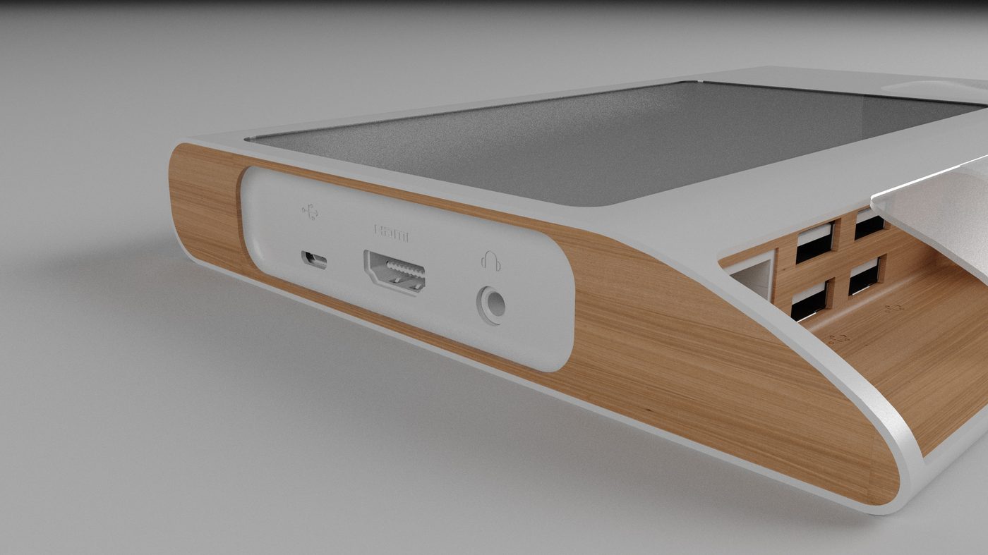
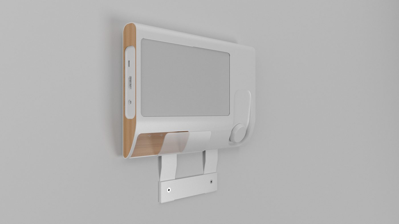
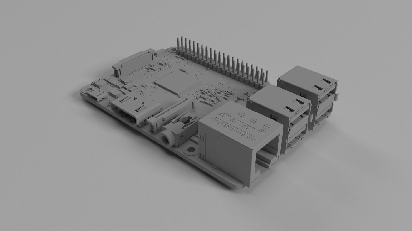
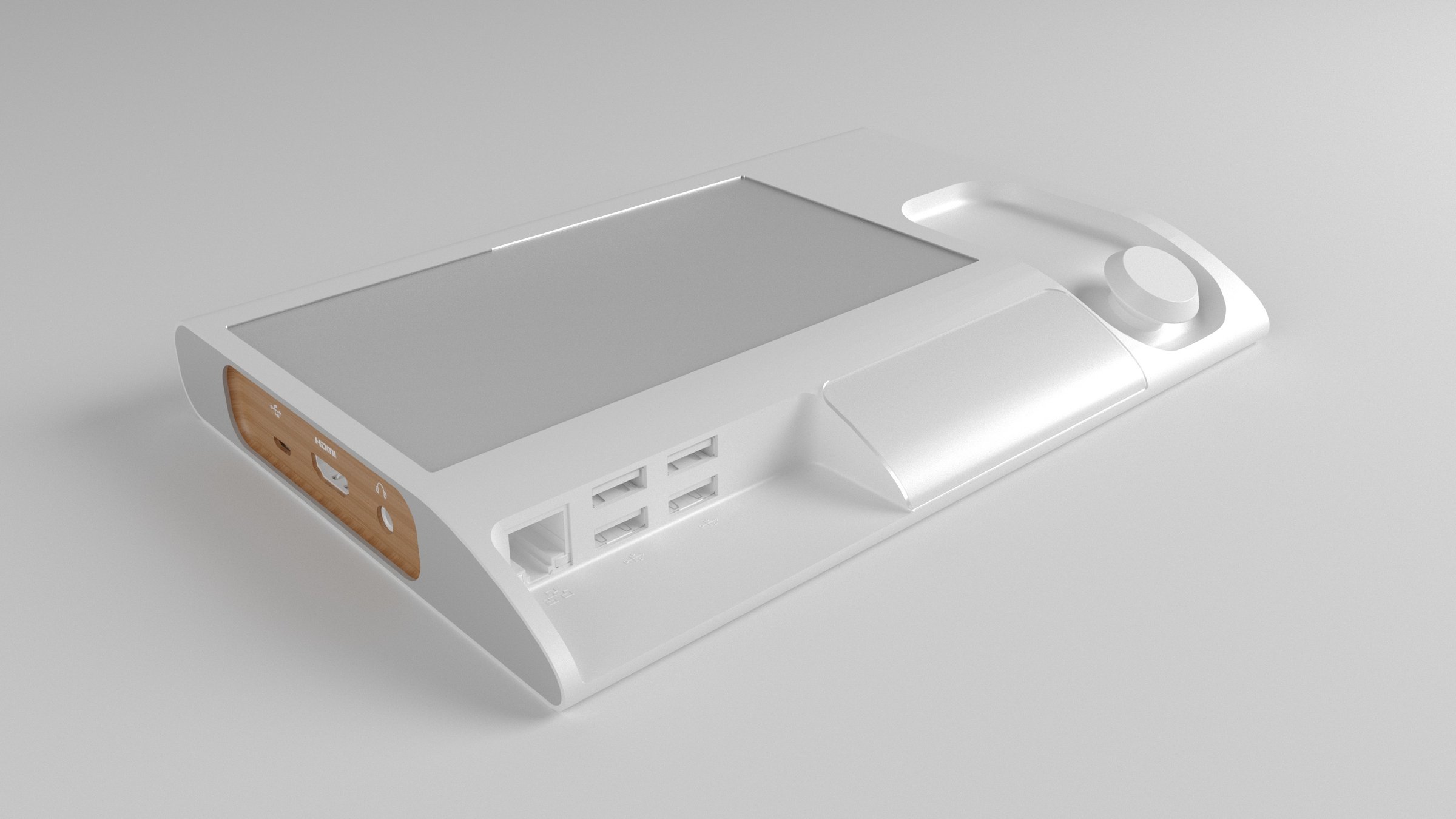
The panel is built around a single-board computer and a flat display, and the housing is designed outward from those two parts. The studies trace it in two directions at once. The shells are laid open first to place the screen aperture, the dial well and the snap-fit ribs along the rim; then the body is resolved as a wedge, so the screen faces the person standing in front of it rather than the person walking past. Oak carries the flanks, which is where the HDMI, micro-USB, audio and the USB bank are moulded out. The rest stays white.
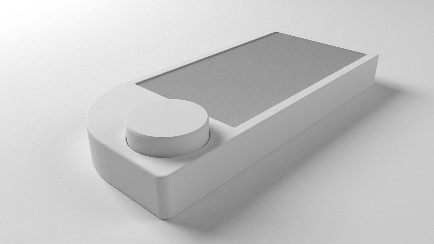
The rotary dial is the physical argument for the design. Almost everything on the screen is a value — brightness, volume, which scene is running — and a dial sets a value faster and more legibly than a row of buttons, with the lights down or a hand full of shopping. It is drawn as a separate part on a short captive cable, and the studies swing it from one corner of the panel to the other before it is seated.
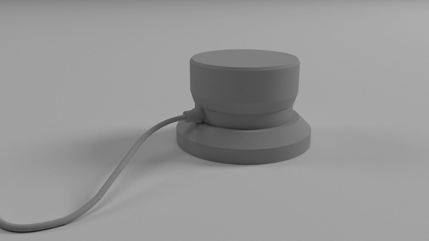
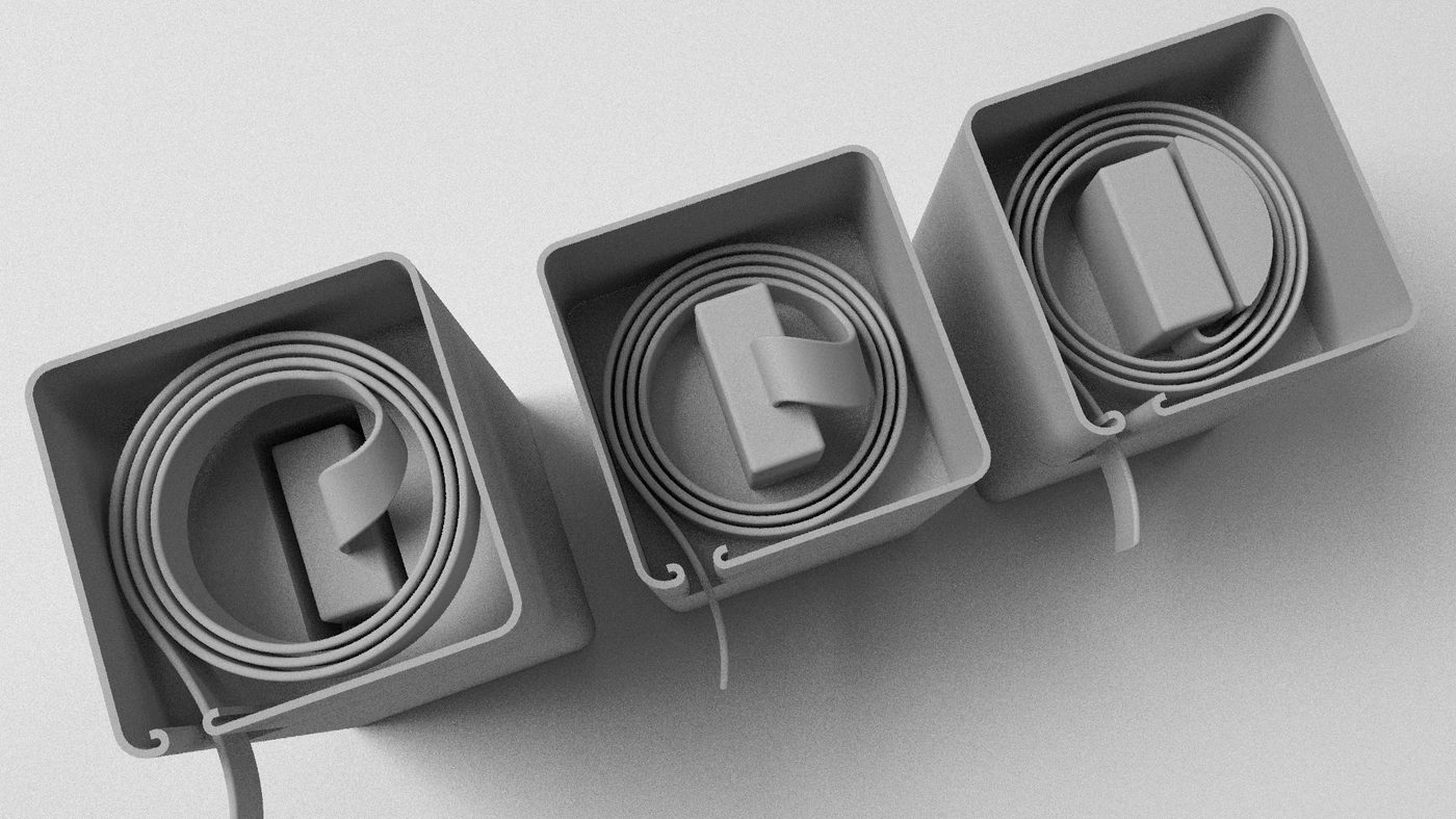
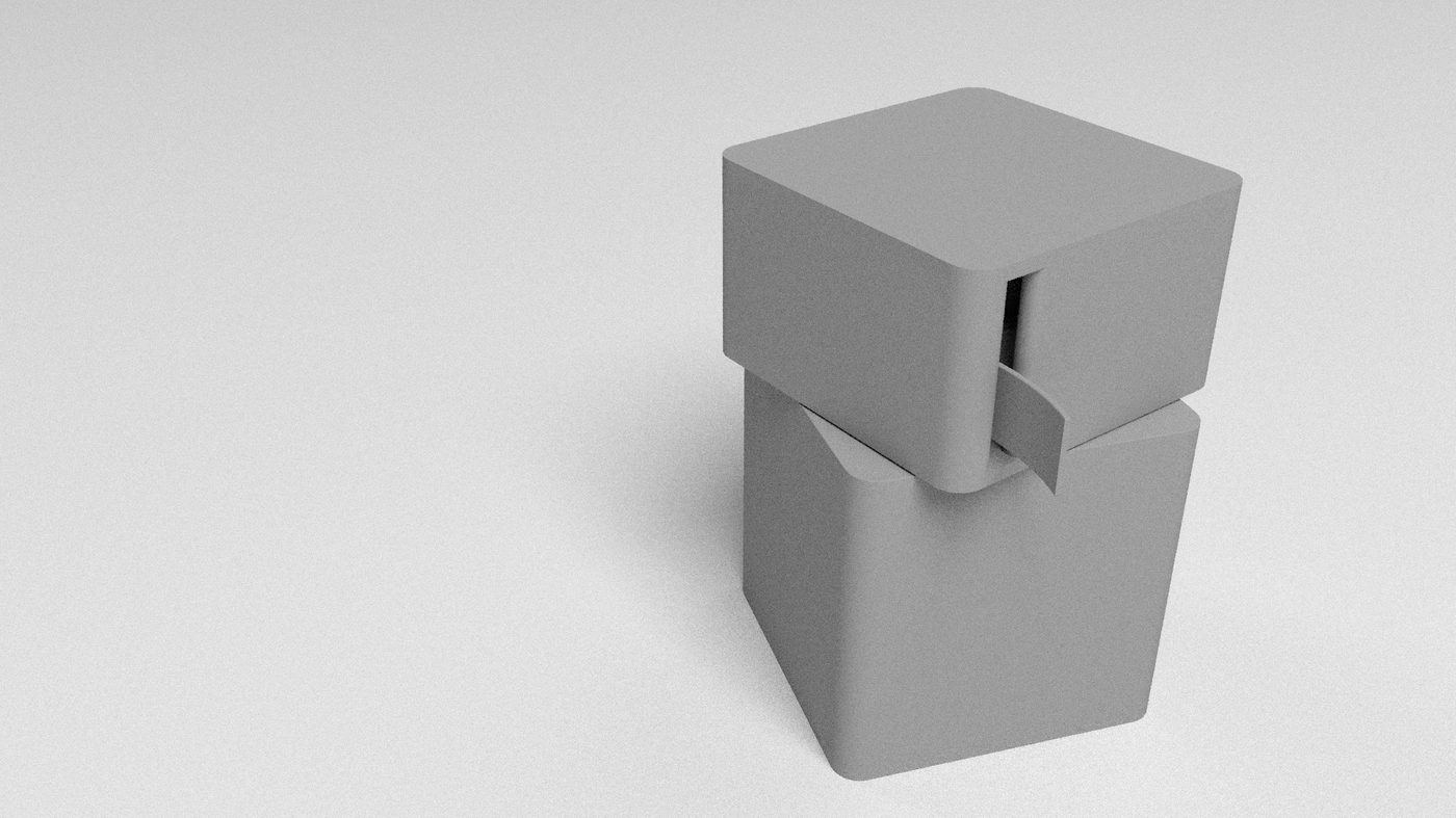
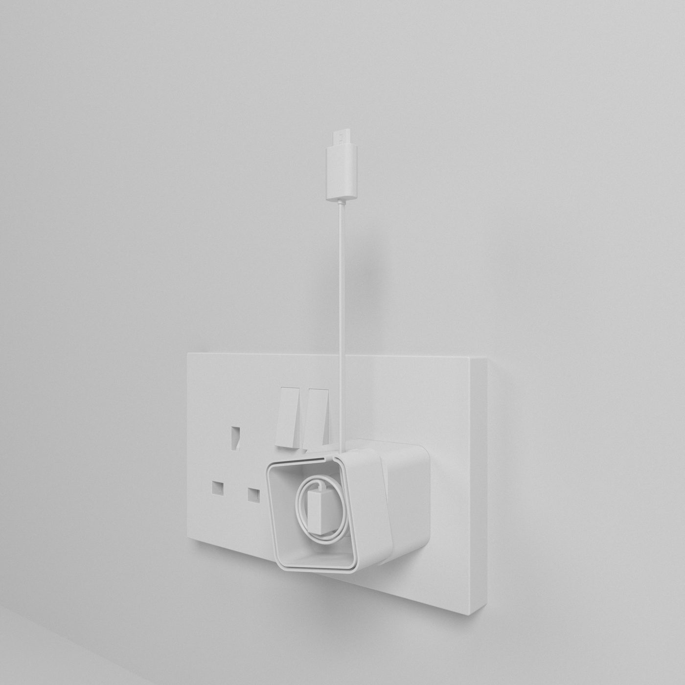
The charger gets the same attention as the panel — a two-part cube that stacks, with the cable tail fed out through the slit between the halves, and a square tray that winds a flat cable down to a neat coil for the shelf behind a television.
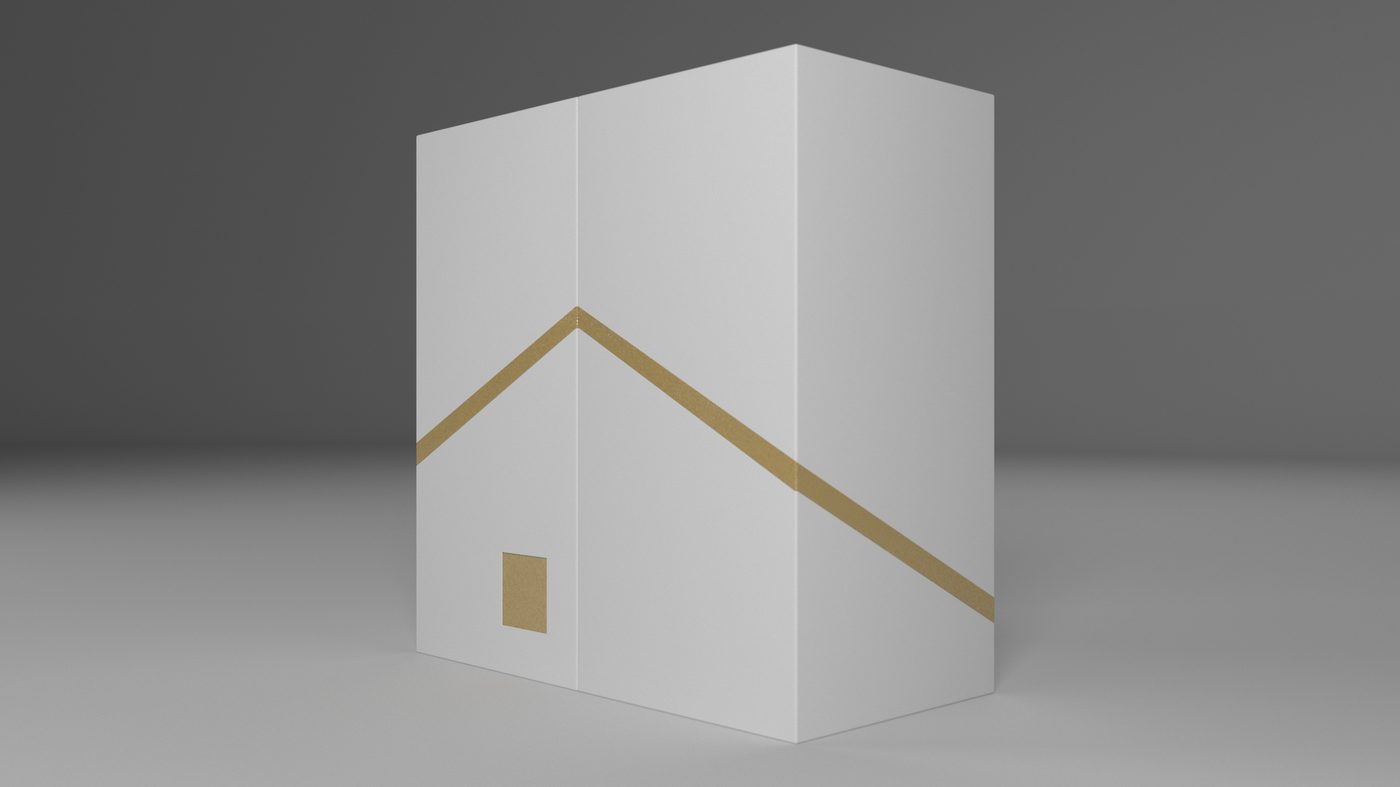
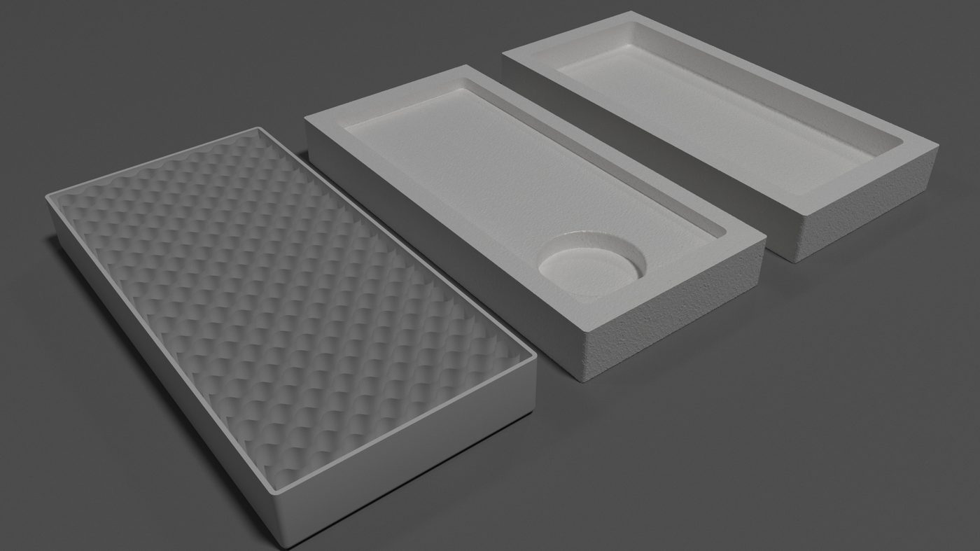
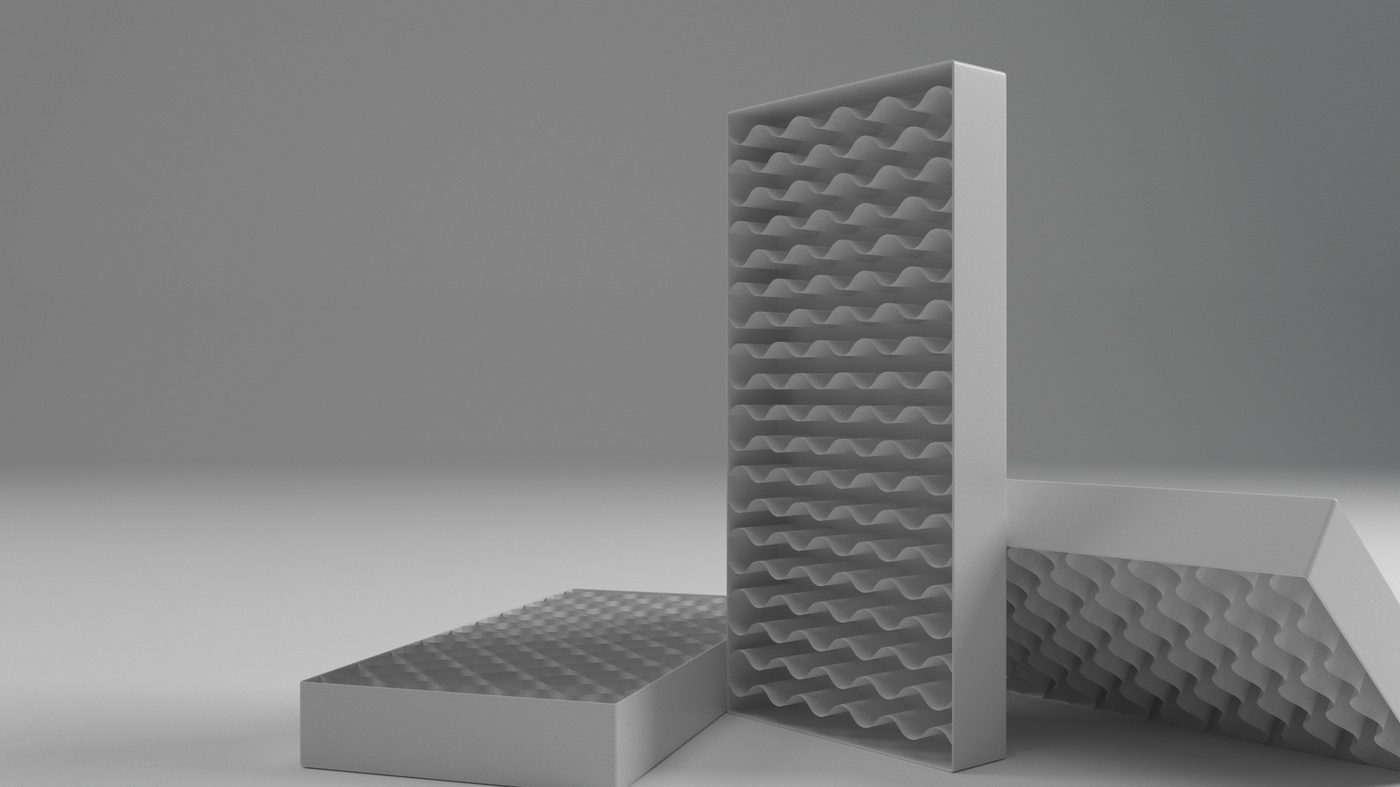
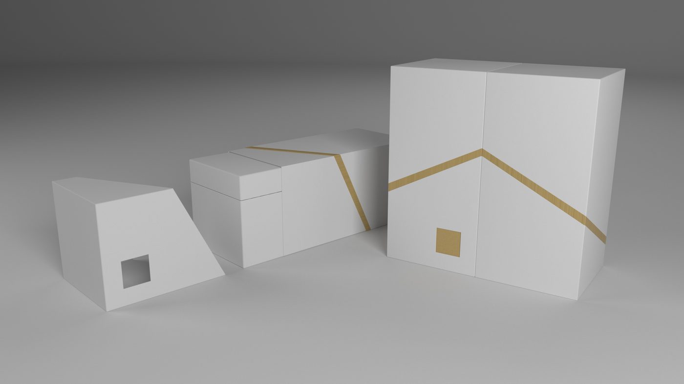
Packaging was in scope from the outset, which is unusual for a commission of this size and changes how the object arrives. The primary tray is a moulded cushion with a circular recess that takes the dial and a dimpled lid that holds it. The secondary carton carries the idea: two angular boxes that stand together to print a pitched roofline in gold across both, so the house only appears when the package is whole.
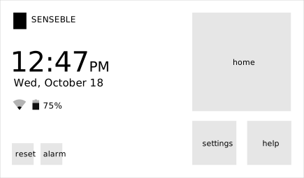
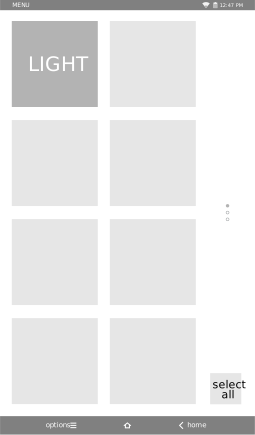
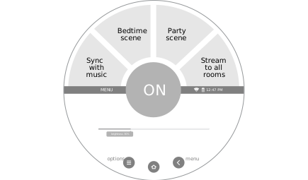
The interface was drawn at the panel’s own proportions. A landscape home screen carries the day, the battery and a row of home, reset, alarm, help and settings; a portrait menu lists the groups on the panel with a select-all; and the dial face for a single device reads brightness as a percentage and names the scenes plainly — sync with music, bedtime scene, party scene, stream to all rooms. The naming is part of the design. The panel speaks in the household’s language rather than the installer’s.
A concept, motif and colour board was put together between the invoice and the first renders, in September and October 2017, and the renders themselves run from October 2017 to January 2018. The project was never brought to market. It is shown here entirely from the studio’s own working files — the paperwork, the clay models, the packaging studies and the interface art — with no client photography and no published write-up behind it.