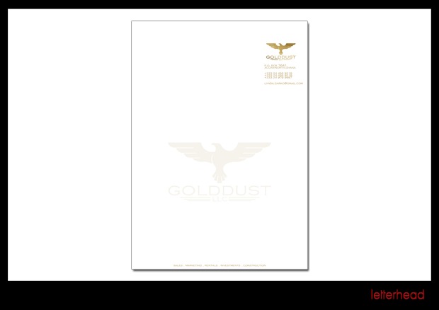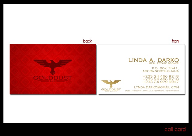
The studio’s own post lists the client as GOLDDUST, LINDA DARKO and the software used as Adobe Illustrator and Adobe Photoshop. Two pieces are shown: the calling card and the letterhead.
The mark is a spread-wing eagle set over the GOLDDUST name and an LLC line. On the card it is worked twice: struck in dark red across a back panel of tonal wax-print diamonds, and printed in gold on the white front, which carries the broker’s name and title, a P.O. box for Accranorth, three +233 numbers, an email address, and a services line — sales, marketing, rentals, investments, construction.
The letterhead keeps the sheet white and lets the lock-up carry the page: a small gold mark, wordmark and address block at the top right, the same group again as a pale watermark across the centre, and the services line along the foot.
The project was published on the studio’s blog in January 2011 as GOLD DUST IDENTITY | GRAPHIC DESIGN; the post is on blogspot.