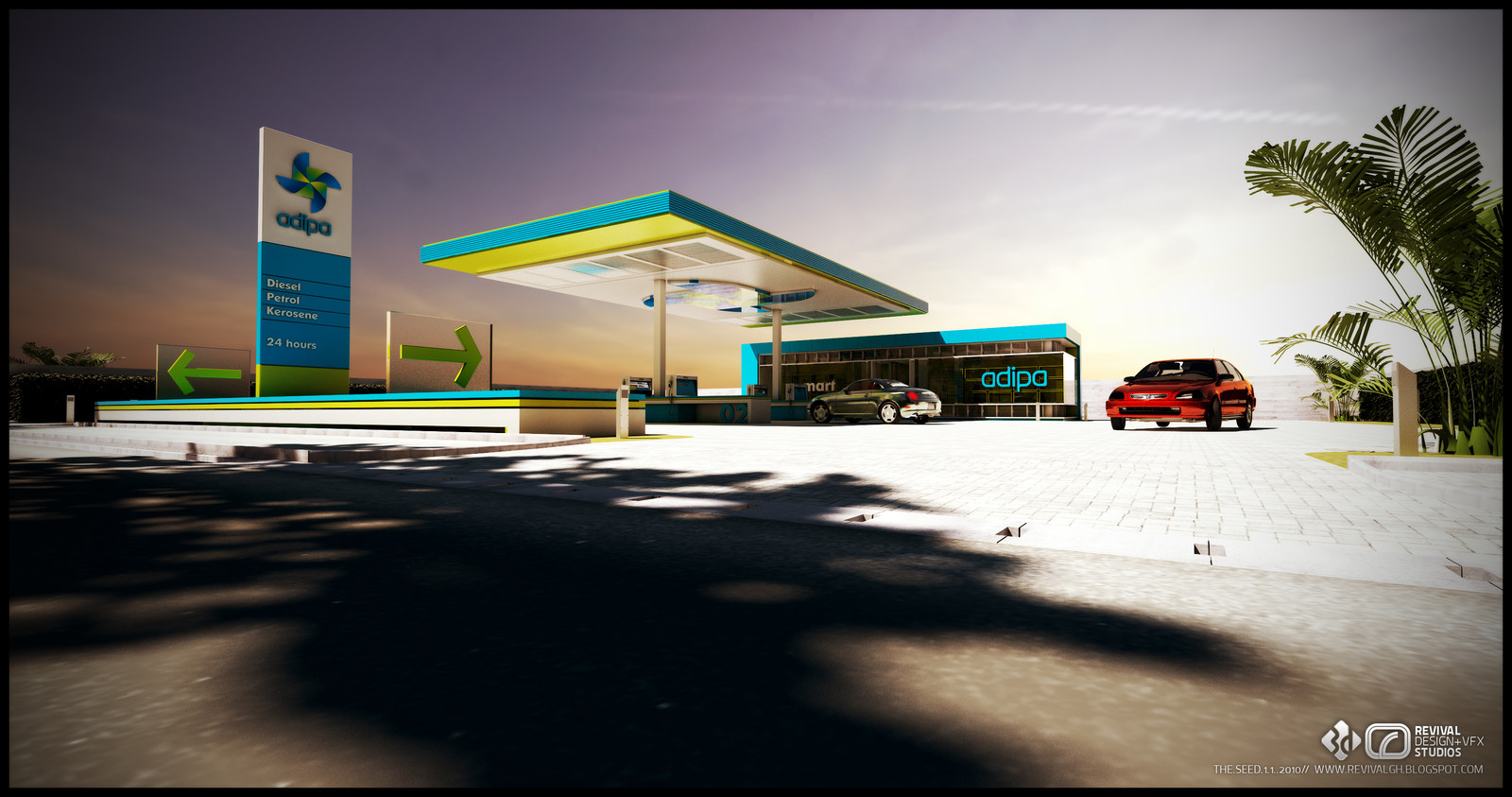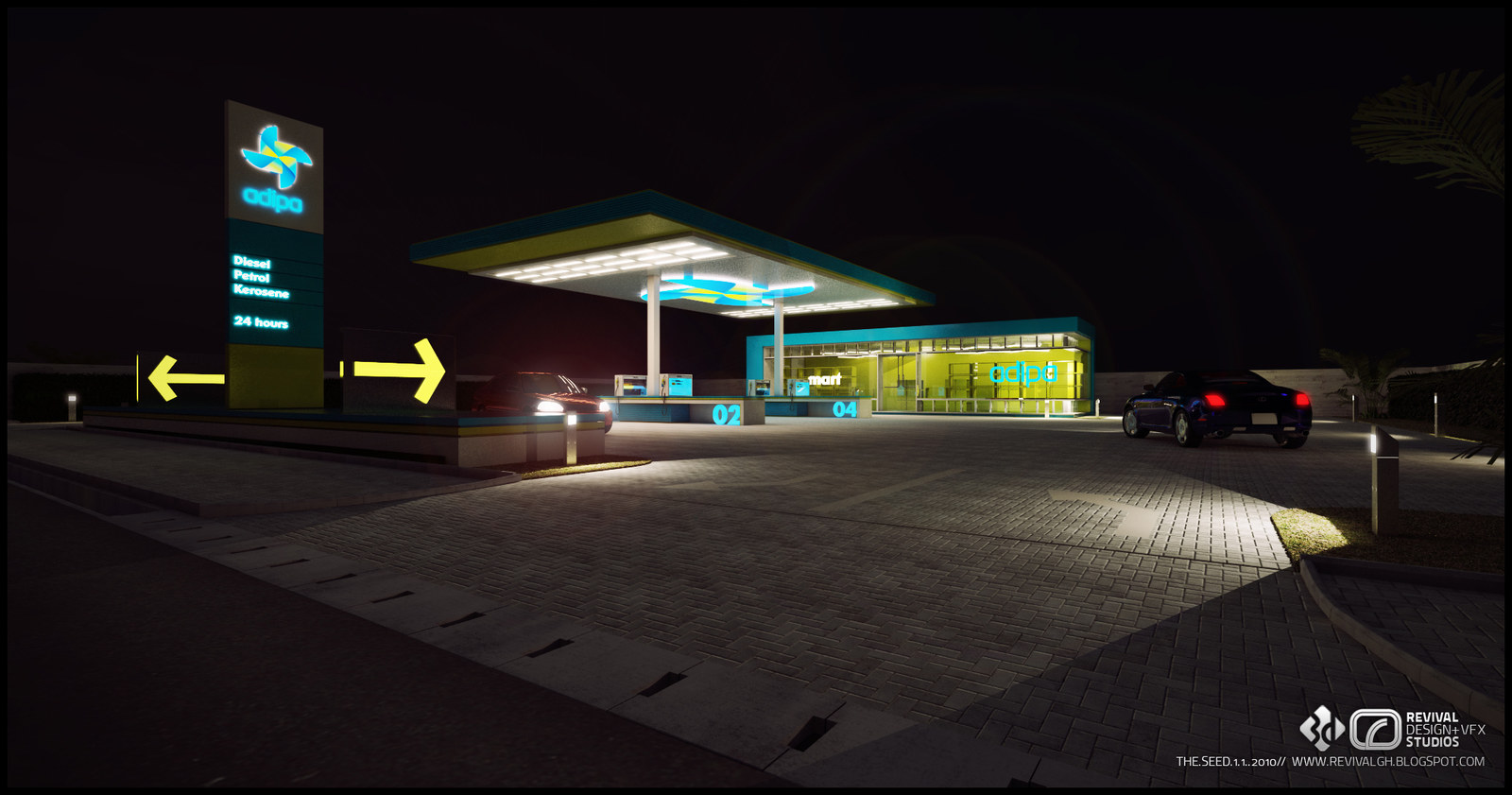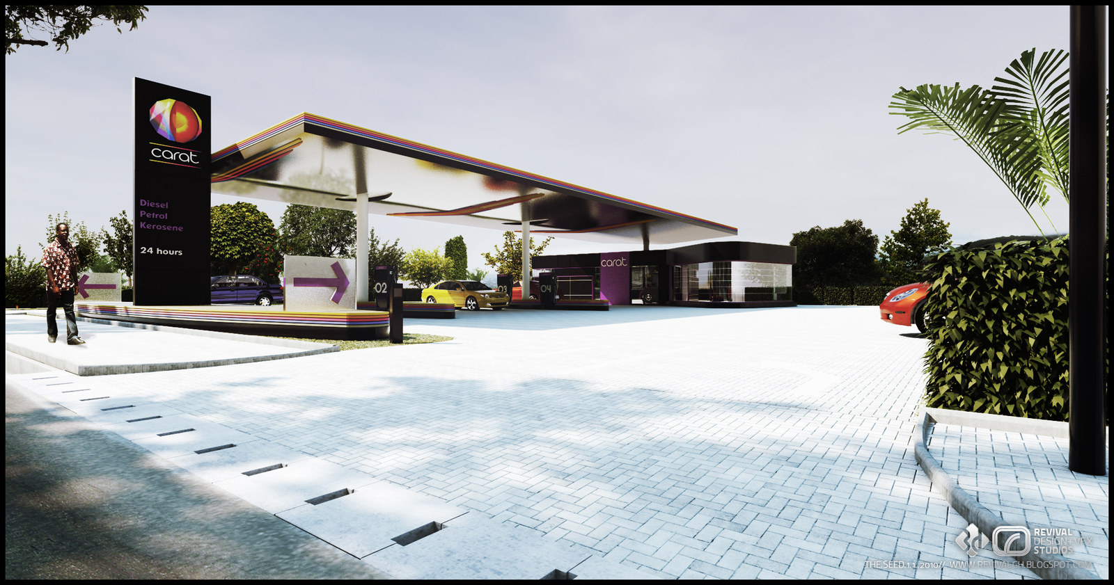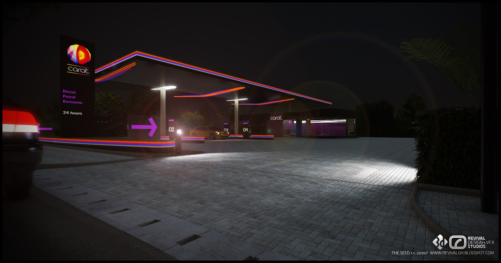
The studio published the set on 4 June 2012 as GOIL REBRANDING, headed GOIL RE-BRANDING COMPETITION — 2010 and signed with its THE SEED.1.1 series mark, which is burned into every frame with the date: THE.SEED.1.1..2010. The concept filling station design and the 3D visualization are RDVS’; the branding that the station identities were built around was done by Oxygen Ghana.
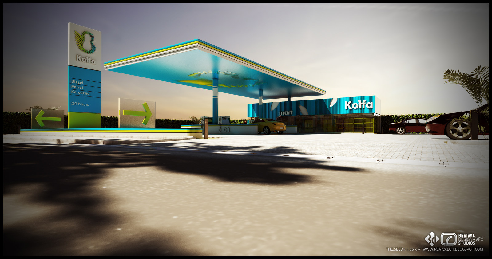
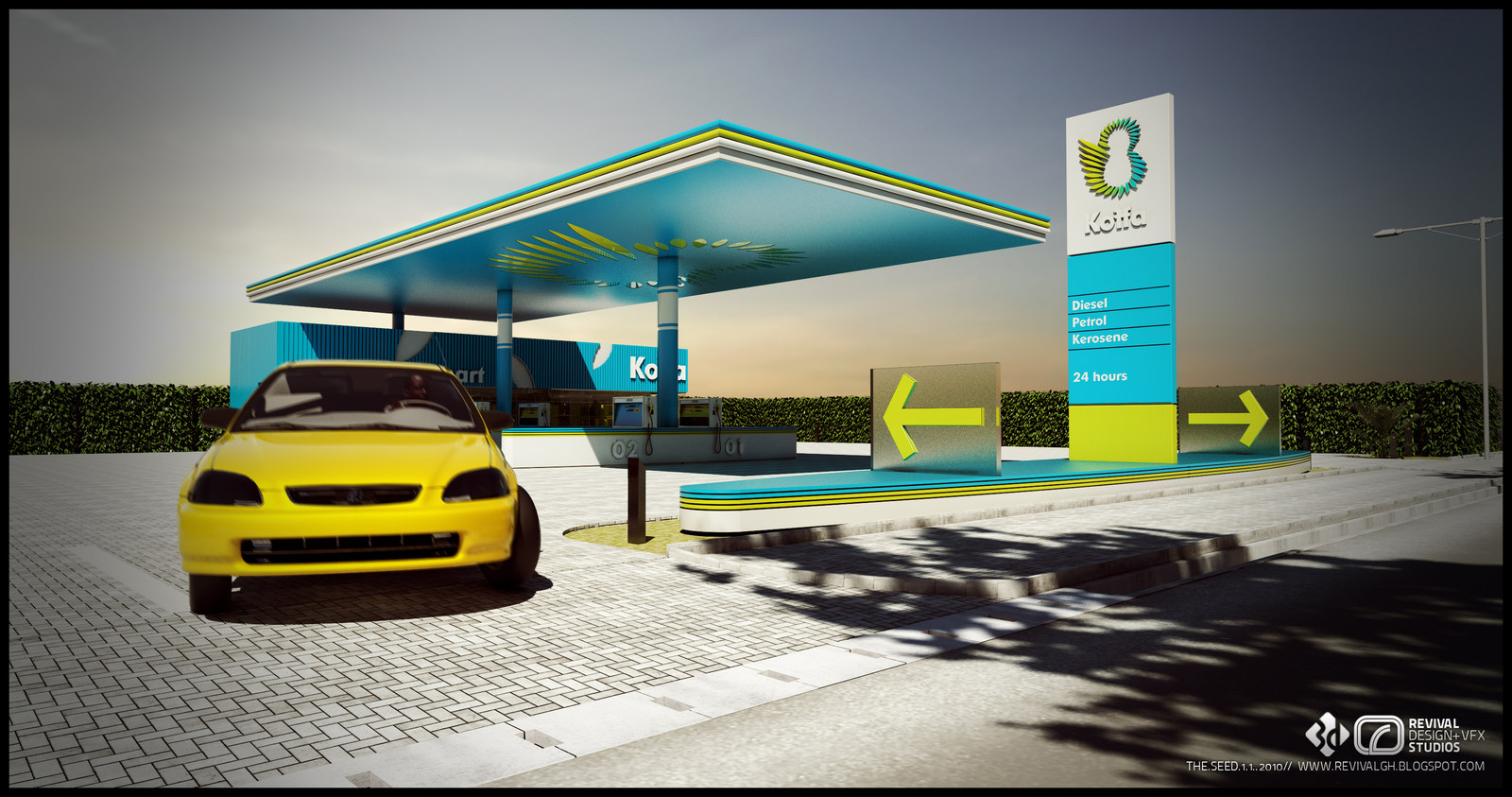
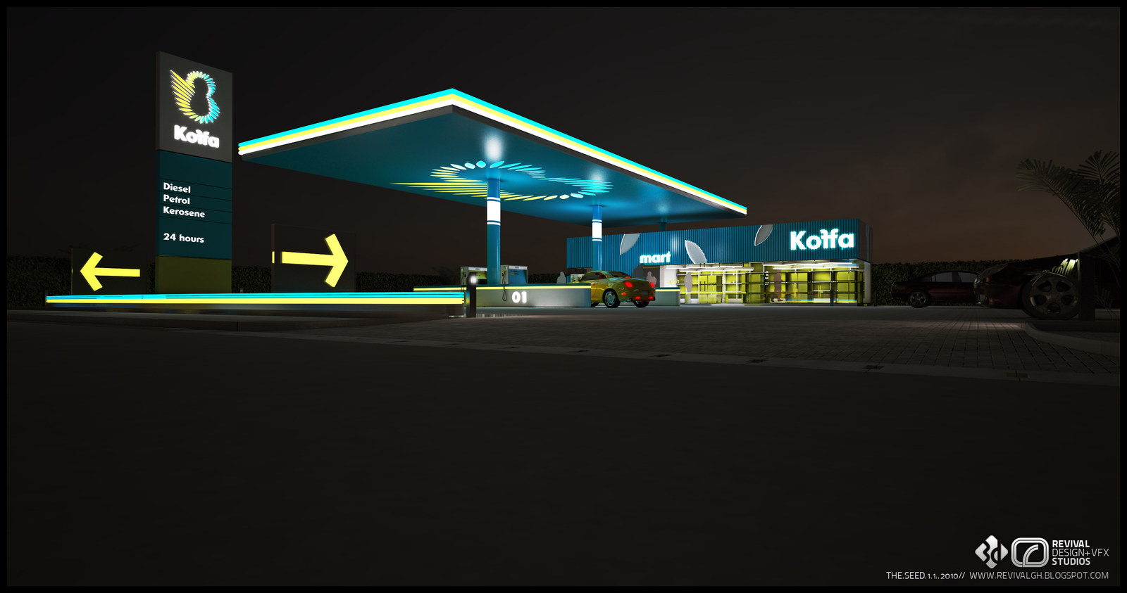
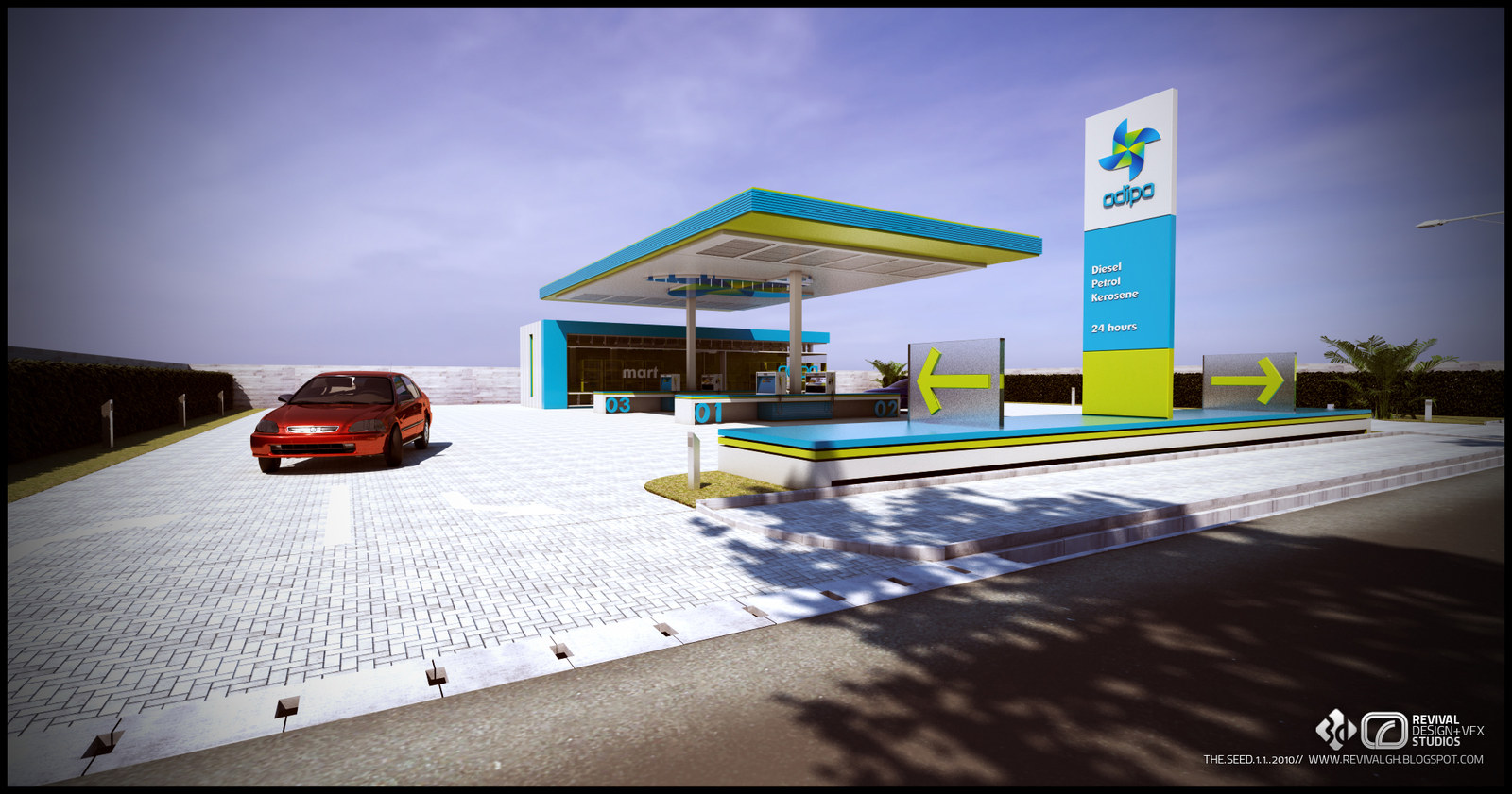
What was designed is the station as a whole system rather than a single look. Each route gets the same kit: a flat-roofed pump canopy on slim columns with the brand colours carried around its fascia and through the ceiling grid, a tall totem reading diesel, petrol and kerosene above a 24-hours line, coloured directional arrows across the forecourt, numbered pump islands, and a glass-fronted mart kiosk at the edge of the canopy. The three routes are named in the studio’s own filenames as adipa, carat and koffa — adipa in teal and lime-yellow, carat in magenta and violet against a dark totem, koffa in teal with a green leaf mark and yellow-green trim.
Each is shown twice or three times over, in daylight and at night, because the pitch turns on the night reading: the canopy underside becomes the principal light source and the arrows and totem the only colour left on the street. Eight plates are kept here from the original post, which is on blogspot.