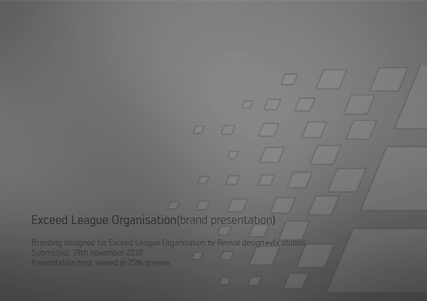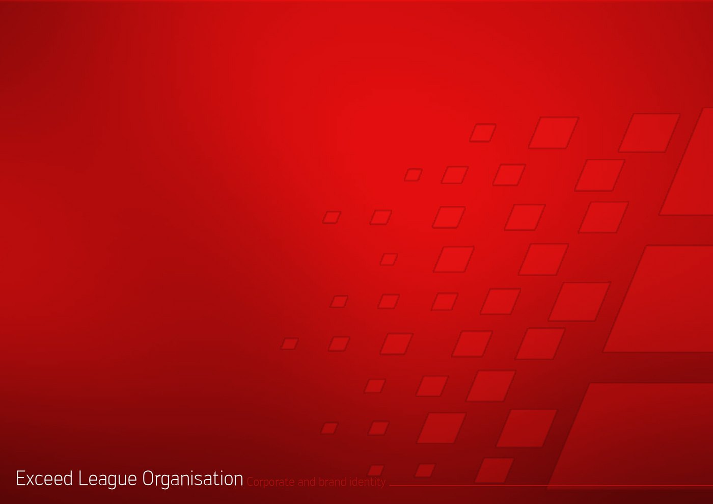
Exceed League Organisation needed a complete identity rather than a single logo, and RDVS. Design presented the work as a branded deck. It opens with two cover plates, one grey and one red, that introduce a pixel-grid motif of dissolving squares; that pattern becomes the connective tissue running through the logotype, the stationery and the desktop wallpaper.
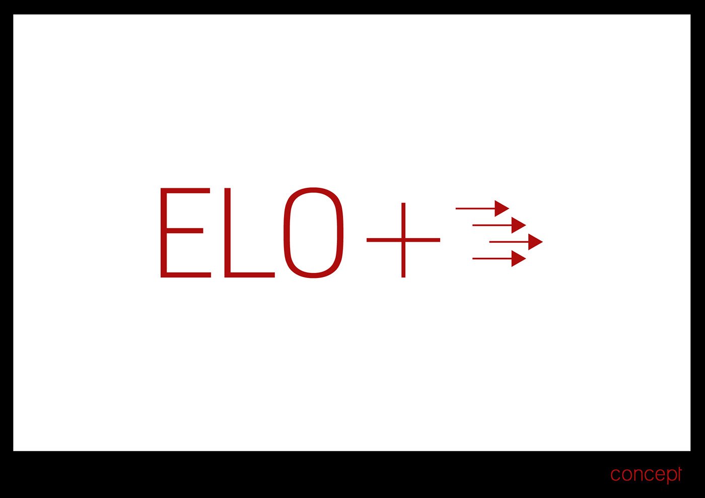
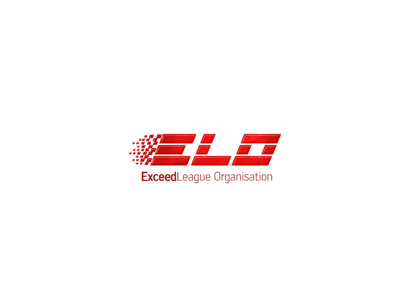
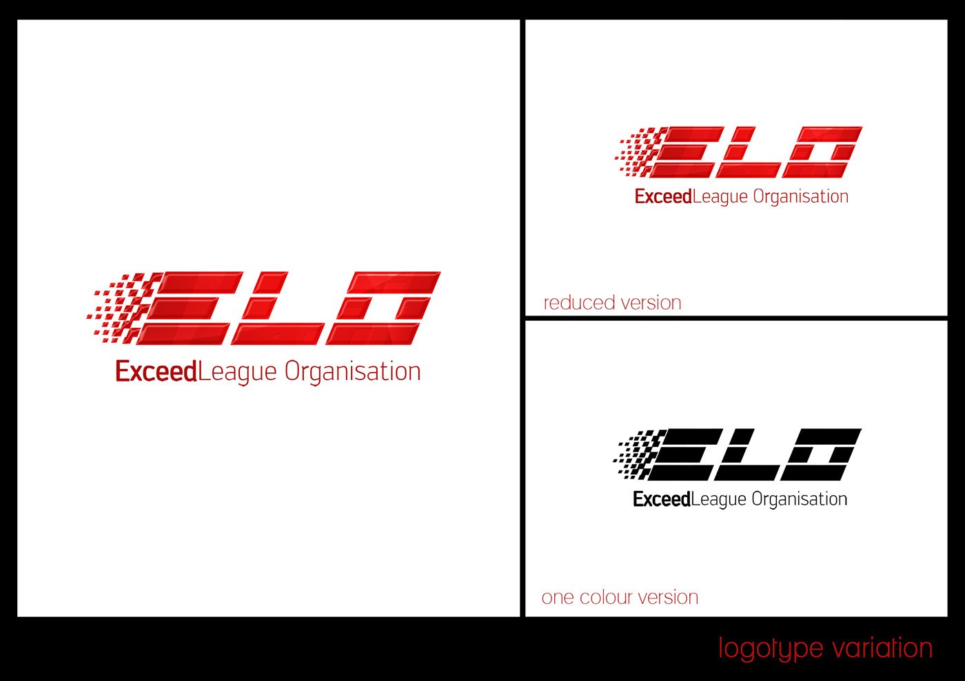
The wordmark sets ELO in a wide, slabbed italic built from the same blocky geometry, fronted by a cluster of squares that reads as motion or a starting grid. A concept plate reduces the idea to ELO plus a cross and three arrows before the lockups appear, and separate plates show the reduced logotype, a single-colour black version and a reversed white mark on black.
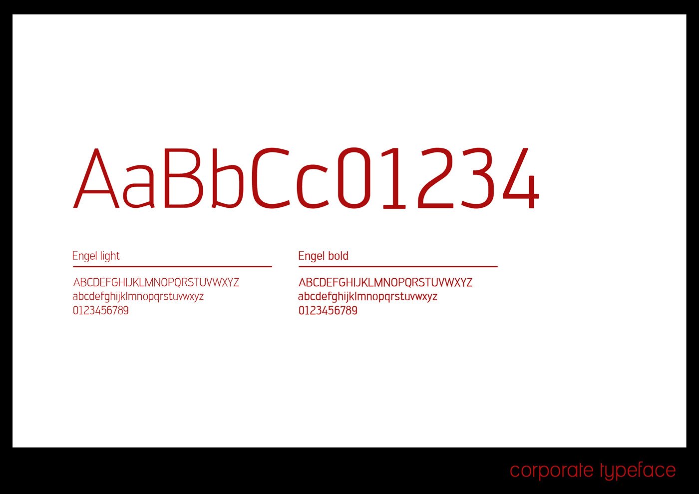
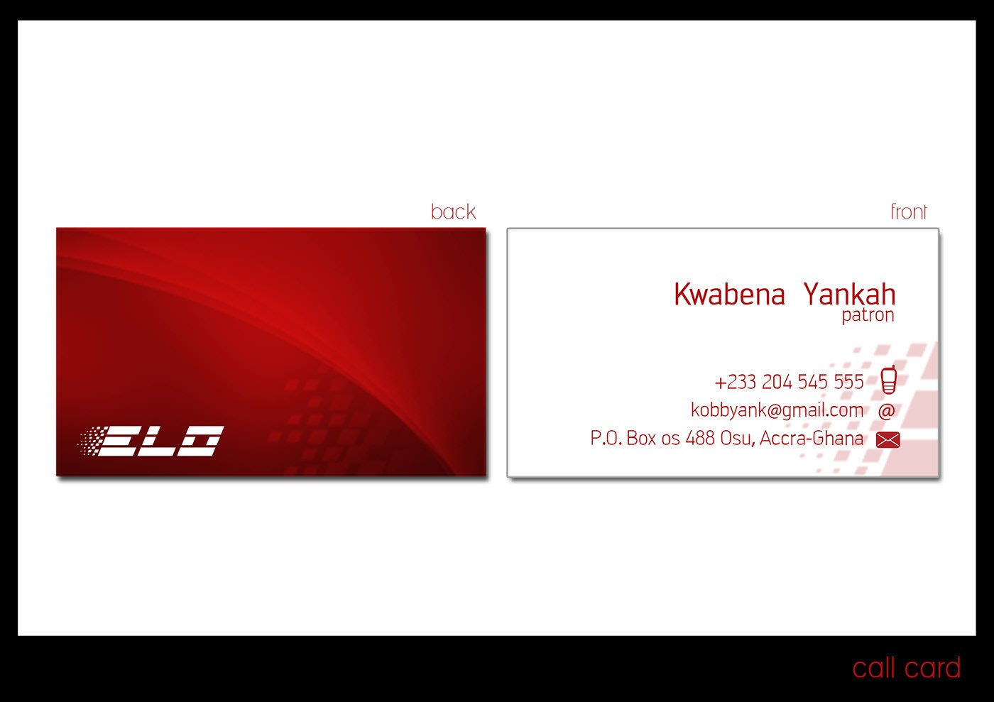
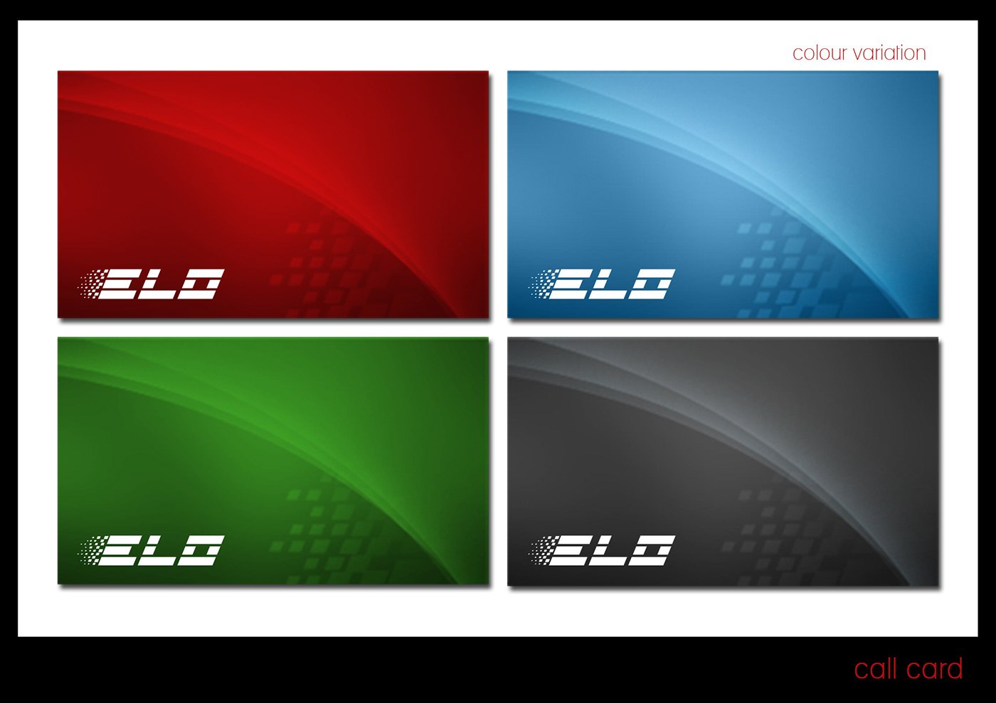
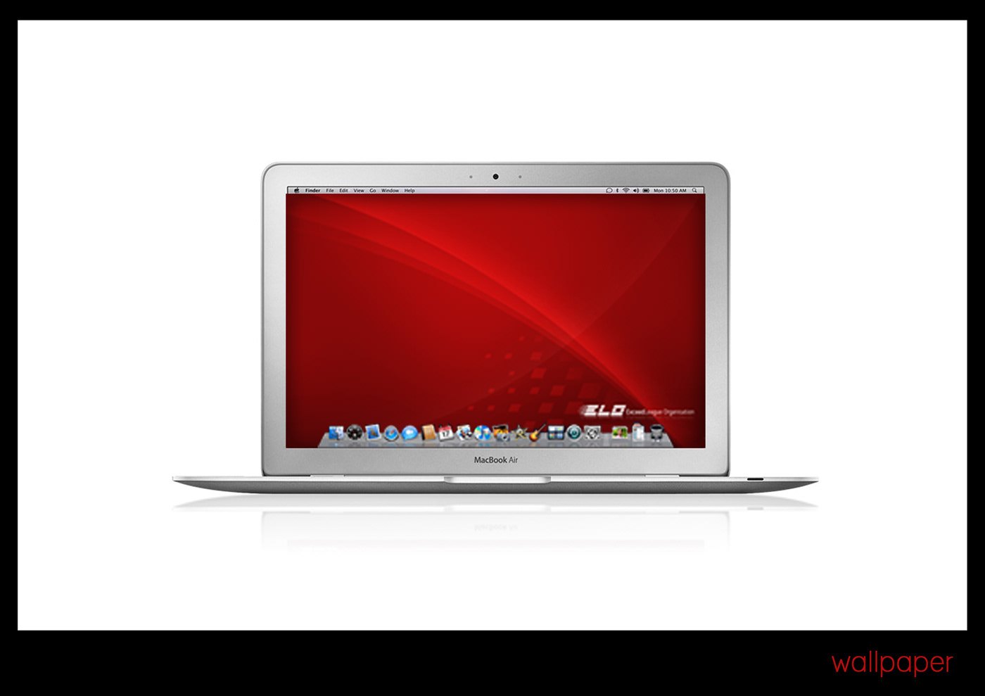
Red does the heavy lifting: a saturated gradient with the pixel pattern fading through it, used on the covers, the reverse of the business card and the desktop wallpaper. Engel light and Engel bold form the type system, specified on its own plate with alphabets and numerals. Later plates widen the palette with blue, green and grey card variants, and the card carries an Accra postal address.
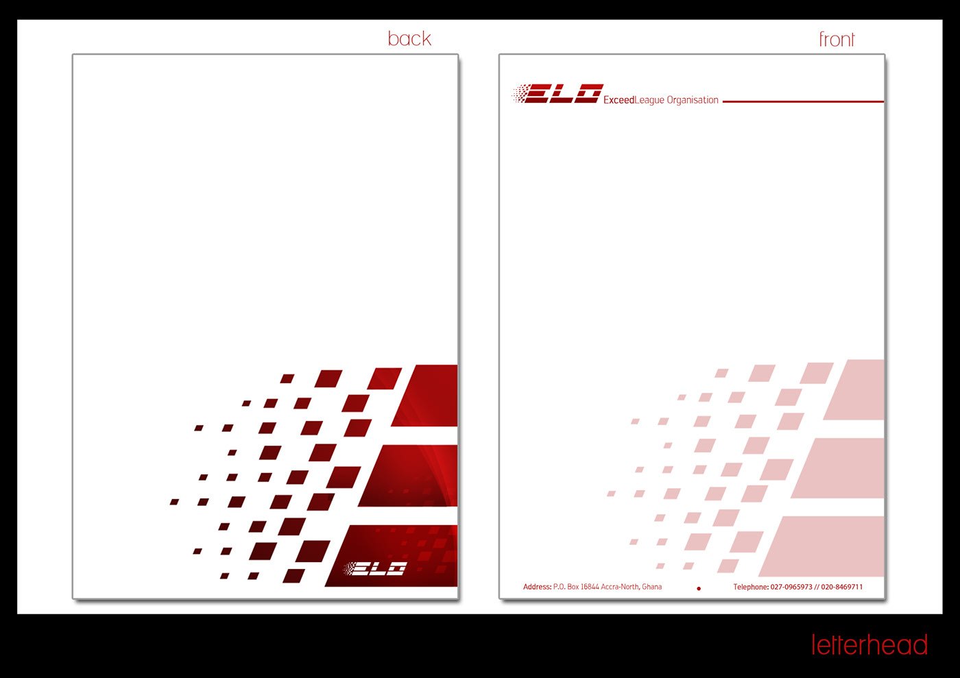
The deliverable is a standard corporate kit: primary and secondary lockups, a colour variant sheet, business card, letterhead with a red top band, and a laptop mockup that puts the wallpaper in context. Every plate is captioned in the same corner style, so the eleven deck plates read as one guideline spread rather than as loose artwork handed over in pieces.
The commission predates the gallery’s online date by five years. The deck’s own title plate reads “Branding designed for Exceed League Organisation by Revival design+vfx studios / Submitted: 19th november 2010 / Presentation best viewed in 75% preview”, and the studio had already posted logotype work for this client on its blog on 26 October 2010, three weeks earlier. The 2015 this listing used to carry is the year the set was uploaded to Behance, not the year the identity was designed.
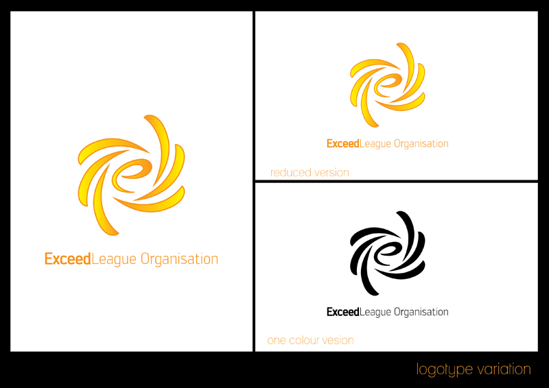
Those two blog sheets show the logotype in orange and gold rather than the deck’s red, and they set out two directions: the pixel-cluster ELO that was carried forward, and a swirling lower-case e built from curved blades, which was not. Both use the same large-mark, reduced-version and one-colour panel layout the finished deck keeps, and both carry the studio’s own typo in the caption, “one colour vesion”, which the deck corrects. The rejected swirl emblem is plated here as the twelfth image, because the blog is the only place it survives. The orange pixel sheet is not, because the deck’s red plate is the same composition at 1400 pixels wide instead of 800 and with the caption fixed.
The project was published as ELO — IDENTITY — RDVS. DESIGN; the full set is on Behance, and the two October 2010 logotype sheets are EXCEED LEAGUE ORGANISATION | GRAPHIC DESIGN , IDENTITY on the studio’s blog.