The studio published the job as E-ZONE - GRAPHIC DESIGN , IDENTITY on 28 October 2012. The sheet itself carries no client line; it is signed REVIVAL DESIGN & VFX STUDIOS with the note NEWLIFE 2.0 / AUGUST, 2012 and the blog address beneath.
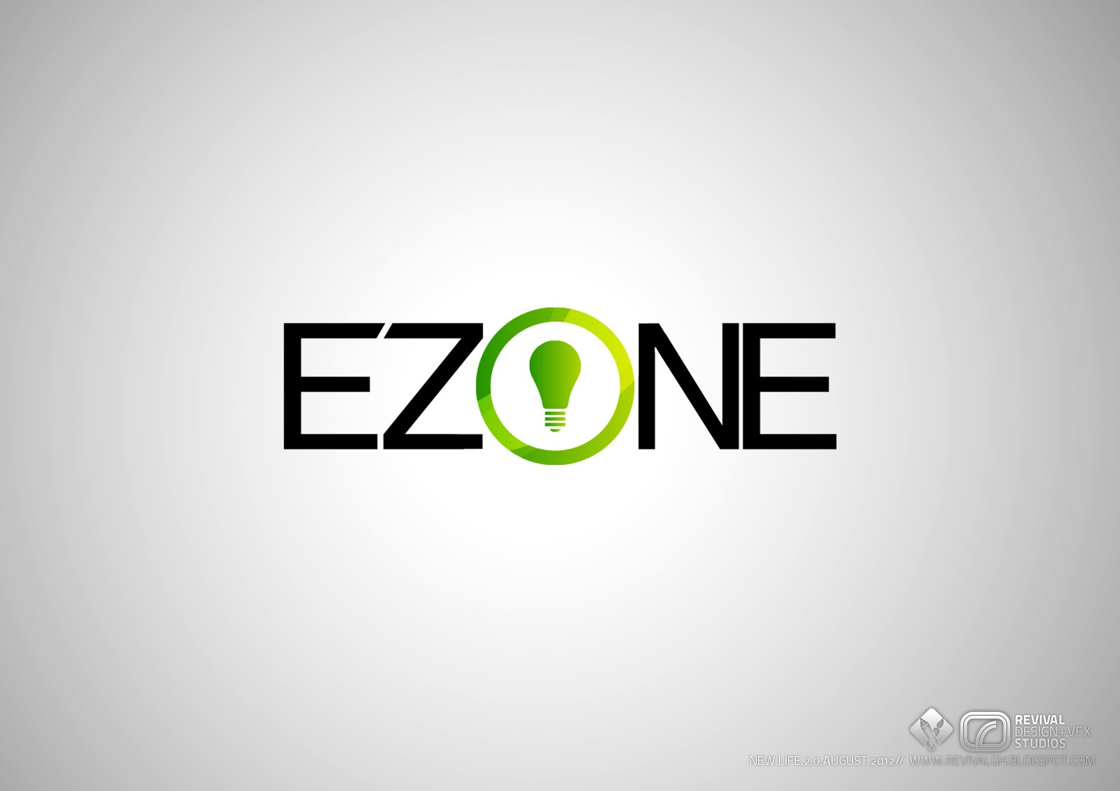
The mark is set in black, wide-tracked geometric capitals — EZ and NE — with the O left out and put back as a device: a ring in two greens, a lighter lime face over a deeper leaf green, and inside it a green bulb complete with a banded screw base.
Read as EZONE, the bulb carries both the missing vowel and the idea, so the identity holds together on one flat colour and one shape over a white ground that fades to grey at the edges. The post publishes this single presentation sheet only, with no tagline or applications given.
The project is on blogspot.