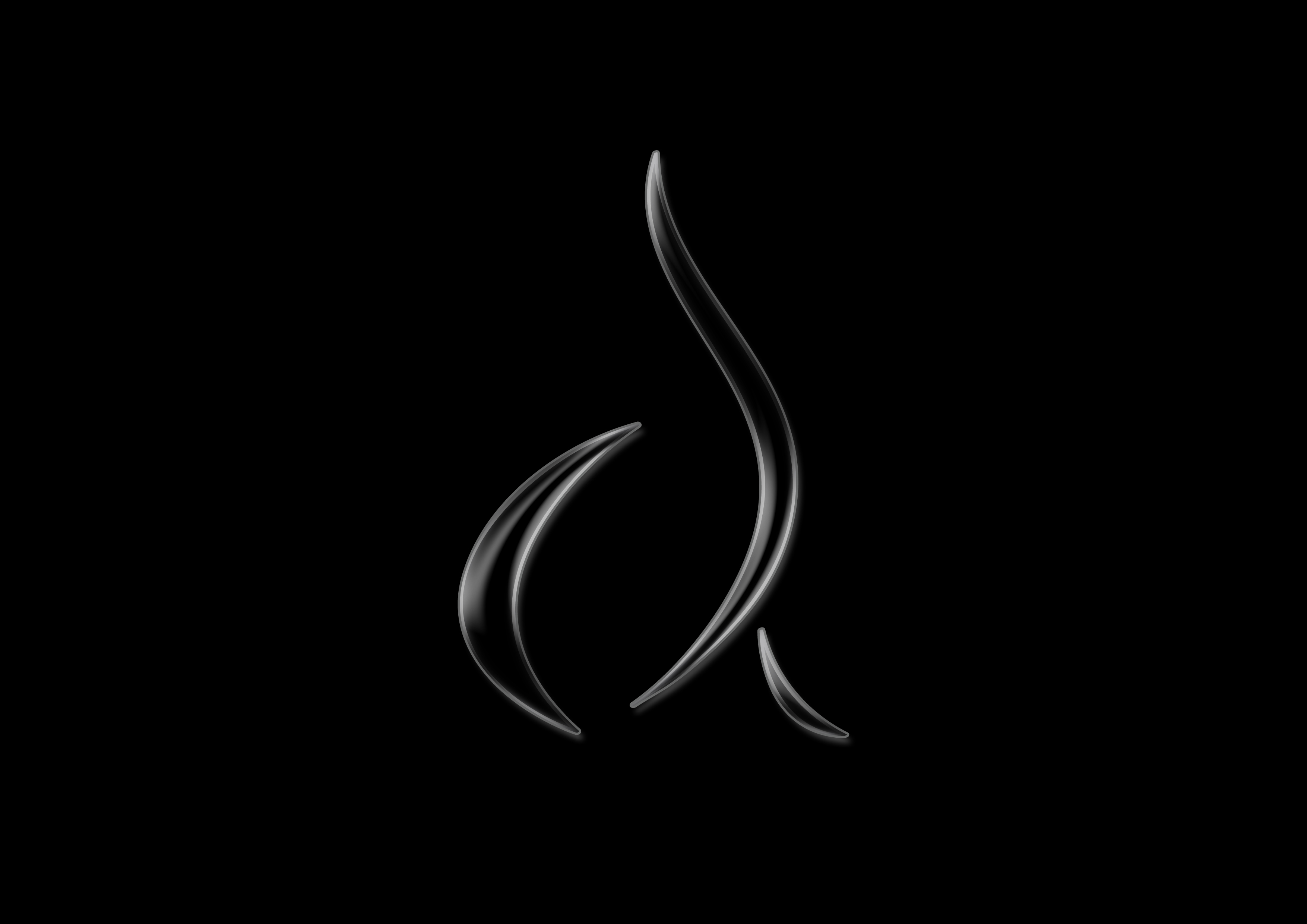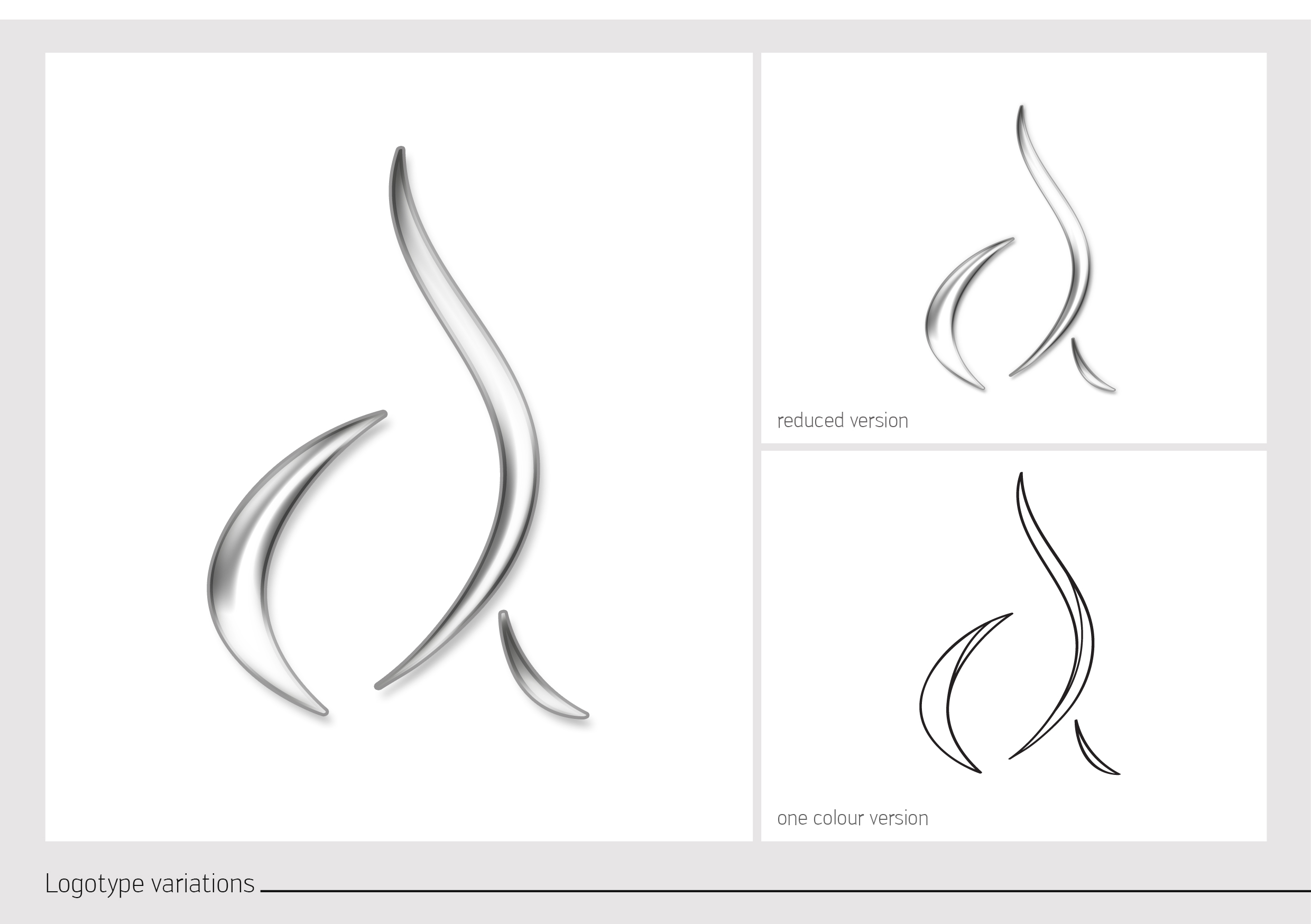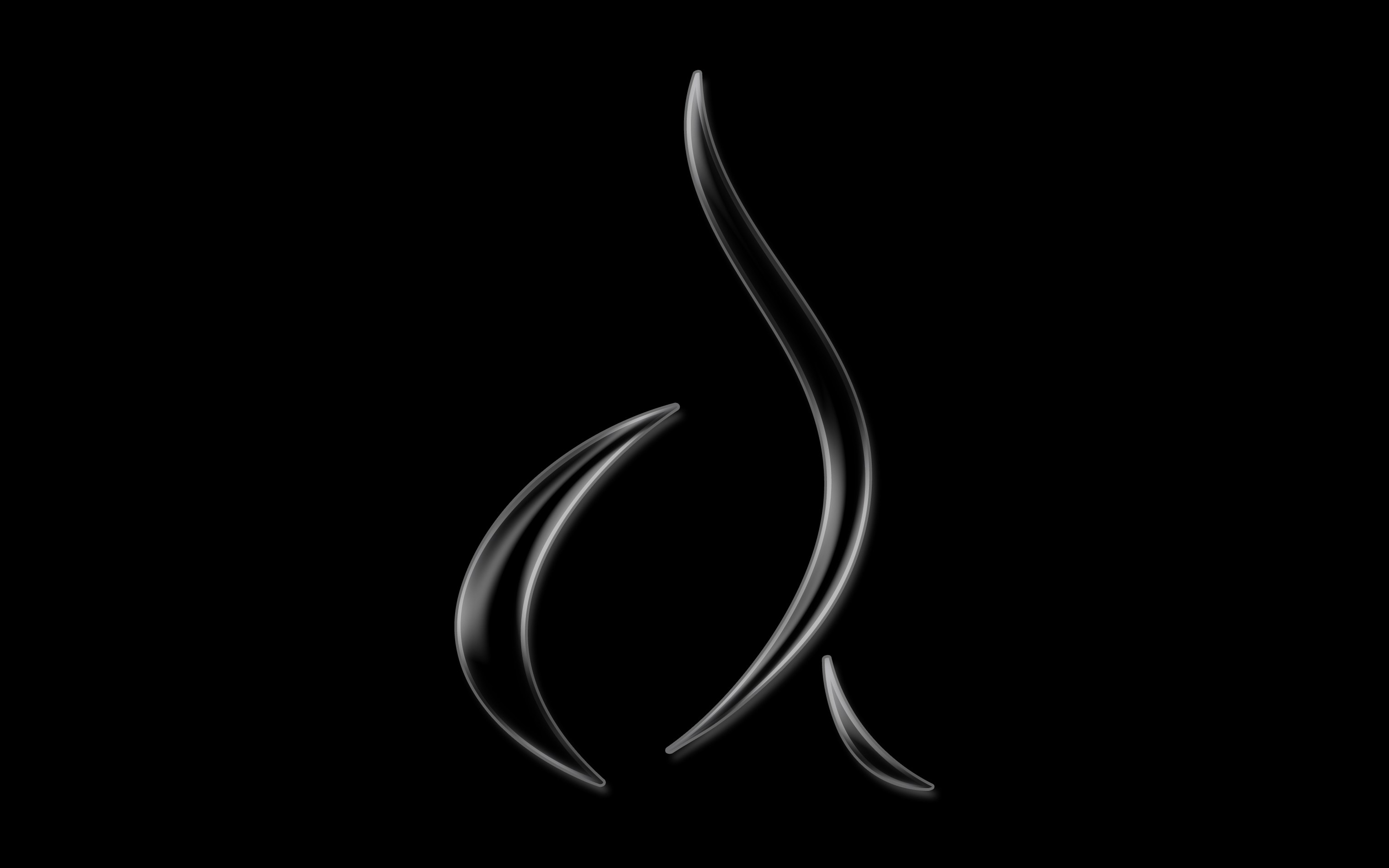
The mark is three tapered strokes. One long stroke sweeps up and over, pointing at both ends, a shorter sickle curves up on its left, and a small flick sits below and to the right. Each is drawn with a bright edge and a grey body that grades from light to dark, and each casts a soft shadow onto the field behind it, so the shape reads as a metal object rather than a flat vector. On the dark plates it stands entirely on its own, with nothing locked to it.
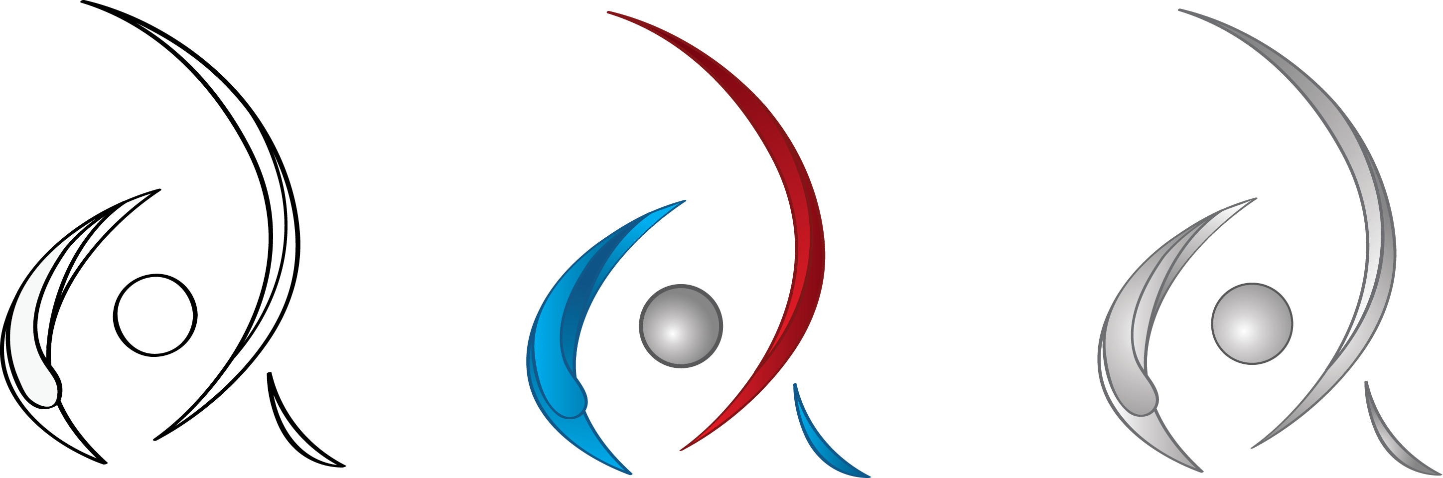
The first sheets hold a more closed version of the same idea: the long stroke sweeps well round the others, so the three nearly enclose a centre. That form appears four times on one sheet, in three combinations of crimson, cobalt and silver and once again as a plain outline. A second sheet sets a circle into the enclosed centre and gives three more versions of it, the circle drawn as an outline in one and shaded as a ball in the other two.
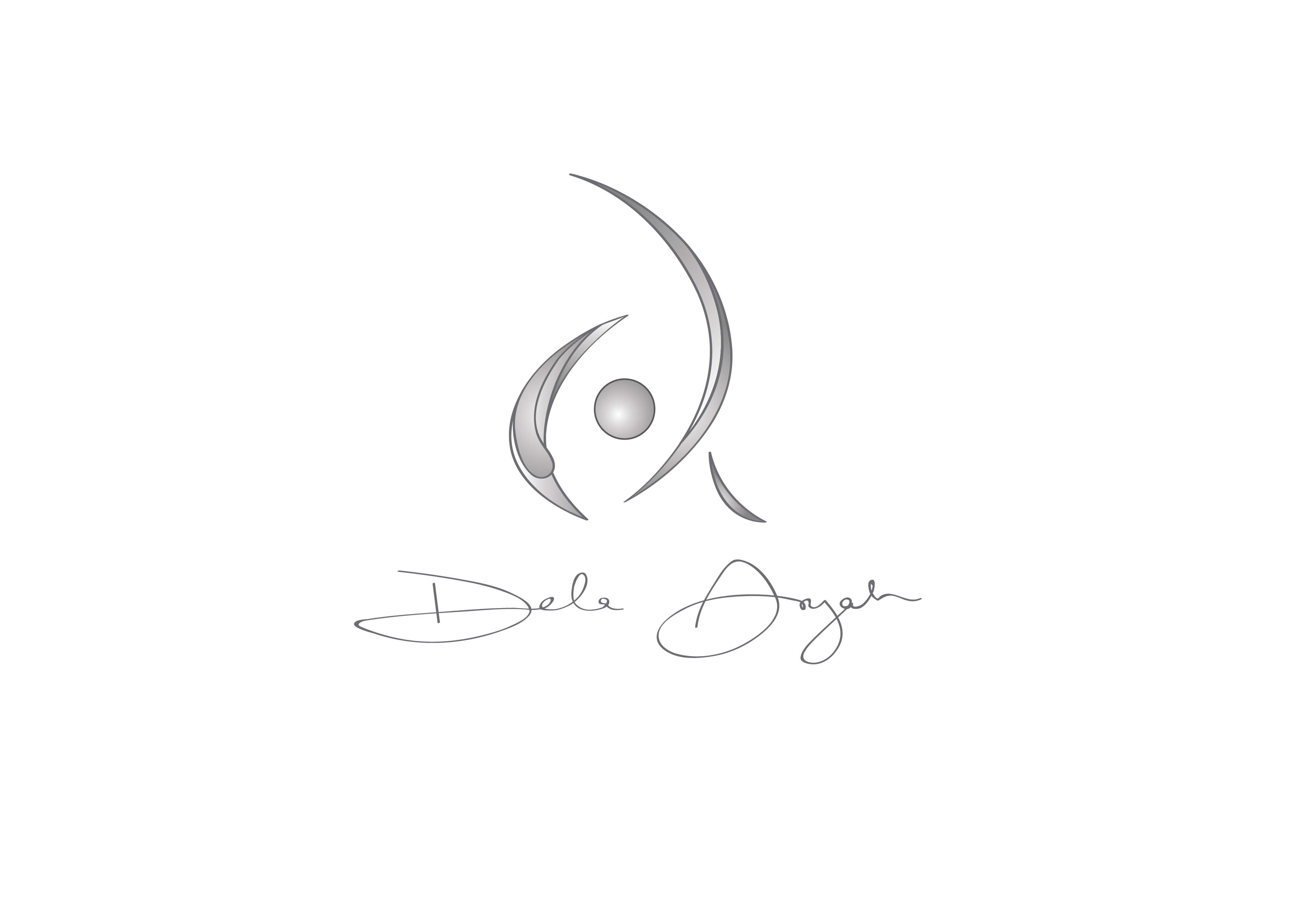
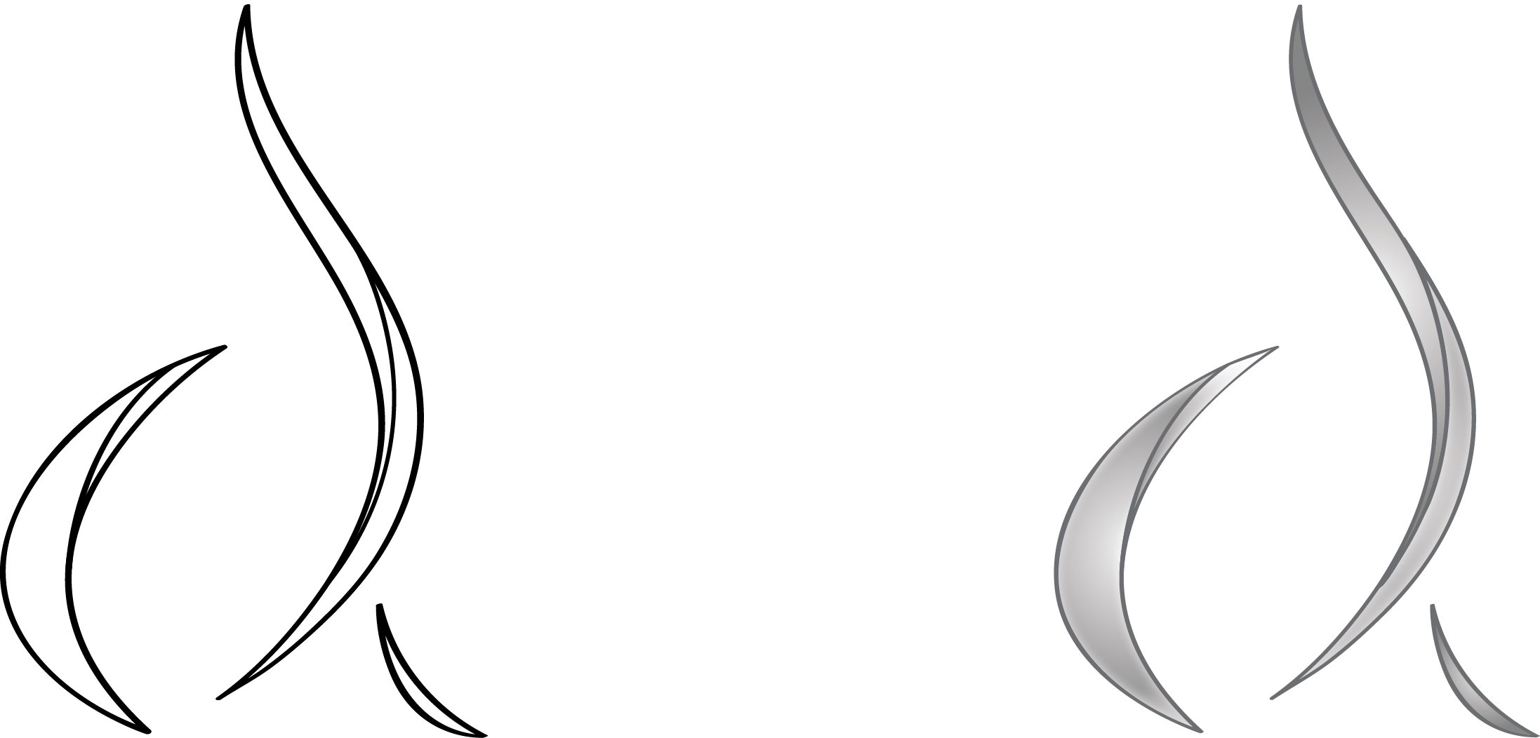
Resolution comes in two steps. First the colour comes out, and a grey version of the closed mark is set above the scanned signature — the first full lockup of the identity. Then the mark itself opens: the enclosing sweep pulls back into a single rising stroke and the sphere is dropped. A wide sheet records that second step twice over, the resolved form drawn once as a black outline and once filled, so it can be checked as line and as solid.
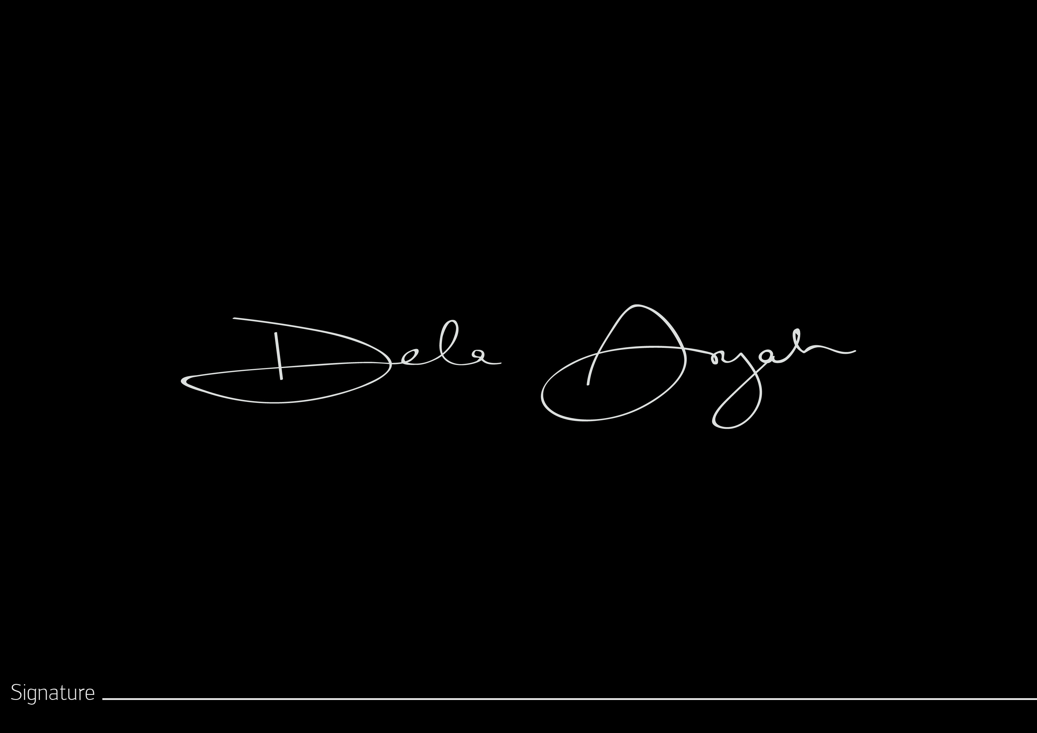
The name is never set in a typeface. It is a signature — drawn in a single thin line, with an oversized open initial and a long flourish trailing off to the right — scanned and reproduced at its own weight. It sits beneath the mark in the stacked lockup, and it also holds the stage alone on a board captioned “Signature”, where the same line is reversed to white on black.
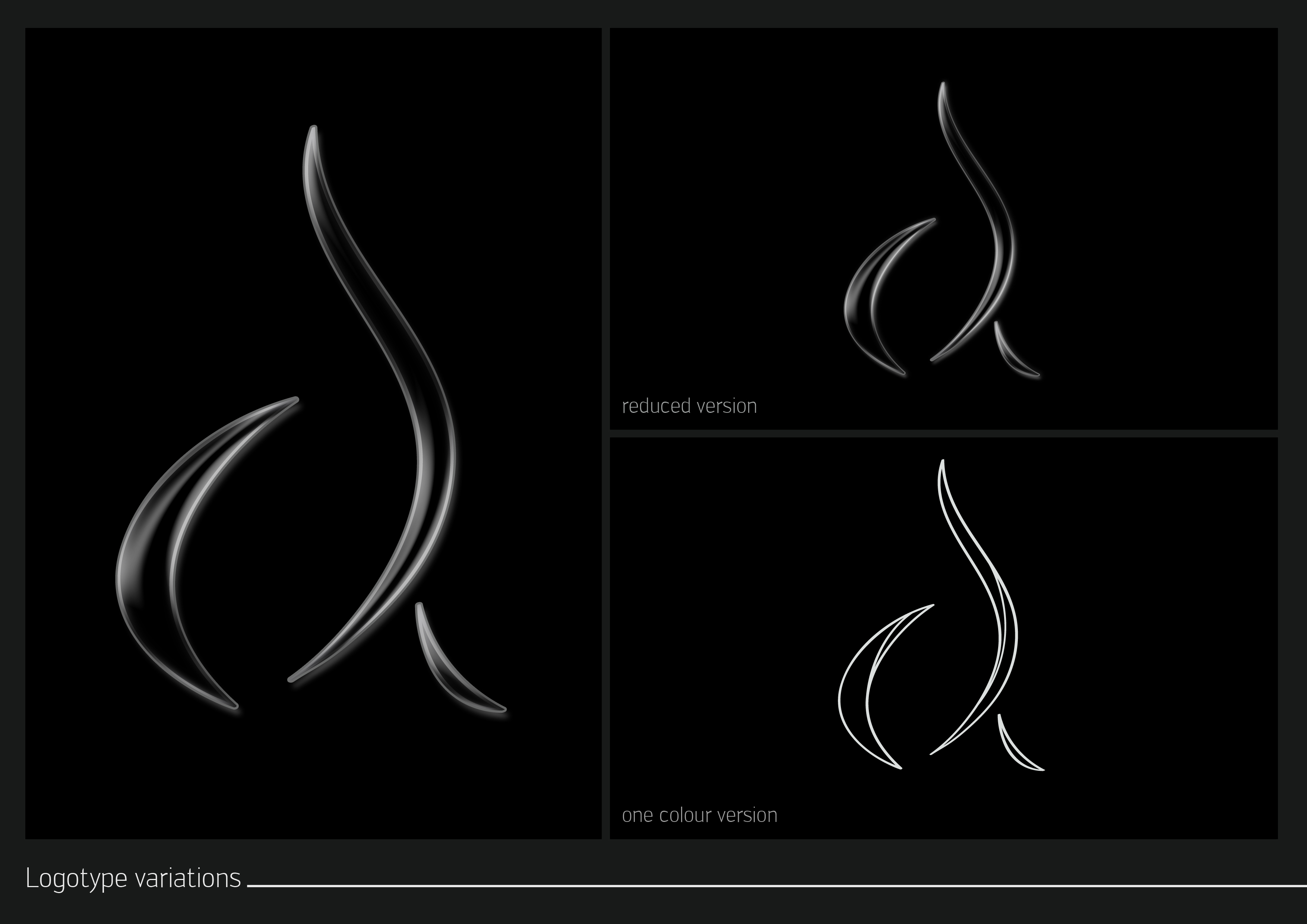
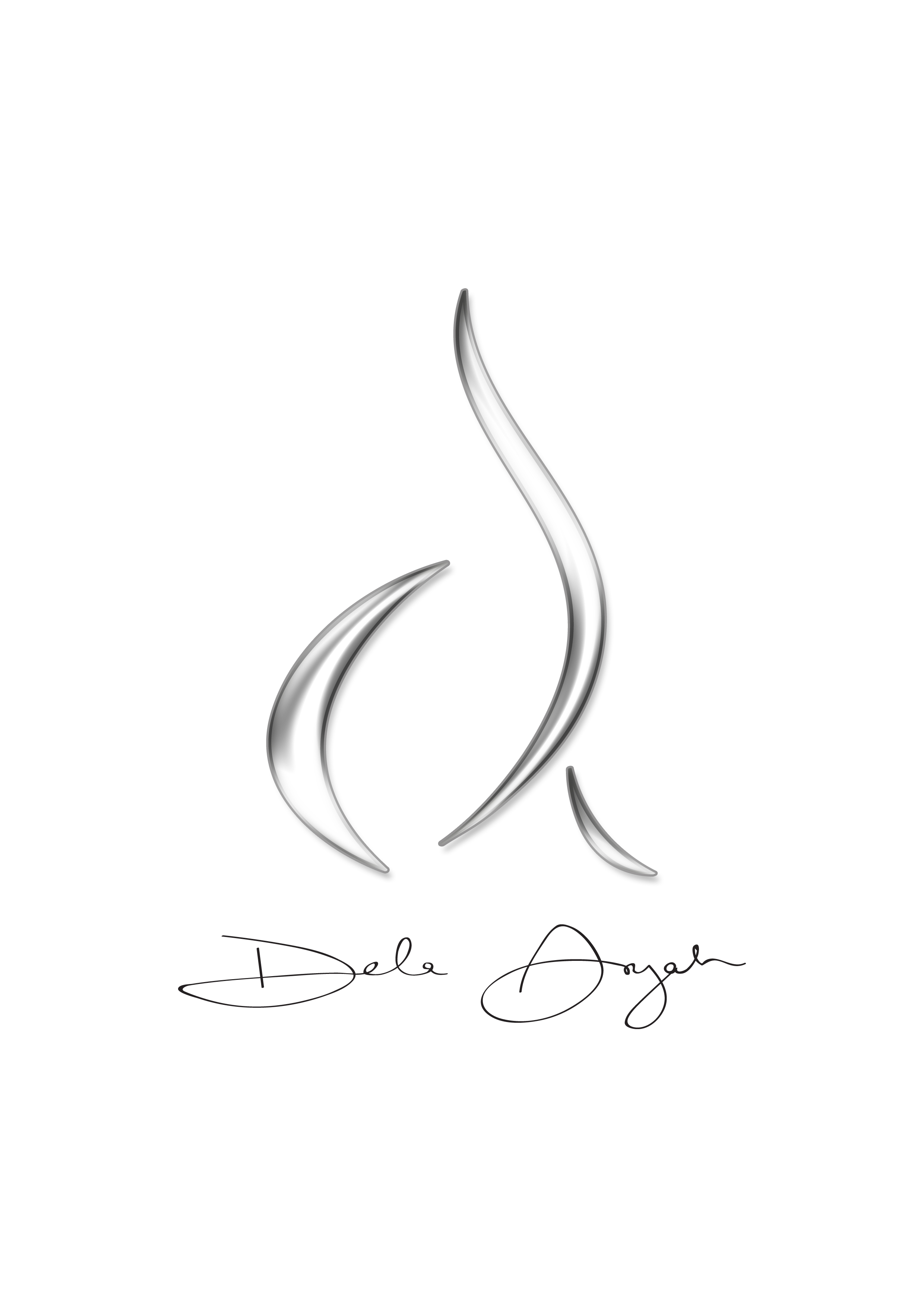
Two boards carry the same three-panel layout, one on white and one on black: the mark at full size, a “reduced version” for small uses, and a “one colour version” stripped back to outline. Both are captioned “Logotype variations”, and they are the part of the set that works as a handover, fixing the mark’s minimum forms rather than showing it off. The stacked lockup appears once, on a portrait sheet that sets the chrome mark over the signature in black ink on white. The dark plates then strip it back to the mark alone, which is where the drawing reads best — the highlights along each stroke do the work and the body of the shape disappears into the ground.
Concept and design were by Kofi Tetteh, for client Dela Anyaa. Documentation was published to our Behance archive in January 2015. View the original project on Behance.