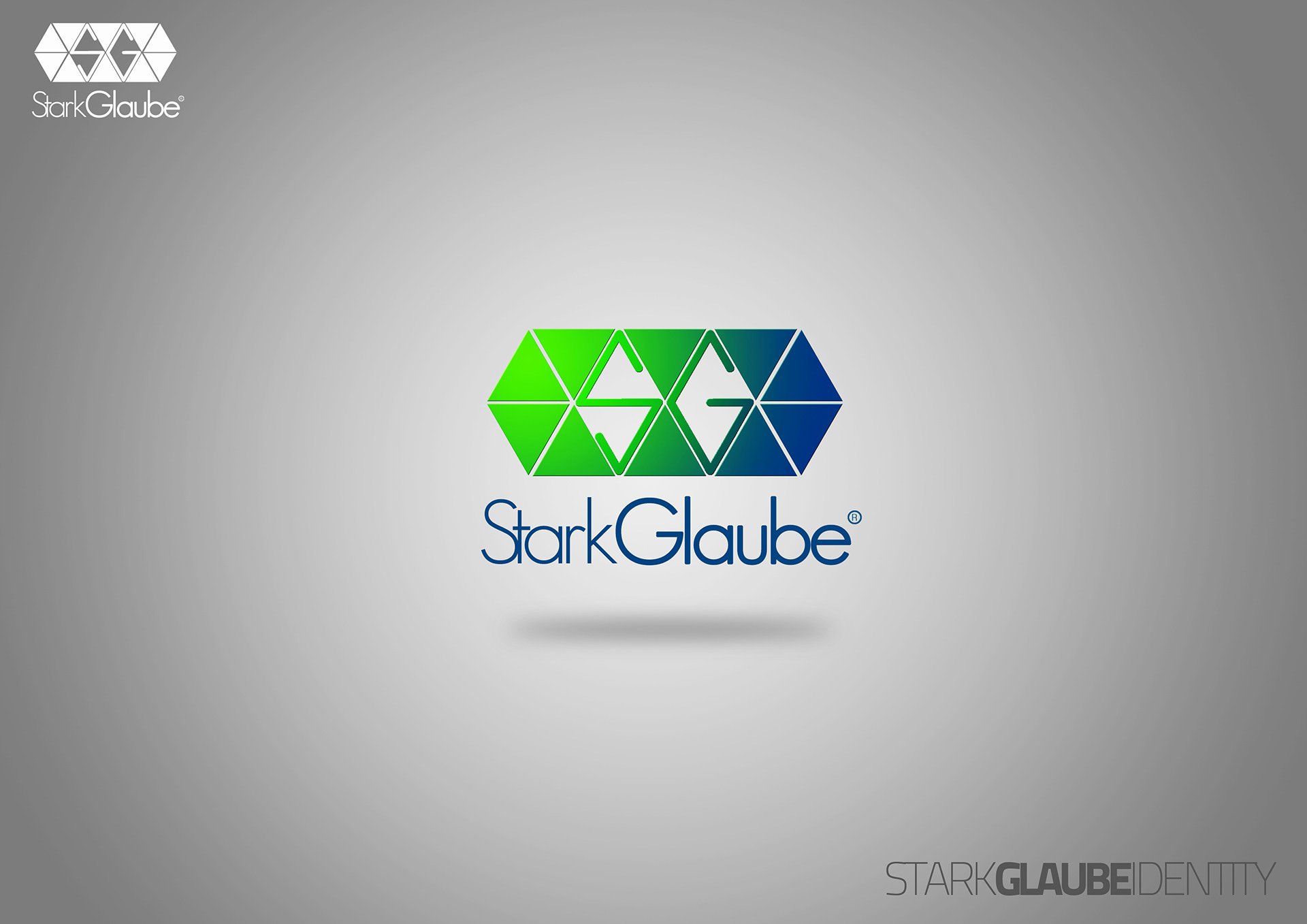
The primary mark is a horizontal band of interlocking triangles running from bright green through teal into deep blue. The two initials are not drawn on top of it but knocked out of it, reading as white letterforms with a thin outline where the triangles meet, so the colour carries the shape. Below, the name is set as a single word — StarkGlaube — in a geometric sans with an oversized open G, and the lockup floats on a grey field with a soft shadow beneath it.
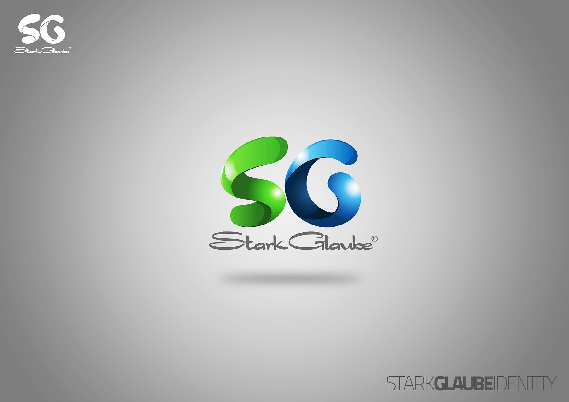
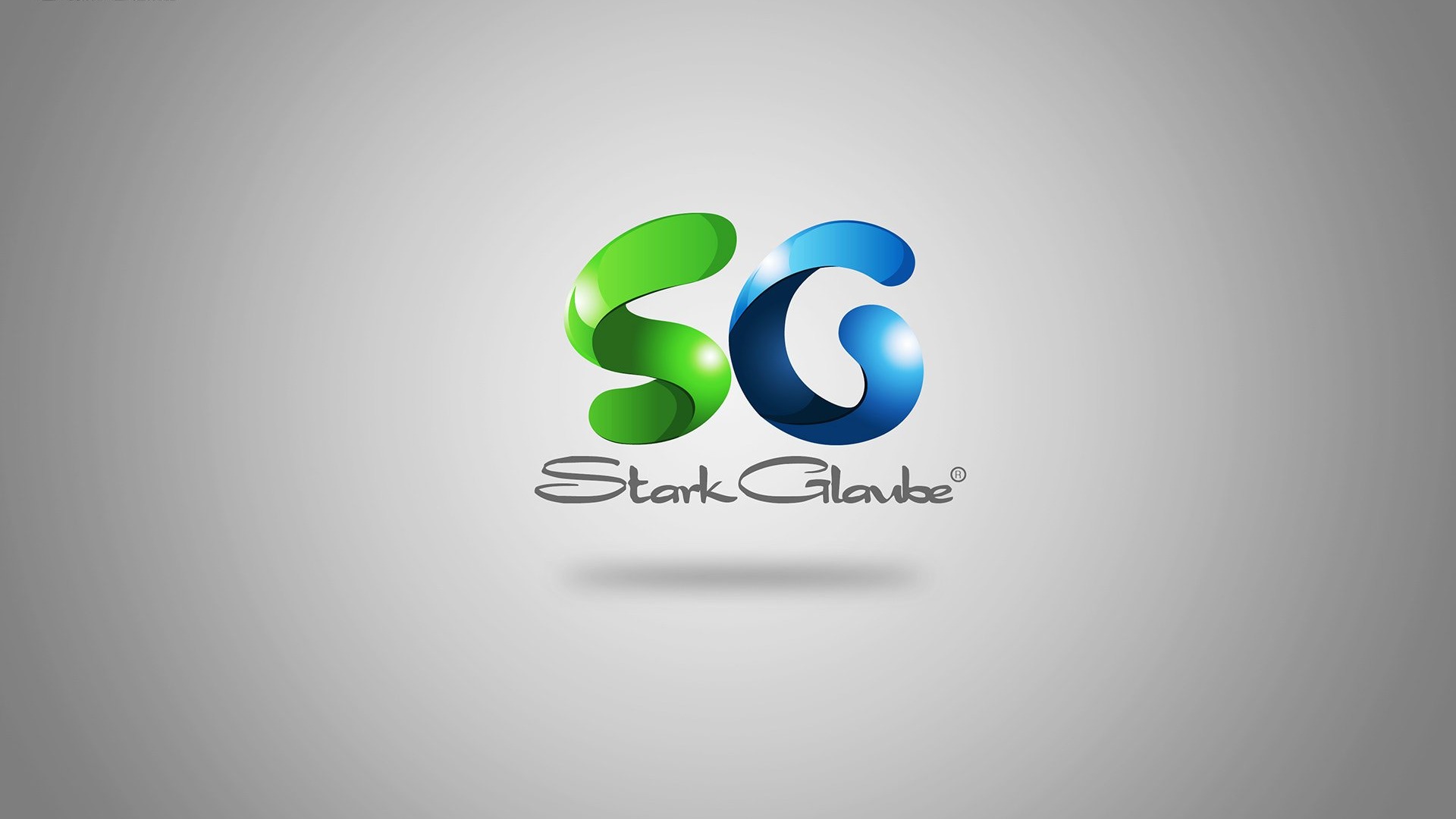
A second route treats the same initials as two glossy ribbon loops, green for the S and blue for the G, paired with a looser hand-set wordmark.
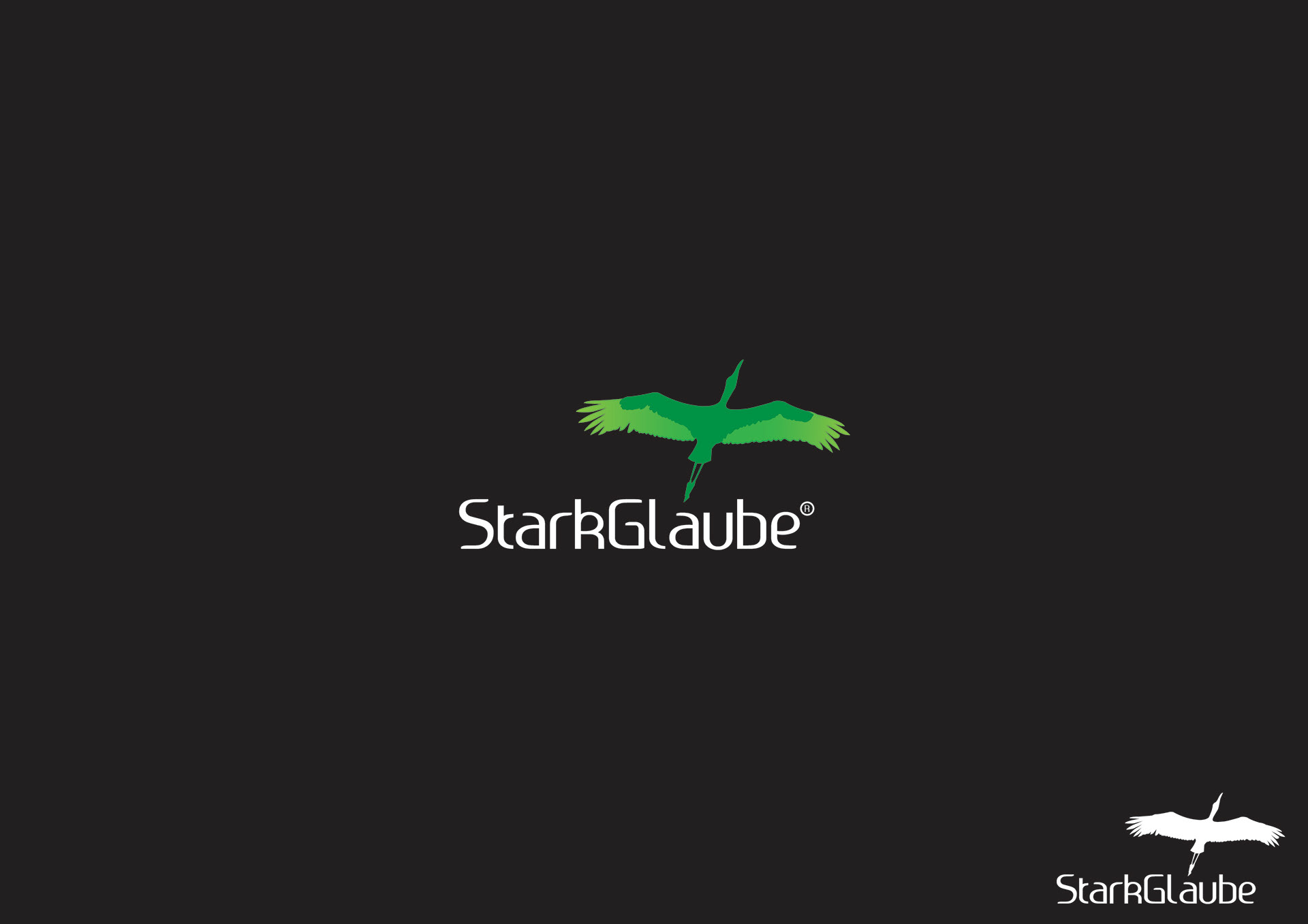
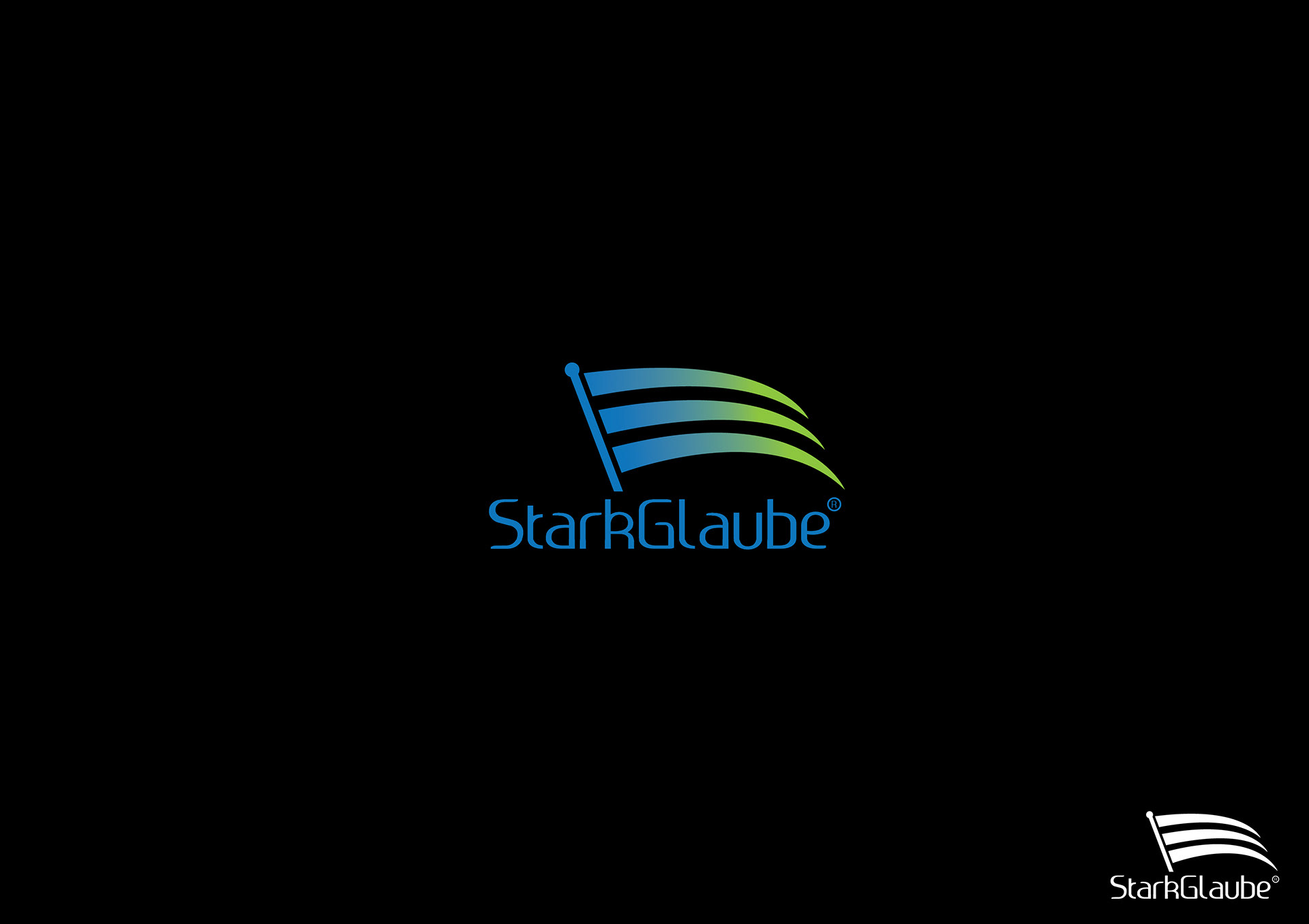
Other options move to a pictorial mark: a bird in flight over the reversed wordmark on near-black, and a three-bar banner on a pole graded from blue into green. Each plate carries a single-colour line version of the lockup in the corner, for the uses where the gradient cannot hold.
Design was by Paa Kofi Tetteh. Documentation was published to our Behance archive in February 2014. View the original project on Behance.