The studio published the job as AIKA - GRAPHIC DESIGN on 7 June 2012. The post carries one presentation sheet and one line of production note, “software used: Photoshop & Illustrator”. The brand is named only as Aika clothing, in the wordmark itself.
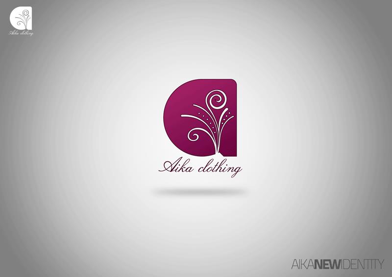
The mark is a solid, and the drawing is cut out of it. The shape is rounded on the left and squared off on the right, filled with a gradient that runs from a bright magenta at the top to a deep plum at the base, and into it is set a pair of fronds in white: two stems that rise, curl over at their tips and throw smaller shoots, the whole thing sprinkled with dots the way a botanical engraving would be. Because the flourish is negative space, the mark holds at small sizes — which is why the same lockup is repeated flat and monochrome at the top left of the sheet.
Beneath it the name is written rather than set: Aika clothing in a plum italic script with a flowing capital, kept to a single line so the mark above stays the loud element. A soft shadow floats the whole lockup off the grey field.
As an identity for a clothing label the parts divide cleanly — the ornament carries the femininity, the gradient carries the colour, and the script carries the hand — and the palette is held to magenta, plum and white so it can be printed one colour when it has to be. At the lower right the sheet writes itself out as one logotype, AIKA NEW IDENTITY, with the middle word weighted. The project is on blogspot.