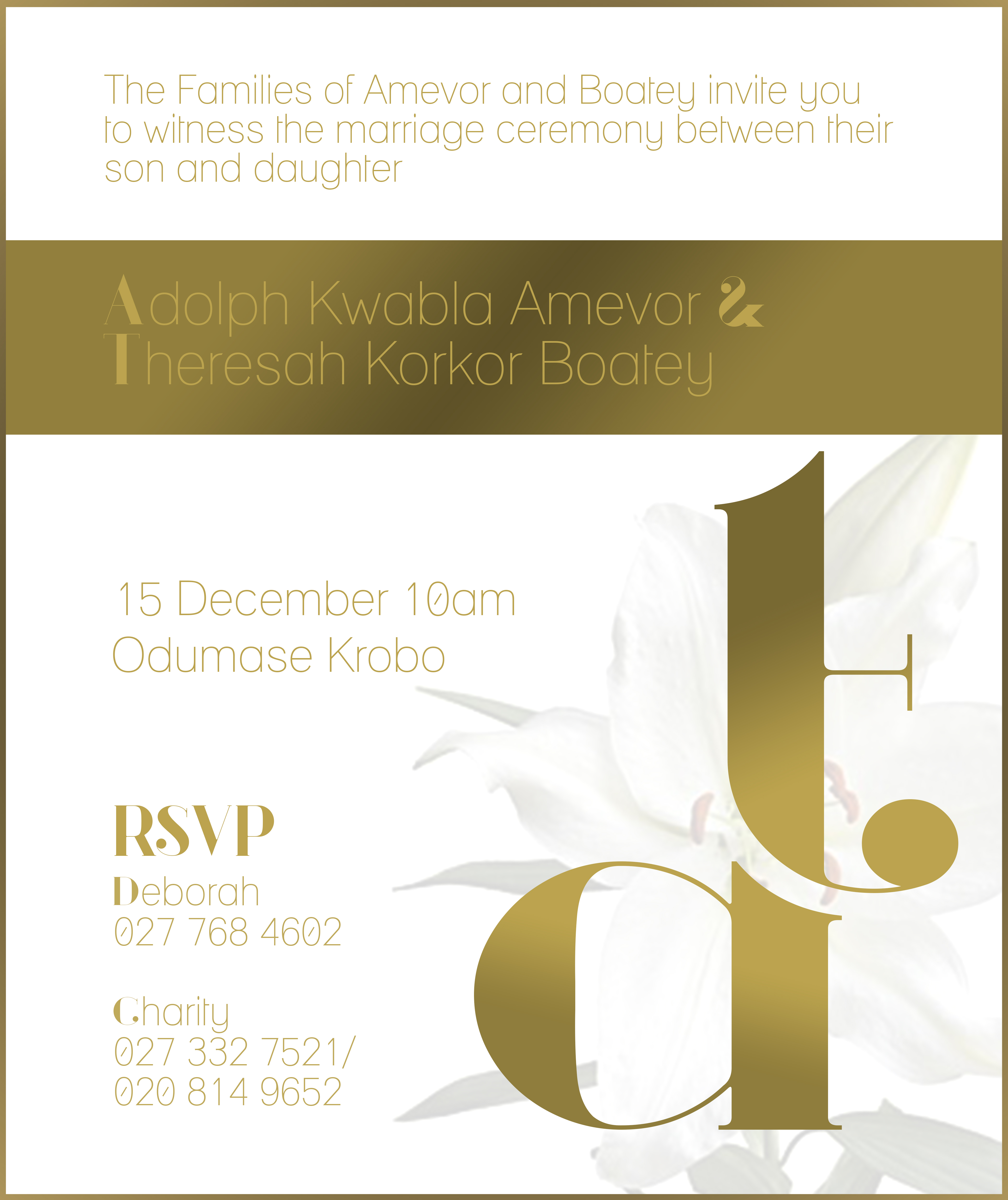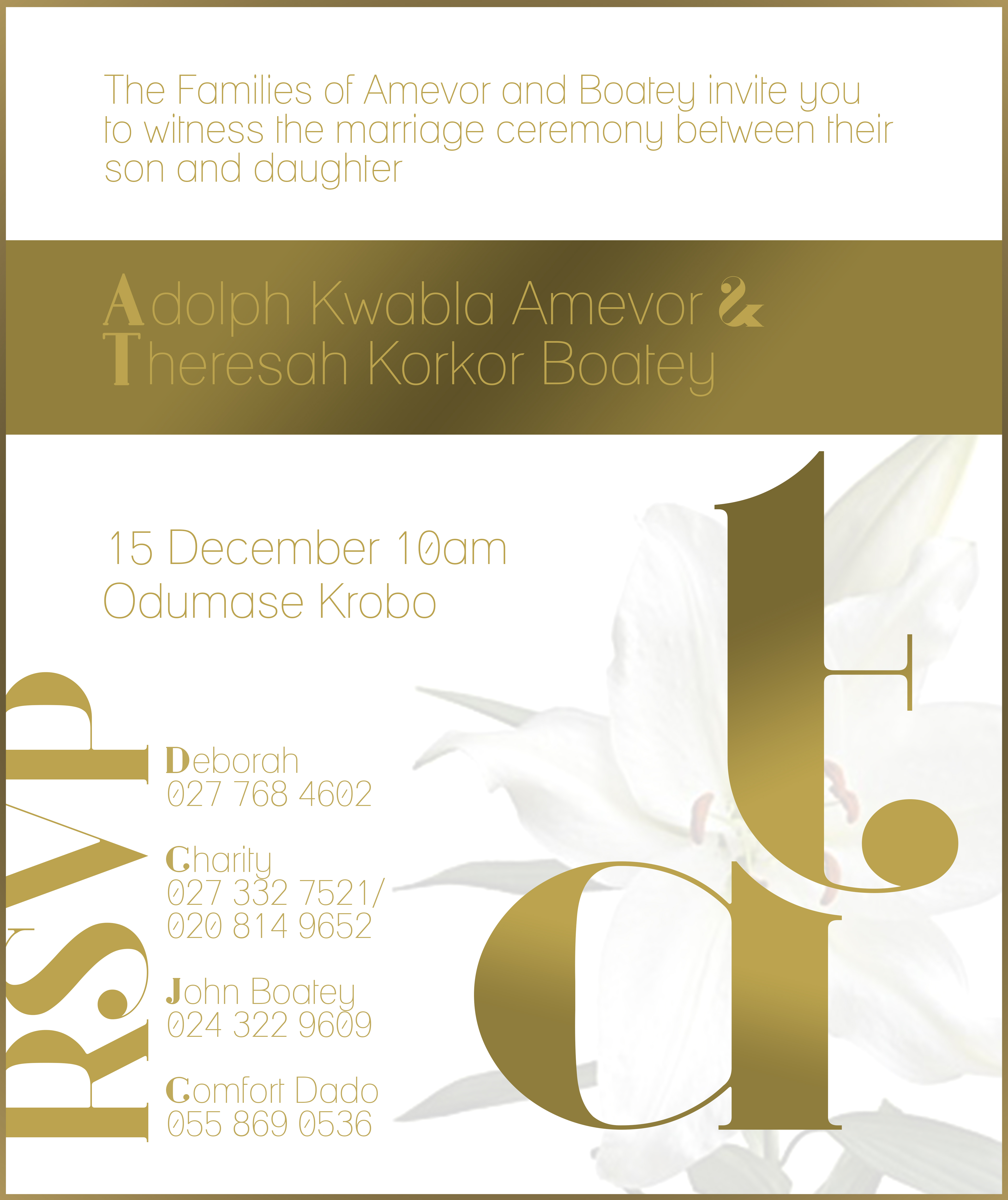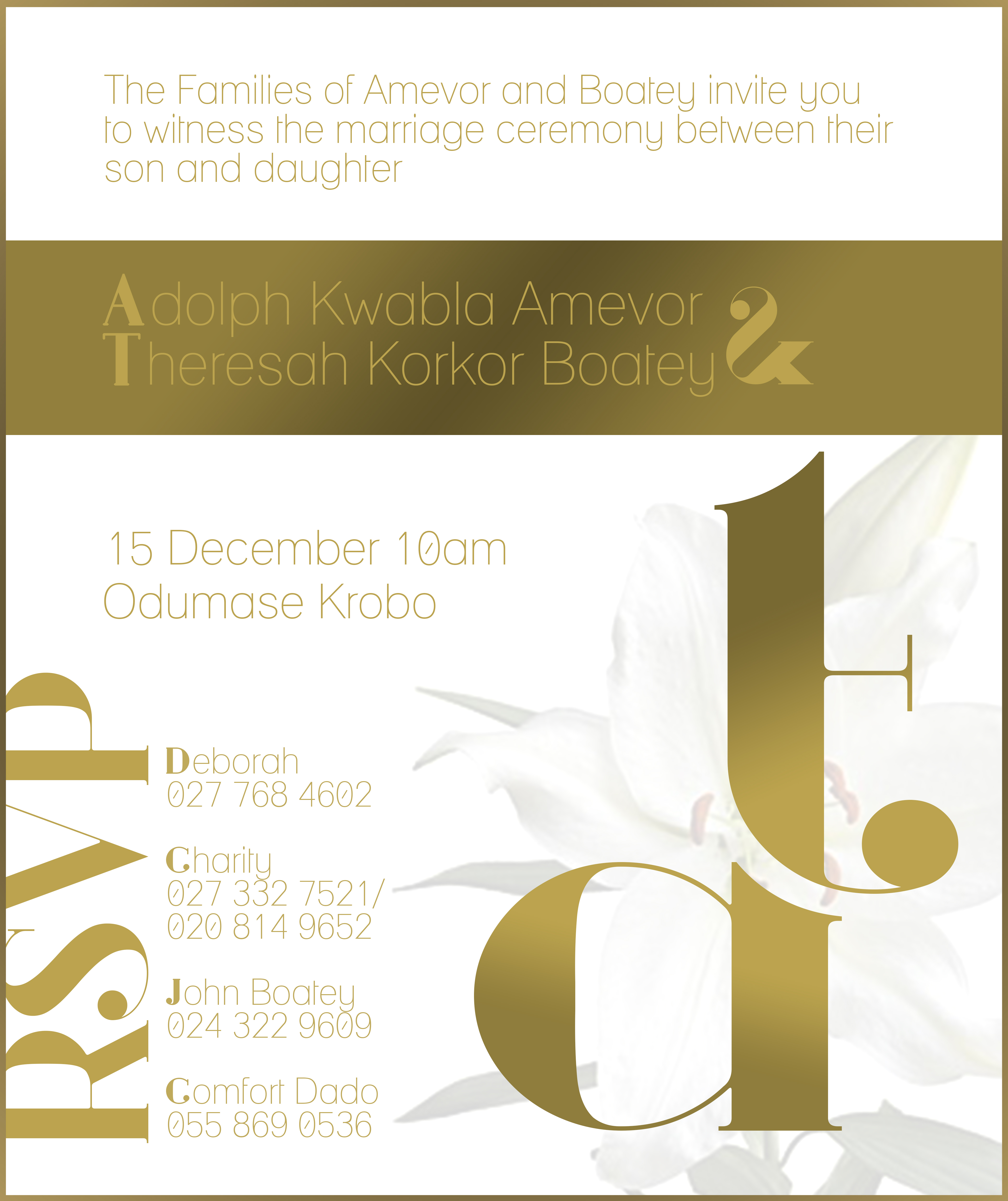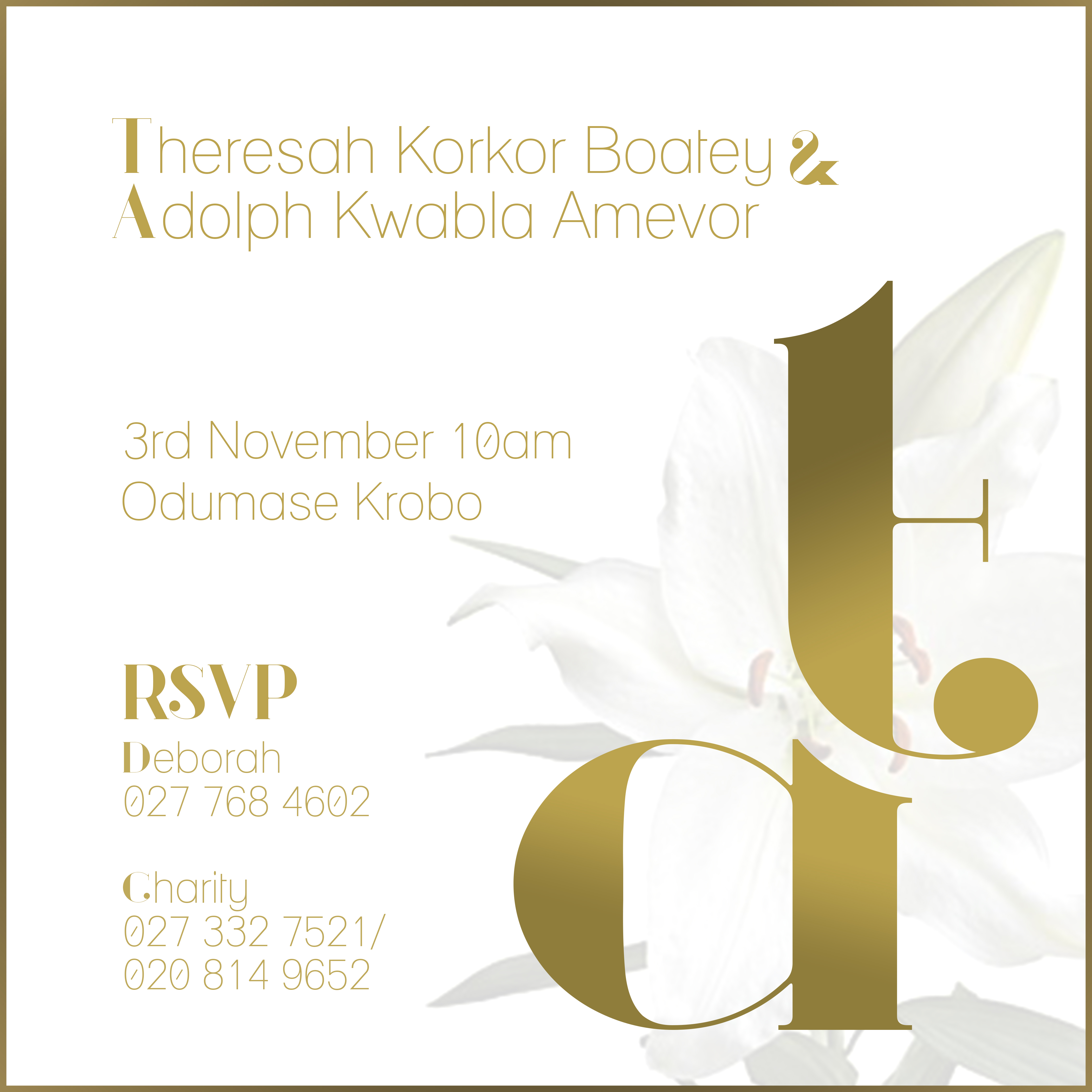
The mark is the project. The lowercase t and a are drawn as one glyph — the t’s stem falling straight into the bowl of the a — and set so large that it holds the whole right side of the card. It is filled with a gold gradient rather than a flat ink, so the letter changes value as it turns, and it sits over white lilies printed at so low a contrast that they read as texture before they read as flowers. Everything else is set in a thin geometric sans whose initial letters are swapped for oversized serif capitals, a device carried across the suite so that a line of names can open on a T or an A without a font change, and each panel is framed by a single hairline gold rule.
The square card is the front. The two names run across the top, hers first, the ampersand picked out in serif italic; below them the date and place — 3rd November, 10am, Odumase Krobo — and at the foot an RSVP set as a piece of lettering rather than a label, high-contrast and swashed, with two named contacts under it.
The portrait card is the invitation proper. It opens with the families rather than the couple — “The Families of Amevor and Boatey invite you to witness the marriage ceremony between their son and daughter” — then lays a solid gold band across the panel with the two names knocked out of it in a lighter tone. The date here is 15 December, 10am, at the same place; the suite therefore carries two dates, and the cards do not say which is which.
The last two panels are the portrait card grown to take a fuller list. The RSVP is turned on its side and set as a giant vertical spine up the left edge, and the two contacts become four. Beyond that they are the same card twice, differing only in where the band’s ampersand sits — after Amevor on one, after Boatey on the other, where it is also drawn larger.
The suite was never published to our Behance archive, so these four panels are the whole record of it.