The post is titled TSIK COMPANY LTD - IDENTITY and went up on 23 June 2009, revised seven minutes later. Its whole text is a description of the client rather than a note about the work: “TSIK is a construction company here in ghana. Their projects include works in building and road construction, civil engineering and sometimes supplies for construction projects.” No labels are attached, no software is named and nobody is credited, so this page carries no Software row. One frame was published, and it is plated here.
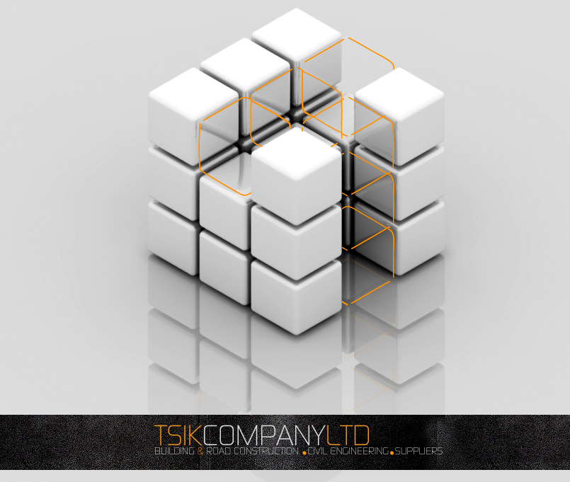
The mark is a cube that is not a cube. It is built from smaller cubes with softened edges, stacked as a three-by-three lattice with deliberate voids pushed through the middle, so the solid reads as an assembly rather than a block; the cubes nearest the camera sit lower than the ones behind them and the whole form leans slightly forward. Run through those gaps is a thin orange wireframe, drawn as the outlines of the positions the white cubes do not fill. The material is glossy white with soft grey shading on the faces turning away from the light, and the mark stands on a pale field with a mirrored reflection beneath it.
Below, a dark textured band across the full width carries the name in a thin, tall geometric grotesque set as one unbroken run: TSIK in orange, COMPANY in white, LTD in orange, butted together without spaces. Under it in smaller grey capitals sits the strapline — BUILDING & ROAD CONSTRUCTION, CIVIL ENGINEERING, SUPPLIERS — separated by small orange squares, with the ampersand orange too. Those are the same three services the post gives in prose, so the sheet and the write-up describe the company in the same order.
This is why the listing carries two disciplines. The wordmark, the strapline and the composition of the sheet are graphic design; the mark itself was modelled and rendered, and the reflection, the falloff across the cube faces and the camera fall are part of what is being presented. The filter bar has a parent token for that kind of work — VFX + CGI, used on pages where the deliverable is a render rather than an animation — and the archive already holds a construction-company identity of the same family in 2GS, so TSIK is typed with the identities rather than with the 2009 renders it happens to sit beside.
Nothing on the sheet is dated and no town is named, so the listing takes 2009 from the post and Ghana from the studio’s own phrase “here in ghana”. Whether the identity was adopted is not said: the post presents a single finished sheet with no alternates and no stationery, and no later post mentions TSIK — searching the studio’s hundred-and-twenty-two surviving entries returns this one alone. The source is on blogspot — TSIK COMPANY LTD - IDENTITY, 23 June 2009.