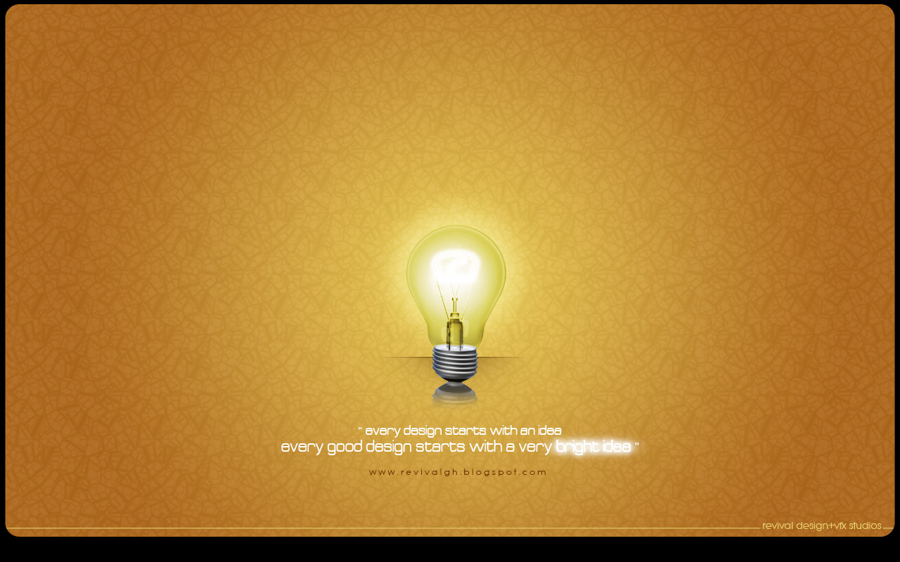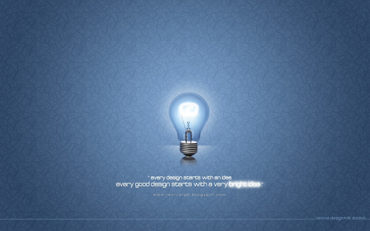
The post is two captions long. It was filed as “the BRIGHTEST IDEA - WALLPAPERS” on 27 September 2009 under the labels graphic design, photoshop, portfolio and wallpapers, and its only text reads “the BIGHTEST IDEA blue wallpaper” and “the BIGHTEST IDEA gold wallpaper”. The missing R is the studio’s own, in both captions, while the title and the artwork spell it correctly; it is reproduced here rather than tidied, because it is what the entry actually says.
The idea being advertised is stated on the images themselves. Under the bulb, in a squarish lowercase face, two lines read every design starts with an idea and every good design starts with a very bright idea, and the words bright idea are set glowing while the rest of the sentence stays flat white -- the pun is carried by the light. Below that the address www.revivalgh.blogspot.com is letter-spaced across the middle, and a thin ground line runs the full width of the wallpaper carrying revival design+vfx studios at the right. There is no client in the picture because the picture is the client: this is the studio promoting the way it works, which is why the listing is filed to RDVS Studios with the In-house service, the same way the studio’s own ident and its in-house interiors are filed.
Two files, one composition. The bulb, its halo, the strapline and the credit are identical in both; what changes is the ground. The blue version puts the lamp in a cool cracked-ice field that washes out to near-white immediately around the glass and deepens towards the corners, and lets the artwork run to the edges of the file. The gold version repeats the composition on an ochre field of the same texture and encloses it in a black rounded frame, so the wallpaper arrives with its own border. Both are 1280 by 800, the size the studio made all of its wallpapers at.
It belongs to a concentrated run. OUT OF THE DARKNESS went up in May 2009, these two on 27 September, and the.SEED followed on 1 October -- three posts in five months, each a single motif on a textured field with the blog address letter-spaced underneath, and the first of them is the only one the post credited to a named designer. Of the three this is the only one that comes in colourways, and the only one made for no audience but the studio’s own.
Nothing else is claimed. No designer is named in this post, so no Team row appears; the software line records only Photoshop, which is the single tool the labels name; and no distribution is described beyond the wallpapers label. Both masters re-encode far smaller than they were uploaded, so the plates here are the house bake rather than the originals.
The source post is on blogspot — the BRIGHTEST IDEA - WALLPAPERS, 27 September 2009.