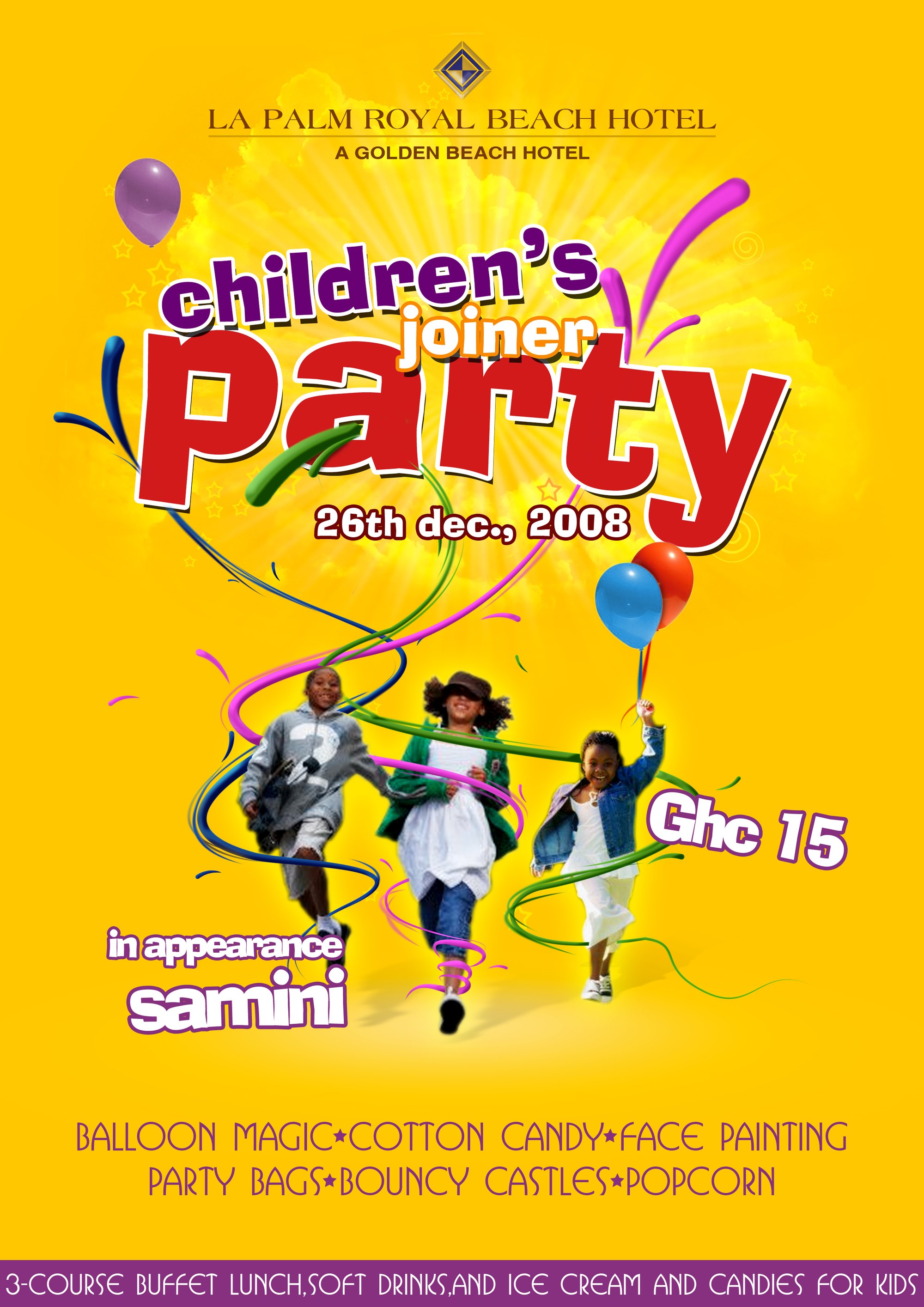
The hotel was running a children’s party on 26 December 2008 and needed one image that could carry the whole invitation at once: the date, the price, the guest act billed on the artwork as “in appearance samini”, the list of activities and the catering. Everything on the poster is therefore set to be read quickly and from a distance.
The sheet is built on a burst of yellow. Radial rays spread from behind a bank of cloud at the top, and the hotel’s diamond monogram and serif wordmark sit on that pale ground like a letterhead, with the strapline A Golden Beach Hotel beneath a hairline rule. Below them the title is assembled from three separate treatments — children’s in inflated purple letters, joiner in orange and white, and Party in a heavy red slab with a white outline and a hard drop shadow — so the three words read as one shout rather than one line.
Glossy three-dimensional ribbons in magenta, cyan, lime and blue are threaded through the lettering and looped down around the three photographed children running out of the centre of the composition, one of them lifting a pair of balloons. A single purple balloon floats at the top left, stars and spirals are scattered across the yellow, and the programme — balloon magic, cotton candy, face painting, party bags, bouncy castles, popcorn — is set in a thin hand-drawn display face in purple. The foot of the sheet is given over to a purple band carrying the three-course buffet lunch, soft drinks, ice cream and candies in the same face, reversed out in white.
It is an early piece of the studio’s graphic work, and a composite rather than a drawing: typography, painted swirls and cut-out photography assembled for print at A4, the artwork file measuring 2480 × 3508 px. The poster predates the studio’s Behance and website archives, so the artwork itself — dated by the event it advertises — is the record for the details given here.