Brief + Overview
The objective was a single animation to be used as the ident for Ceeander Entertainment, a film production company. The brief fixed the shape of the deliverable from the outset: a short-length piece spanning between 20 and 30 seconds at minimum, cut at 30fps and produced at a screen resolution of 1920×1080 Full HD on a widescreen aspect ratio of 16:9.
The finished film runs 22 seconds. It is written as an opening rather than a closing card — the company’s logo put into motion so that it introduces every production and captures the senses and attention of the viewer from the very first moment. The target audience, in the brief’s own terms, is anyone who patronises the company’s productions.
Concept
Ceeander Entertainment is a Nigerian film production company set up through a collaborative effort between two passionate film enthusiasts, both certified film directors, actresses and producers. The company was established primarily to showcase and promote Nigerian culture to the world through film and documentary productions.
The concept draws its inspiration from African arts and culture, synthesising traditional artefacts and symbolisms with indigenous African themes. The result is meant to resonate with the company’s vision of producing films that project African culture and its values to the rest of the world.
Motif + Elements
The motif integrates tribal and ethnic African elements into the piece, from colour palettes to symbols and artefacts such as masks. The company treats those elements as a means of showing the cultural affiliation of its vision.
Colours follow the same logic, taken from the general motif of tribal African colour: brown through red, yellow and green to black, with blue used to some extent.
The company’s actual logo is type based, and since the piece is an animation of that logo rather than a redesign of it, no new type is introduced anywhere in the film except what the logo already carries.
Storyboard Narrative
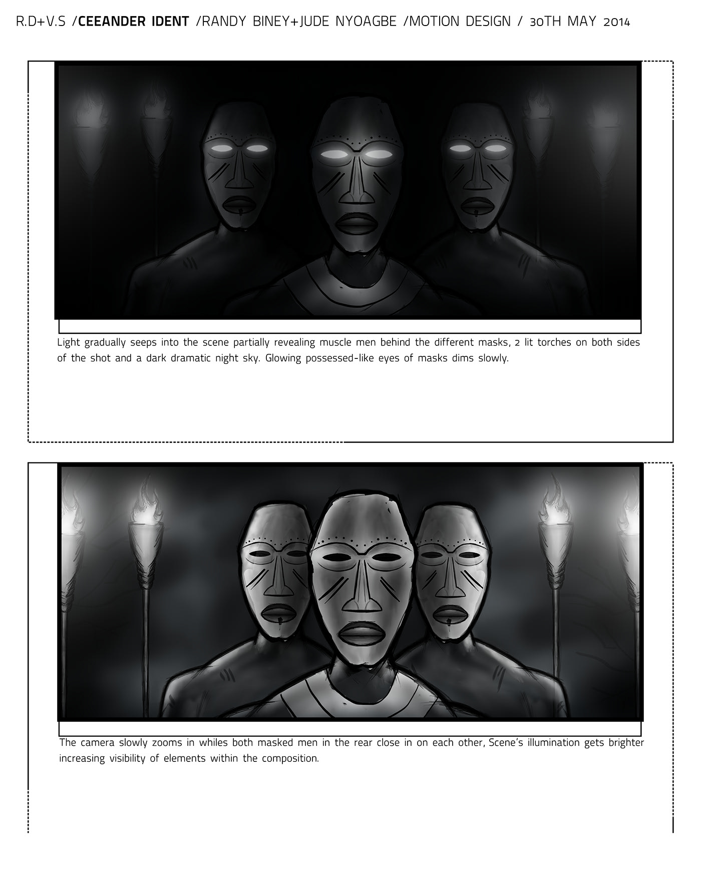
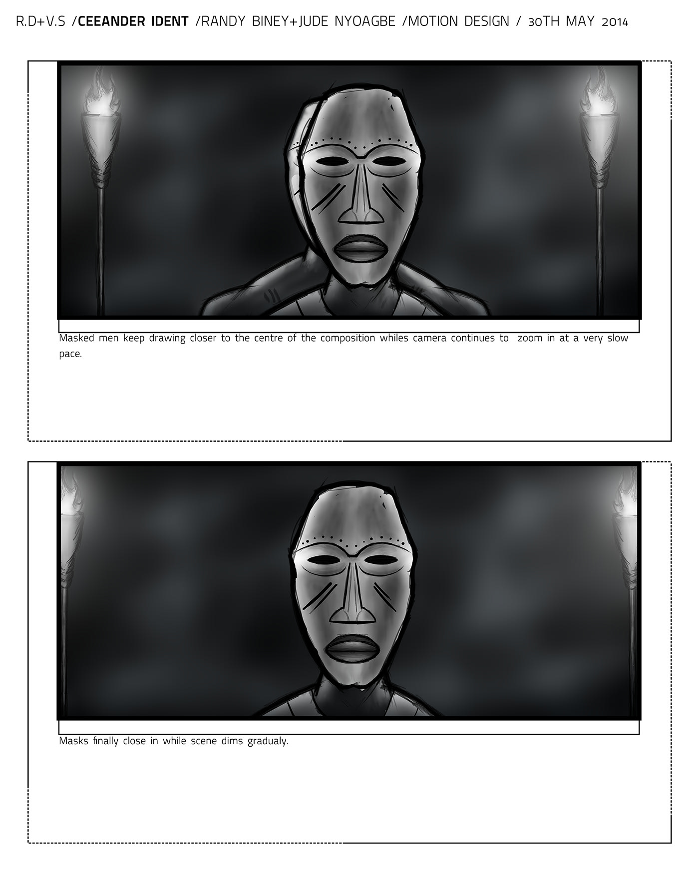
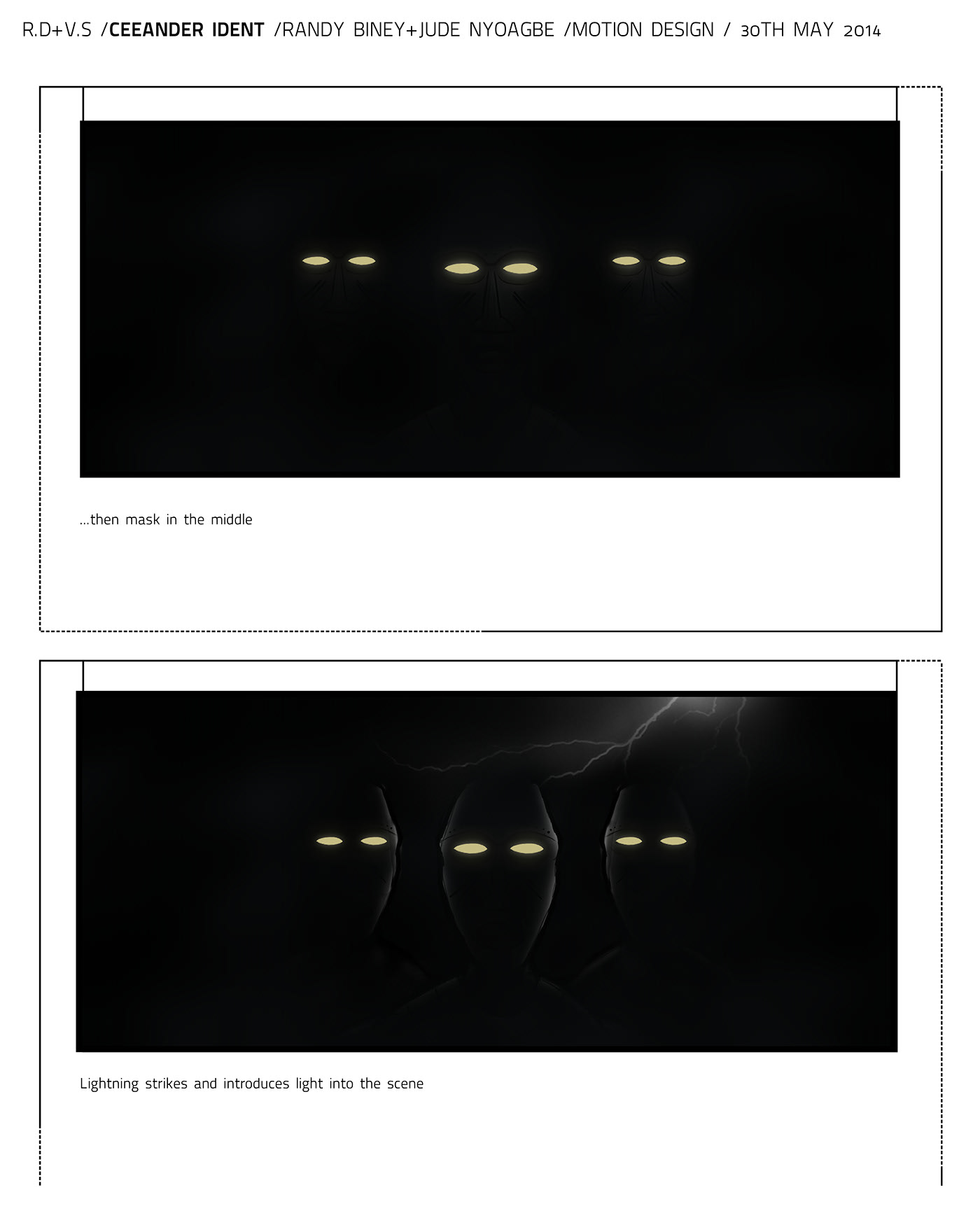
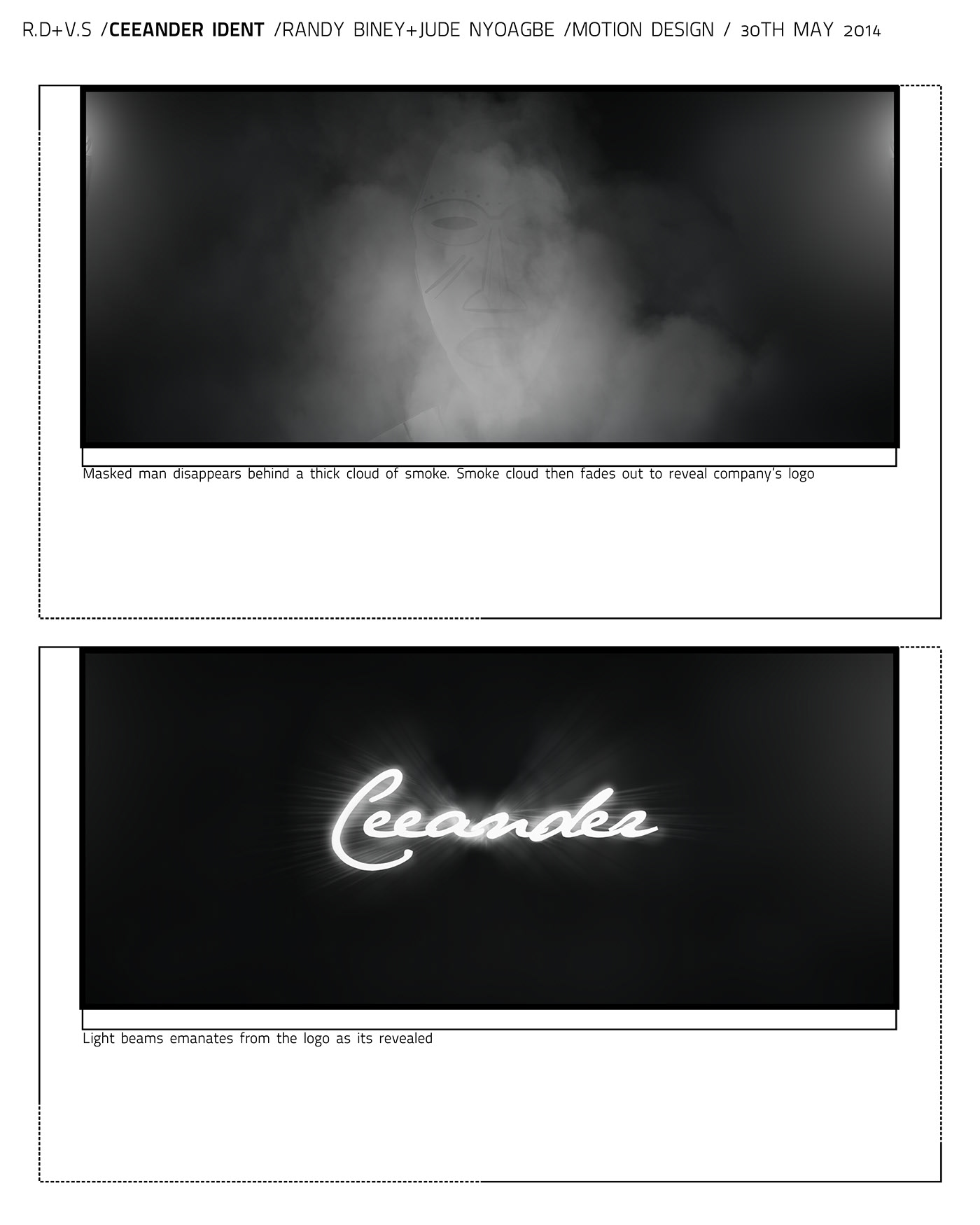
Five boards headed “R.D+V.S / Ceeander Ident / Randy Biney + Jude Nyoagbe / Motion Design / 30th May 2014” work the sequence out in monochrome before it is lit in colour.
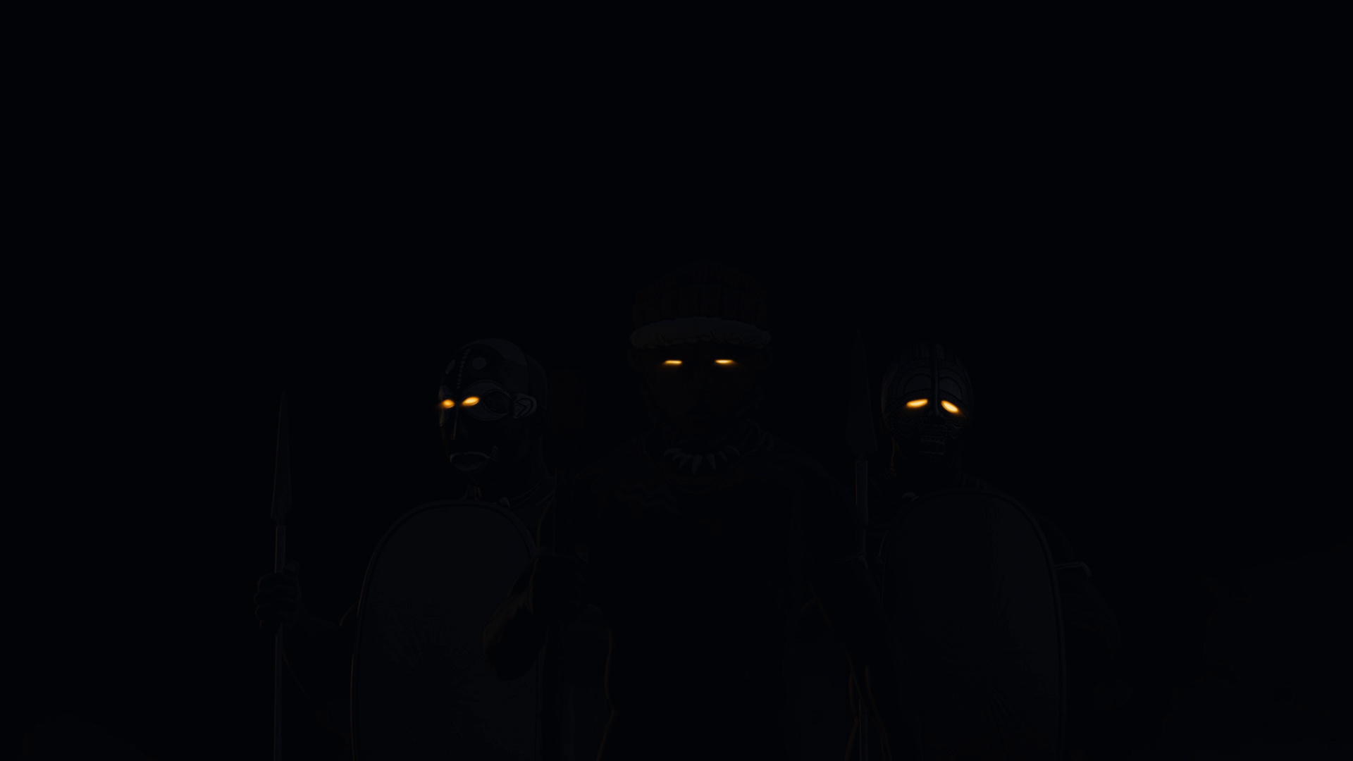
The scene opens in darkness with only the masks’ eyes glowing. Light gradually seeps in, partially revealing the muscle men behind the different masks, two lit torches on either side of the shot and a dark dramatic night sky, while the possessed-like glow of the eyes dims slowly.
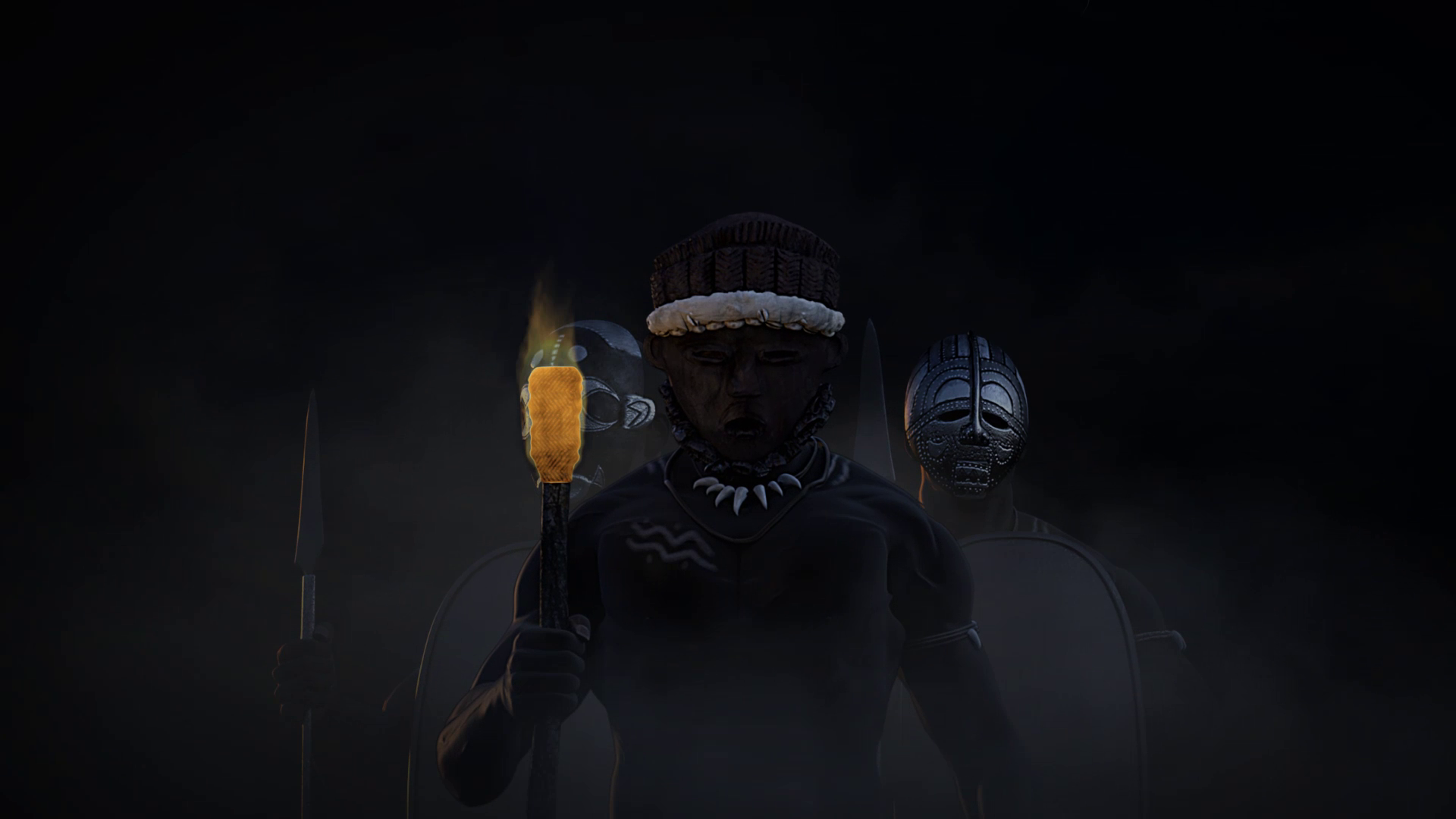
The camera then holds a slow zoom as both masked men in the rear close in on each other, the scene’s illumination getting brighter and increasing the visibility of elements within the composition, until the masks finally close in and the scene dims gradually.
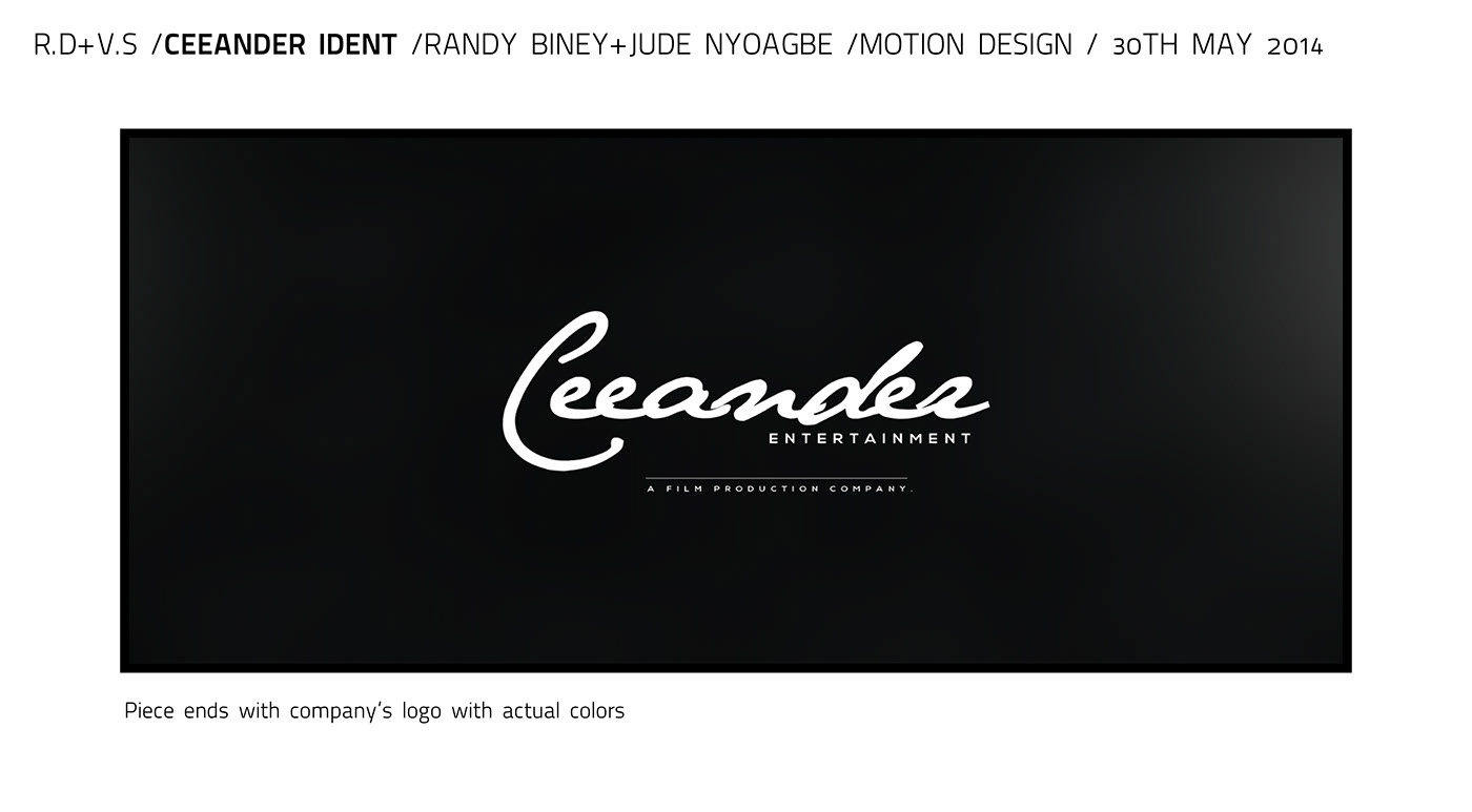
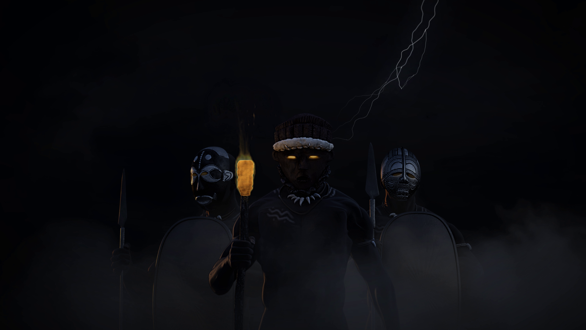
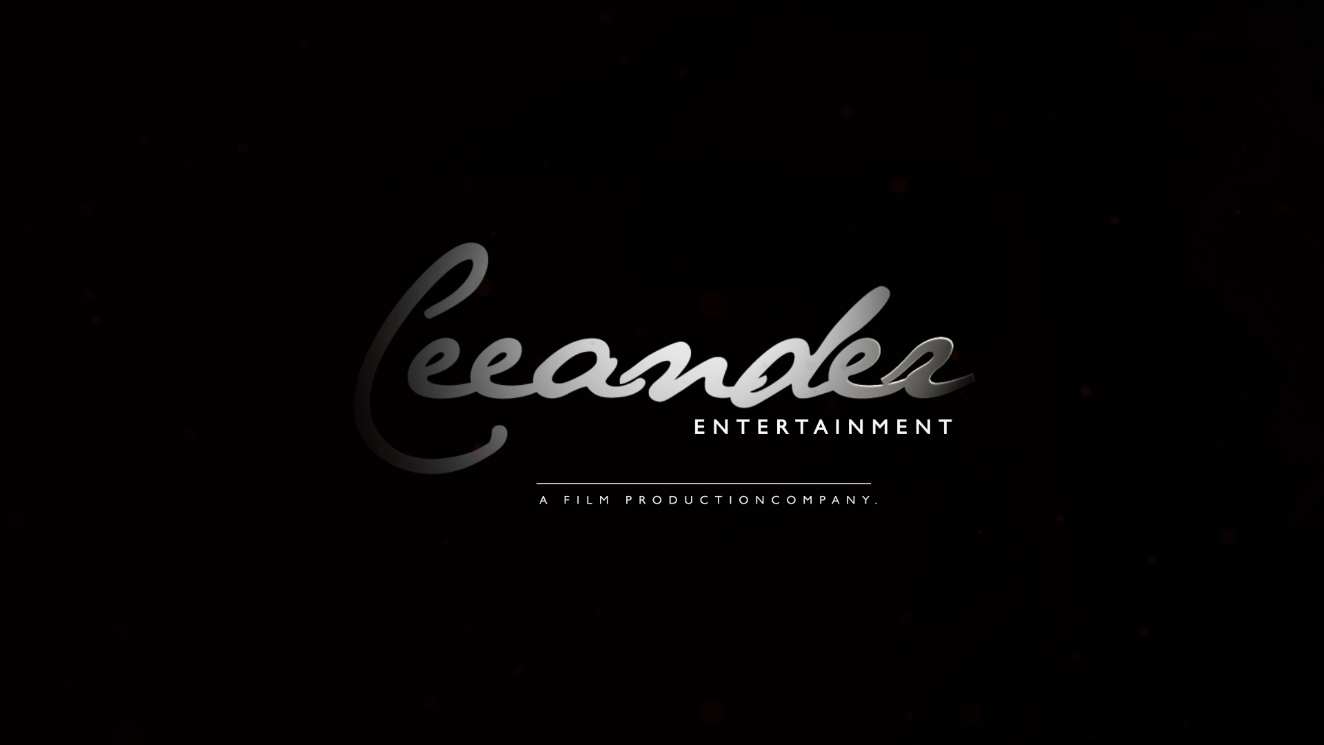
A single mask resolves in the middle, and lightning strikes to introduce light into the scene — the one point at which the film is lit by something other than torchlight. The masked man then disappears behind a thick cloud of smoke, which fades out to reveal the company’s logo with light beams emanating from it.
The piece ends on the logo in its actual colours.
Published March 2015. View the original project on Behance.