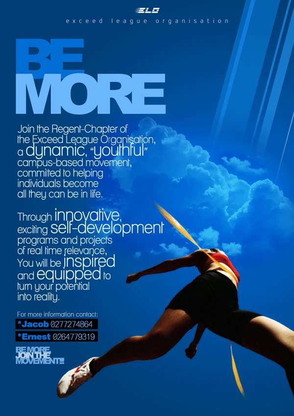
The studio published it as BE MORE - GRAPHIC DESIGN on 6 June 2012. The post carries one plate and two lines of note: the client, which it types as “Exceed League Organization (ELO)”, and the toolset, Adobe Illustrator and Adobe Photoshop. The poster itself spells the name with an s — exceed league organisation, letterspaced under the logo at the top of the sheet — and this page follows the artwork.
The headline is the load-bearing part. BE sits above MORE, the second word set far larger in a pale blue condensed grotesque, while the first is dropped into a deeper blue so it reads as part of the field rather than on top of it. Read on its own the type does the asking; everything below it is argument.
The figure is a track athlete driven hard to the right — red singlet, black shorts, white spikes, a gold ribbon pulled off the shoulders and streaming behind — and the crop is the point: the head falls outside the frame, so the body is stride alone rather than a person you might recognise. Set against a bank of cumulus and shafts of light raking down from the upper right, the image supplies the upward register the words claim. It is assembled work, not a photograph: the runner is cut out and re-lit into a sky that was never behind them.
The copy block at left runs the pitch in white and jumps the key words up in size as it goes, so skimming gives you dynamic, youthful, innovative, self-development, inspired and equipped before you read a whole sentence. It asks specifically for the Regent Chapter of the organisation, which makes this a chapter’s own recruitment rather than a national campaign, and it puts the reader in touch with people rather than a website: two black chips carry Jacob on 0277274864 and Ernest on 0264779319. At the lower left the movement is named again as a stack — BE MORE / JOIN THE / MOVEMENT!! The poster is on blogspot.